Design and Reasoning
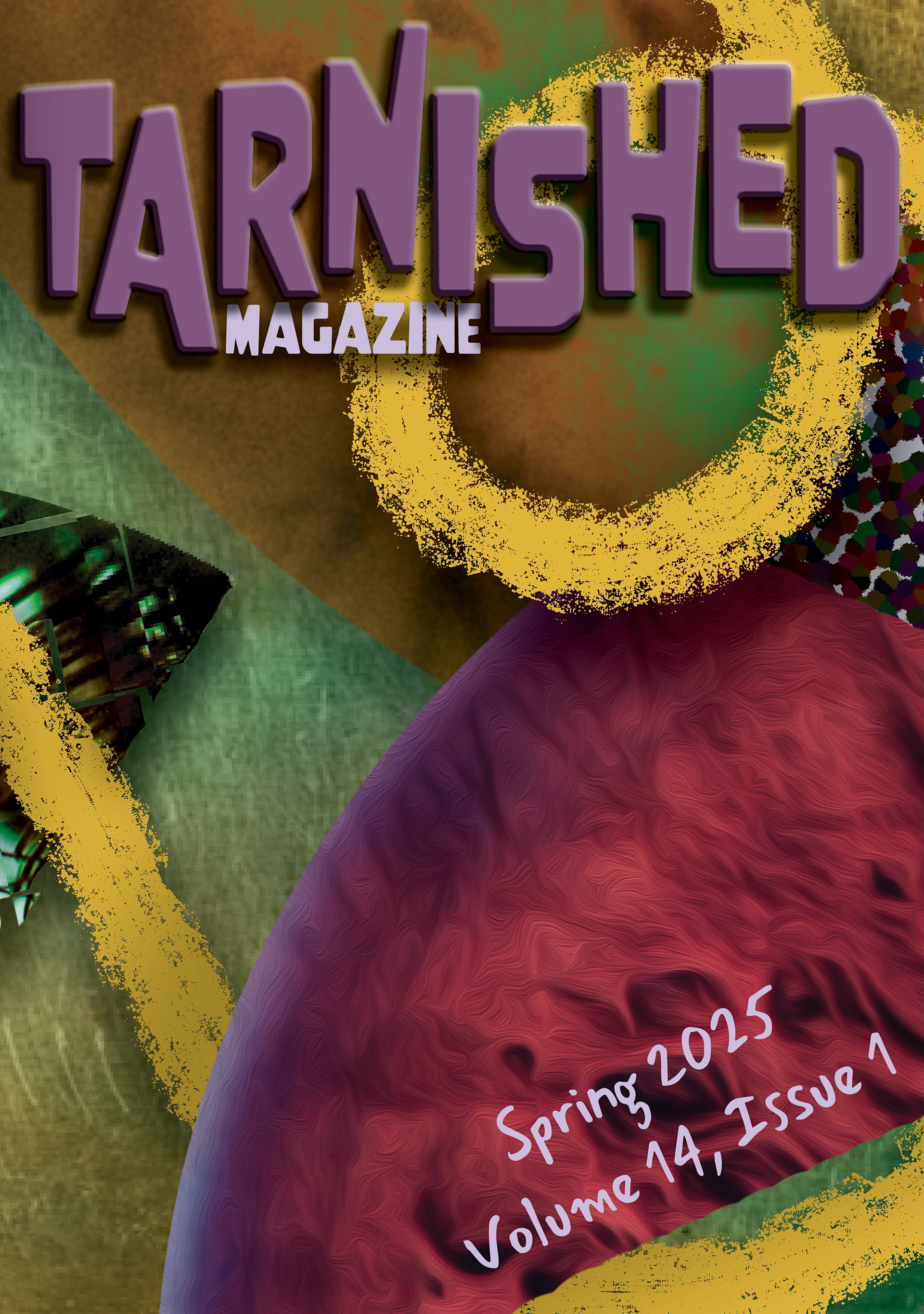
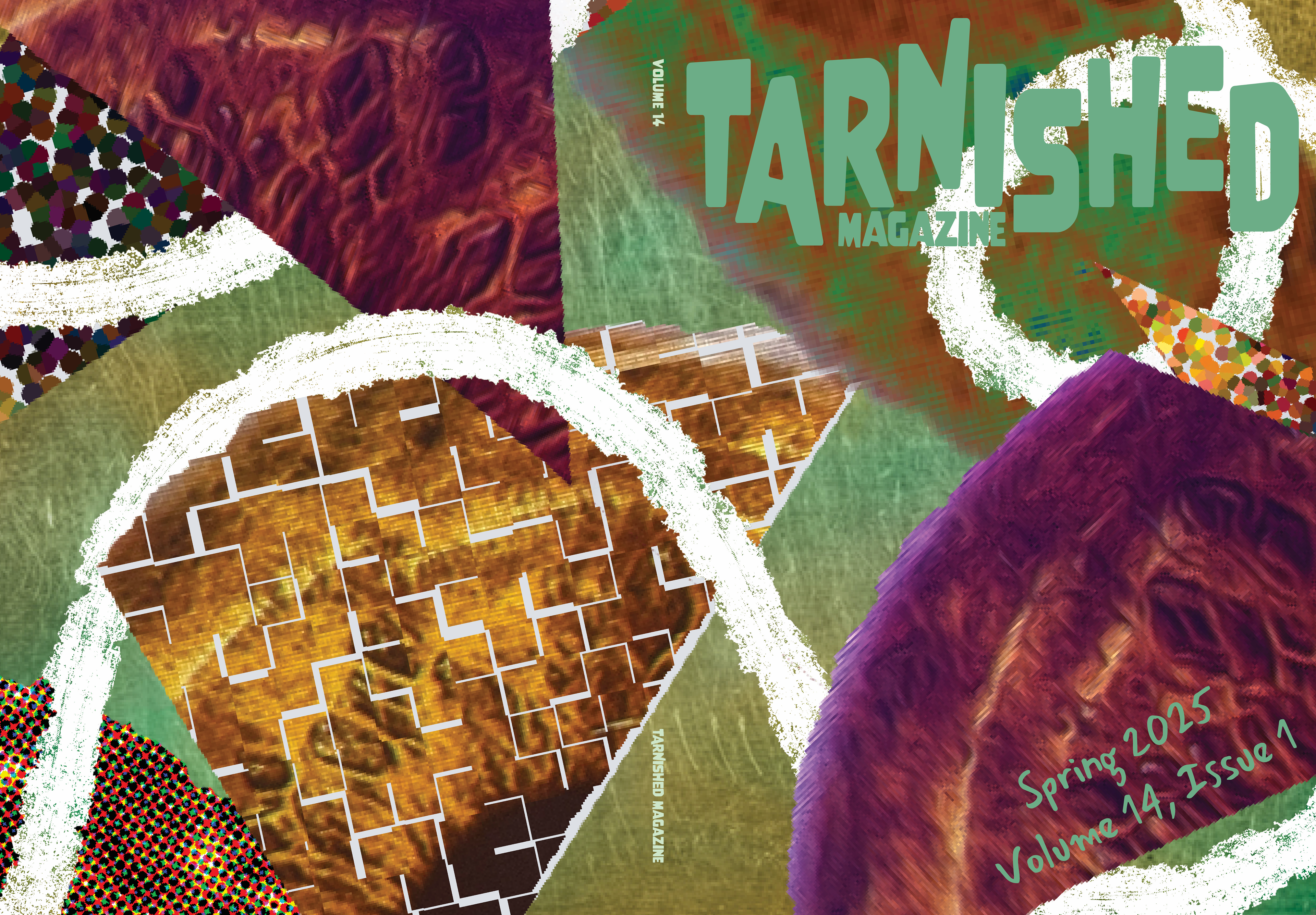
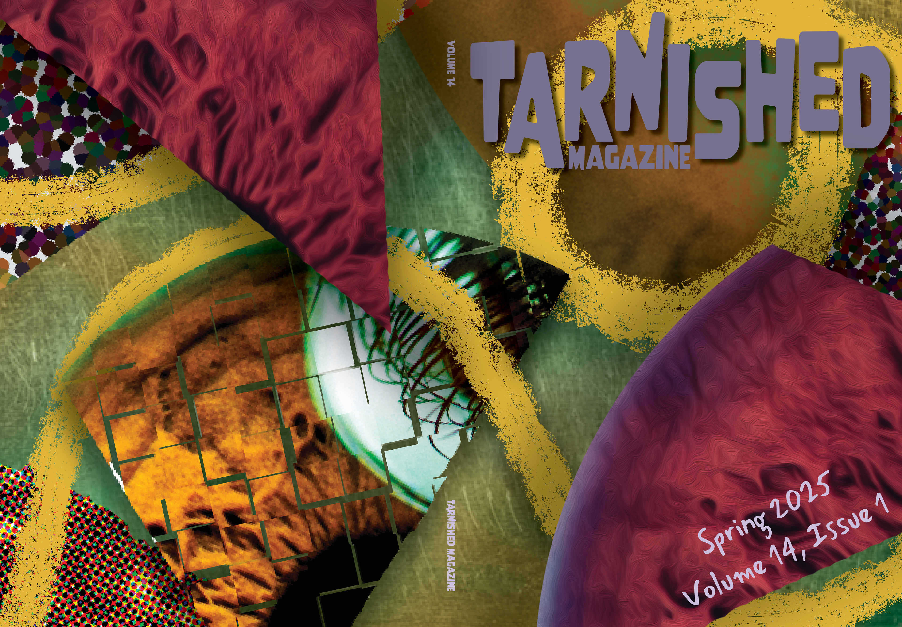
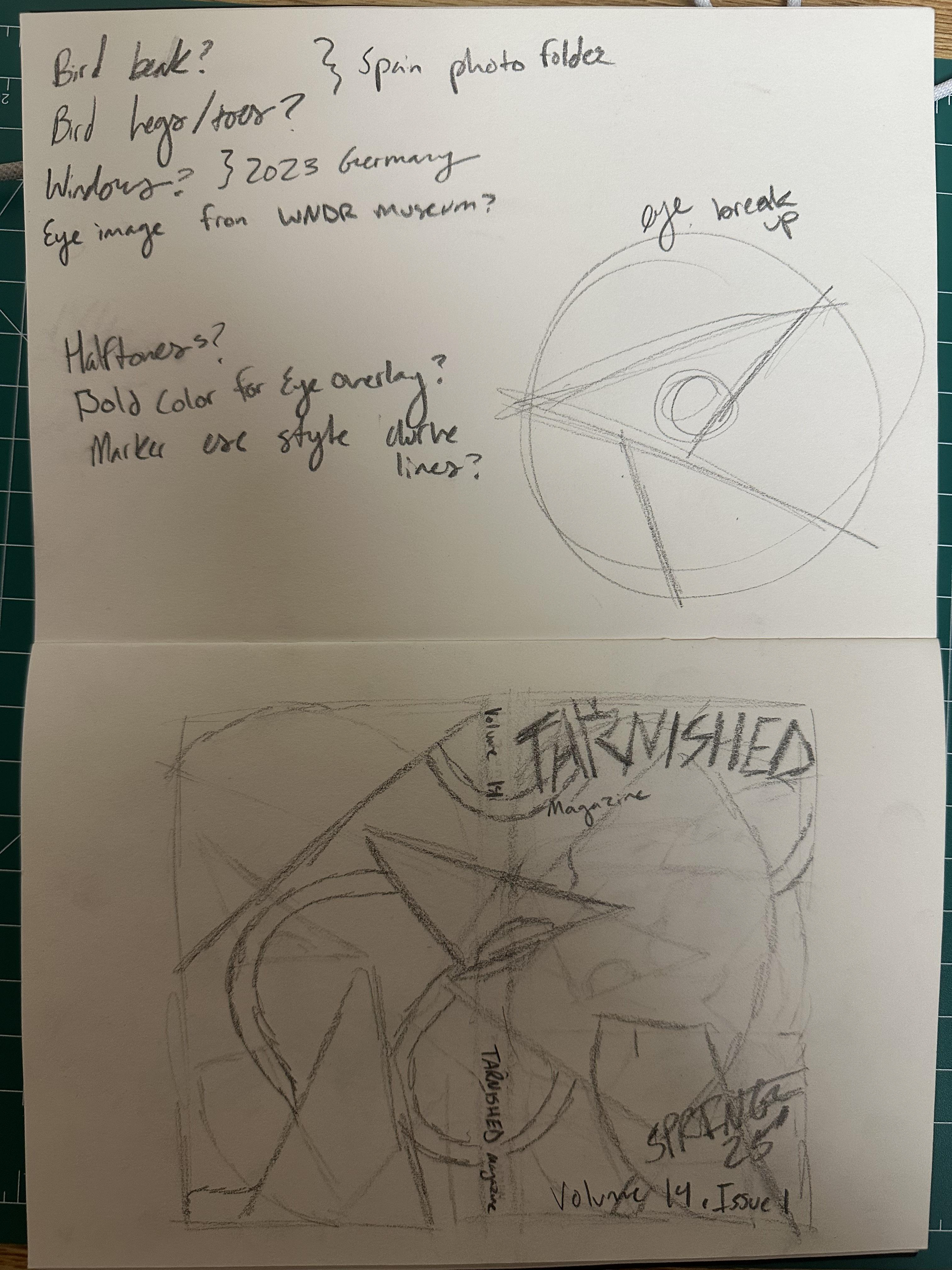
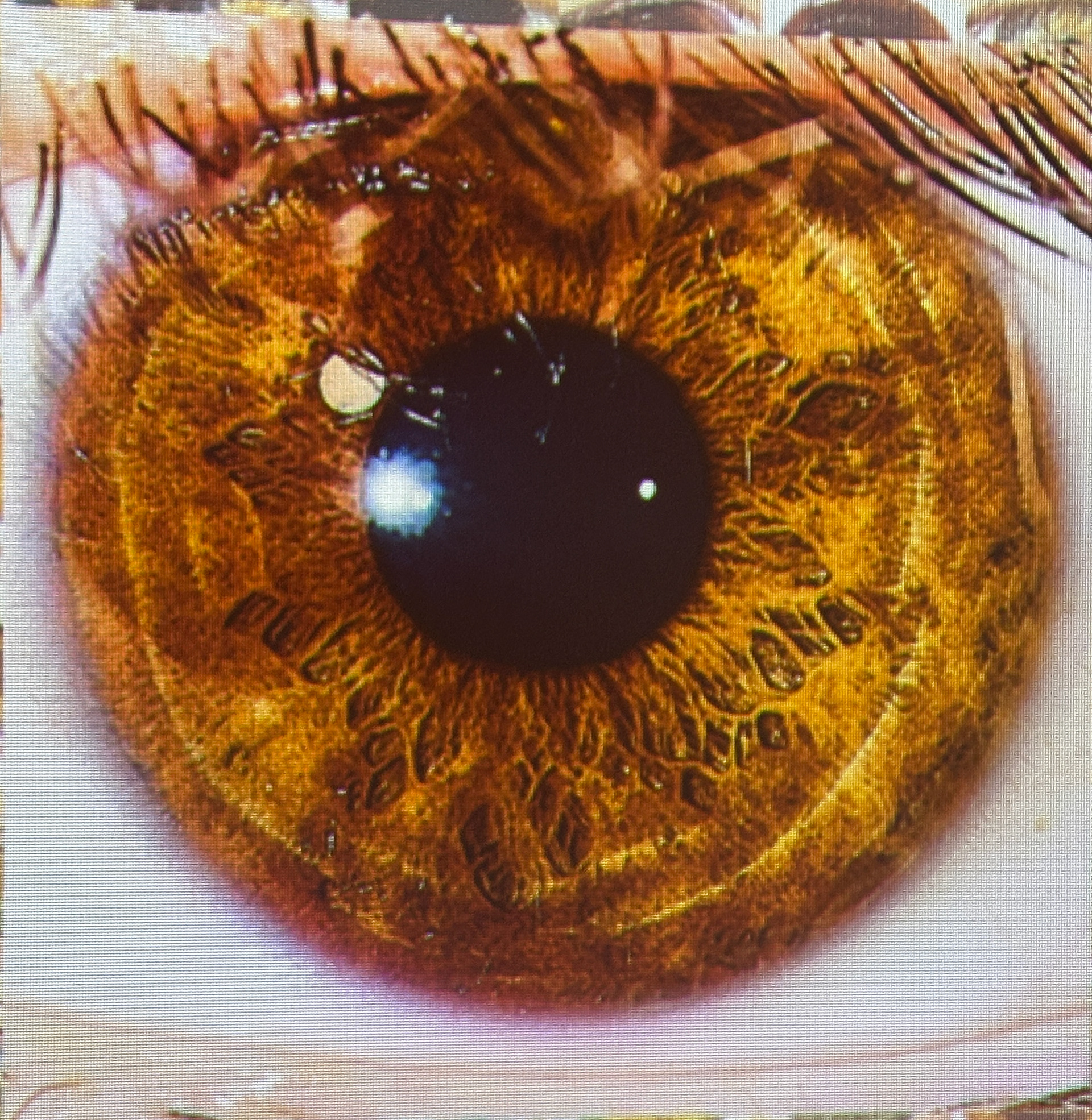
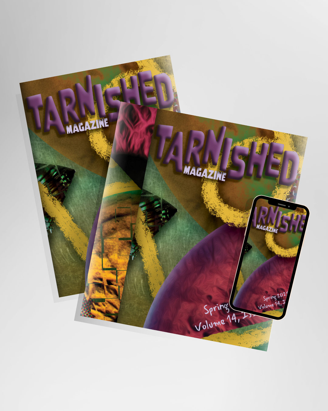
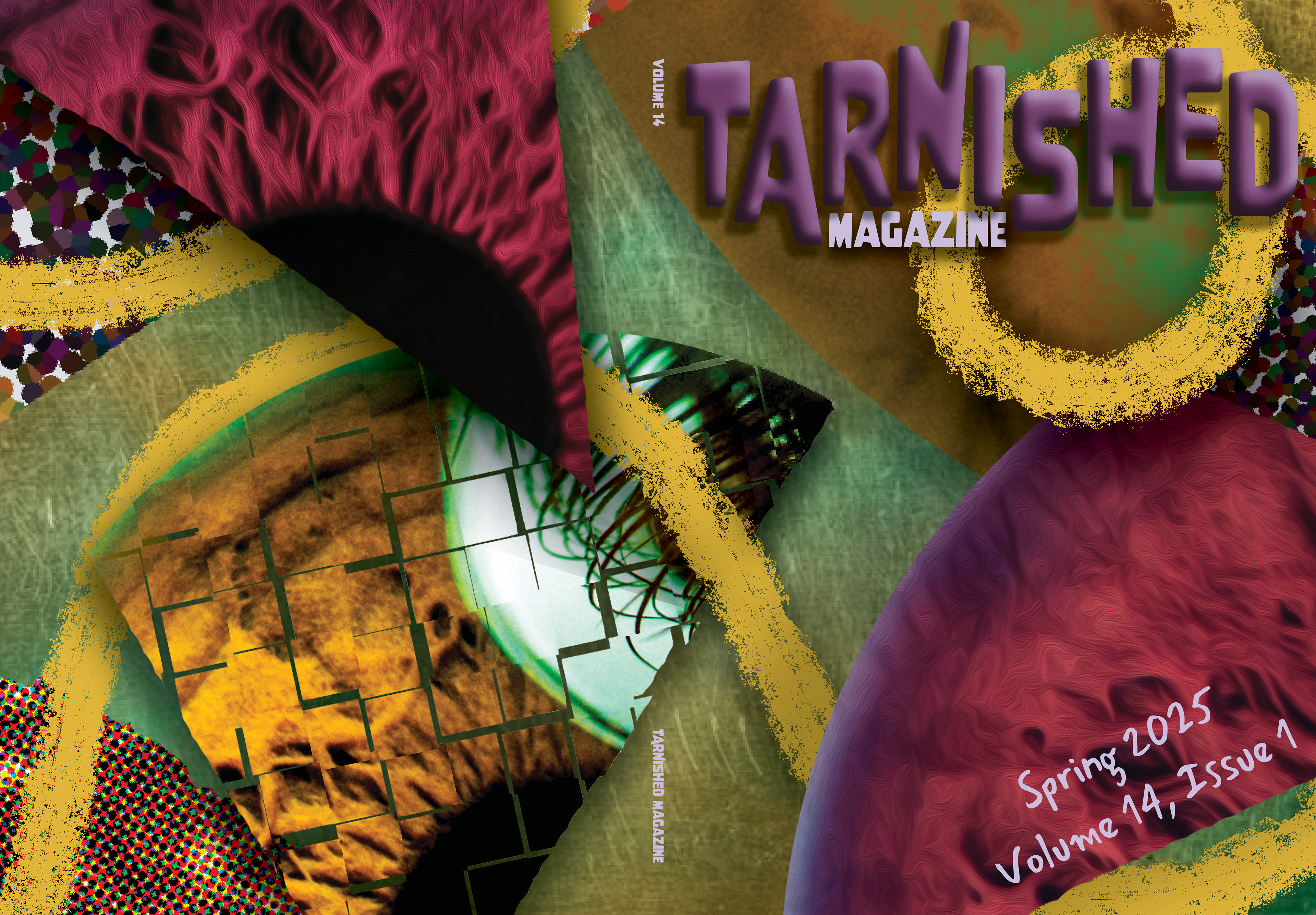
The goal of the design for the 14th volume of Tarnished magazine, was to create a publication spread that was very different from what you might normally see. The description provided in the design brief was to create a design that fit the aesthetic of "not your mother's collage". In this design, I used close up images of eyes, including my own, to create something that was visually engaging and intrigued viewers to figure out what the shapes actually are.
The full cover spread (front, back, and spine) measures 17.25 in x 11.9 in.
Full Flat Spread
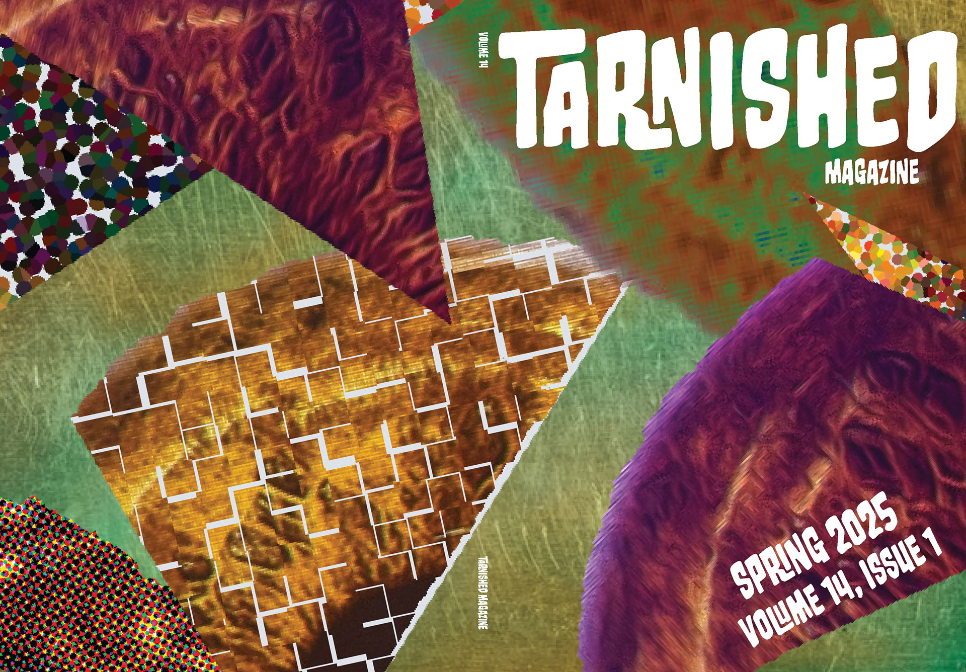
Drafts and Sketches