Printed Material Flats
Designs and Reasoning
Café Mysa was created as a place so that people of all ages would have a home away from home. For locals, this is a place to escape everything else, take time for yourself to relax or be productive, and hang out with friends. The company also strives to allow everyone the opportunity to taste authentic food from all over the world, especially if traveling is not currently in your plans. For those who are visiting from other countries, the goal is to bring at least a small, authentic piece of home for those who are homesick or just craving a certain snack.
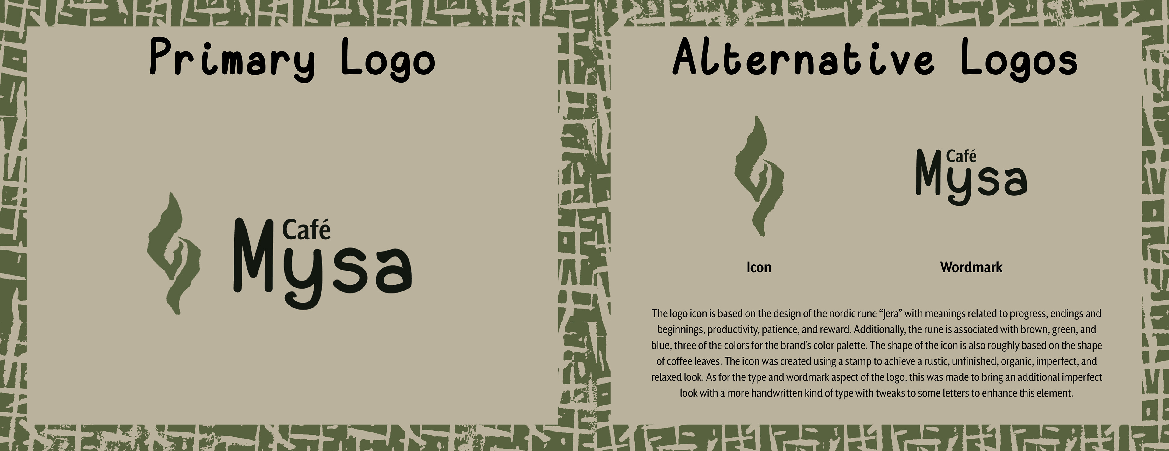
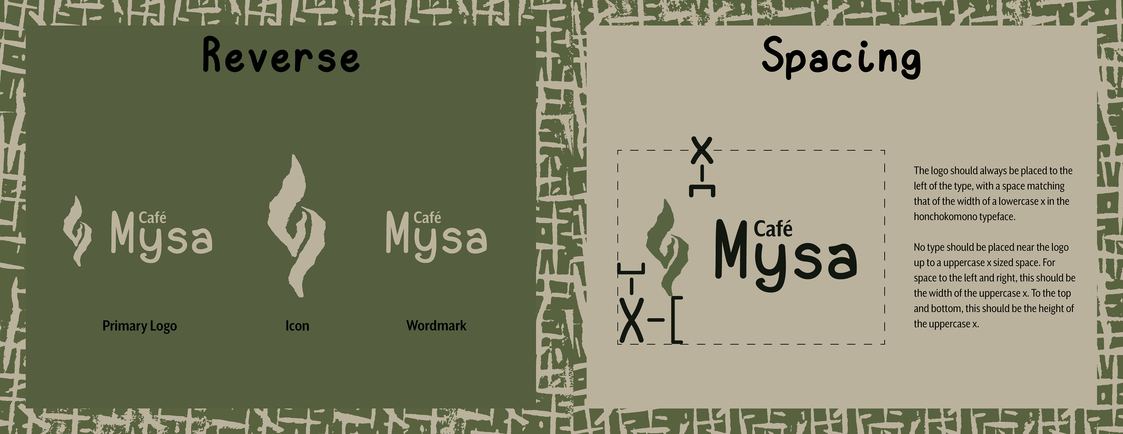
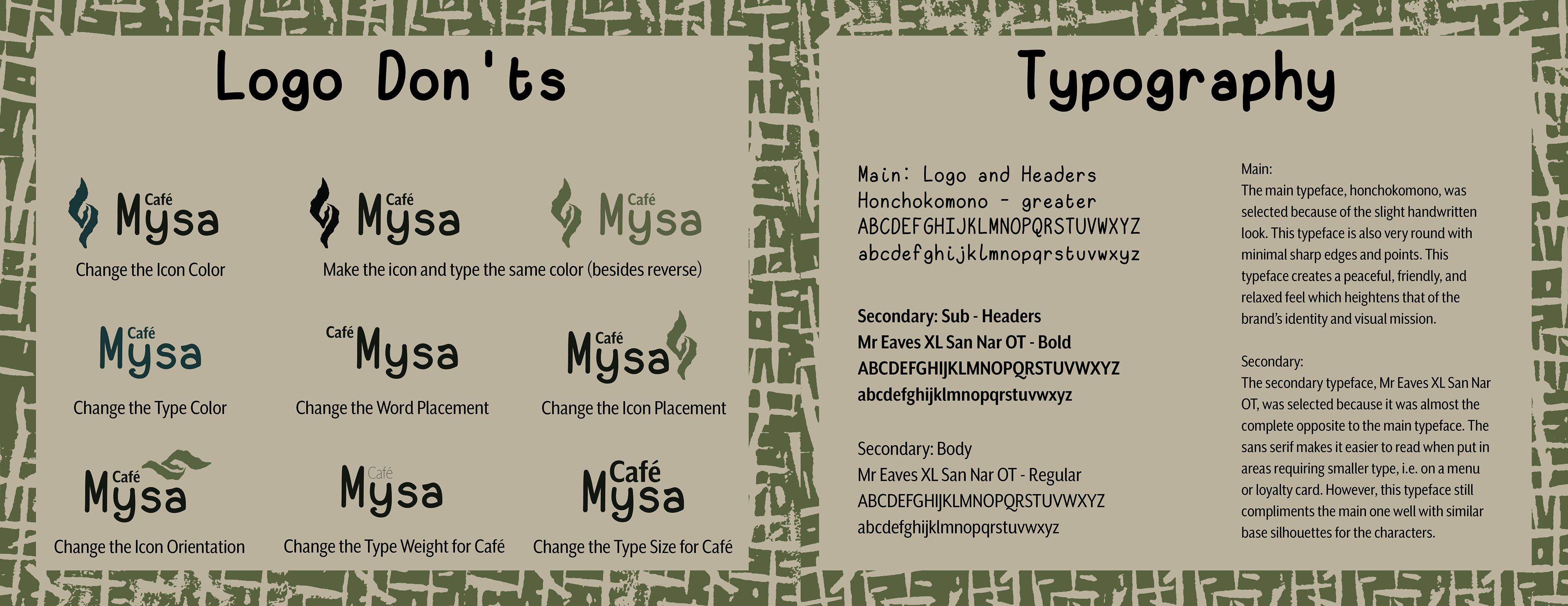
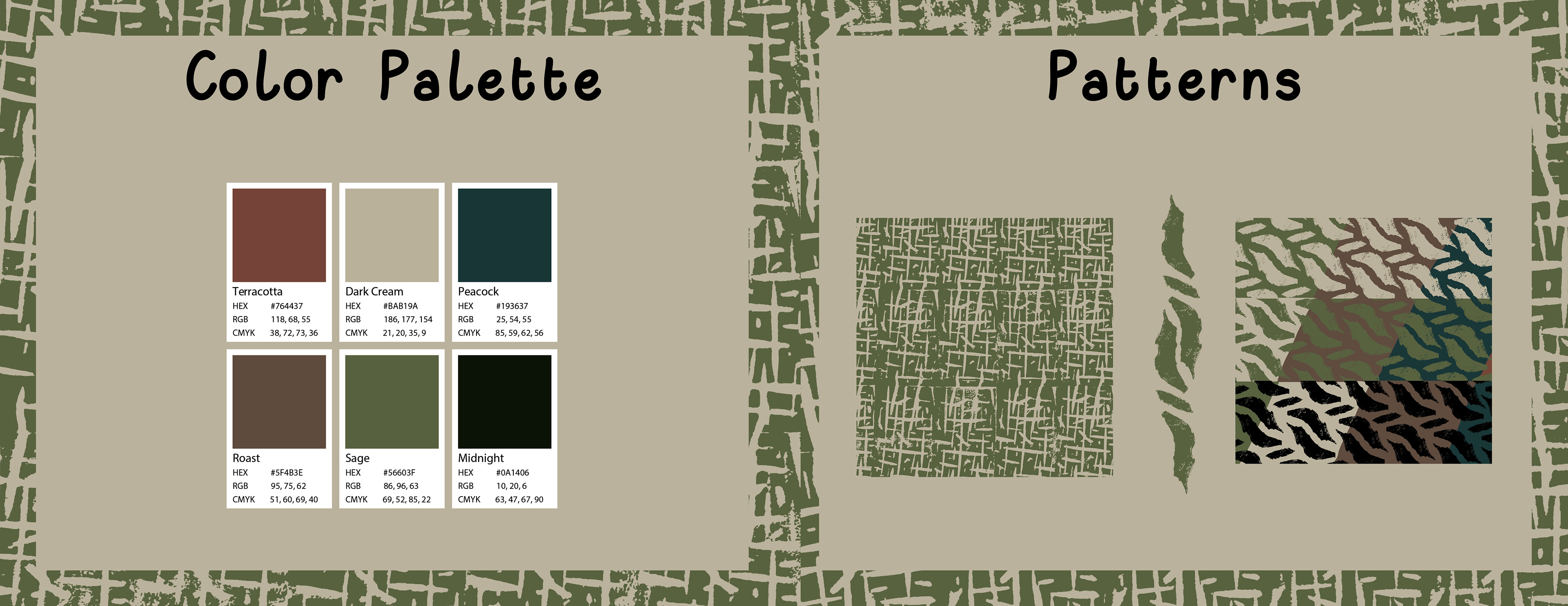
The goal of the design for the brand style guide and promotional materials was to replicate the company's aspirations in a visual sense. The array of designs relies heavily on a more muted, neutral color palette, rough stamp design, elements of nature, and handwritten style fonts.
The designed materials include the following, listed with their file sizes:
- Brand Style Guide: 8.5in x 11in
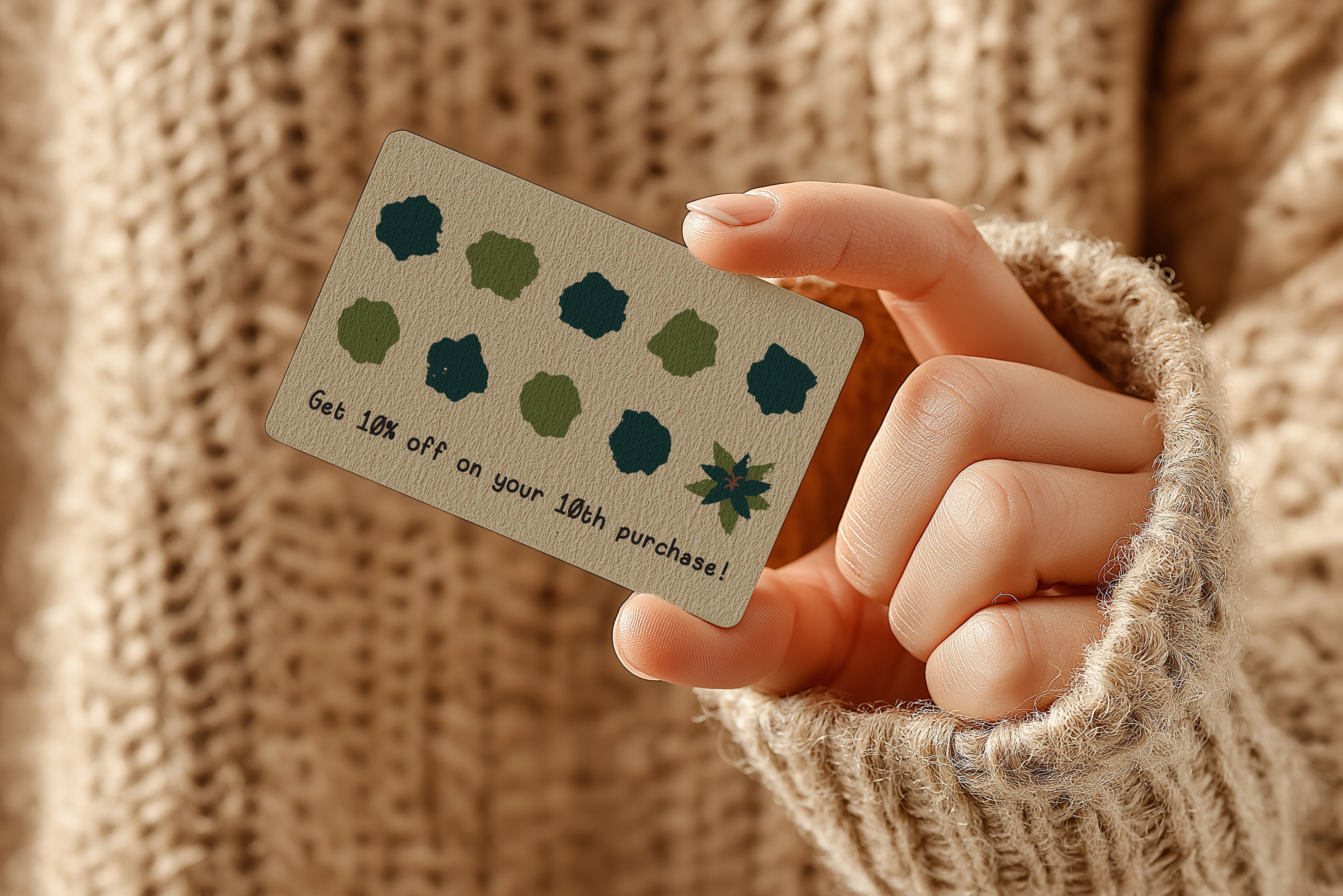
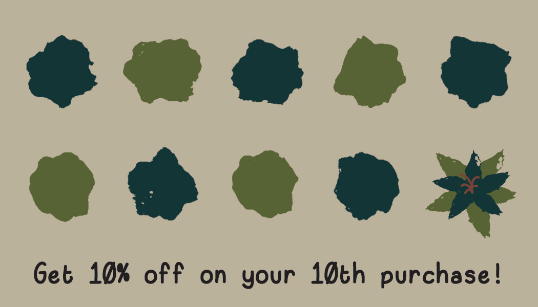
- Loyalty Cards: 2in x 3in
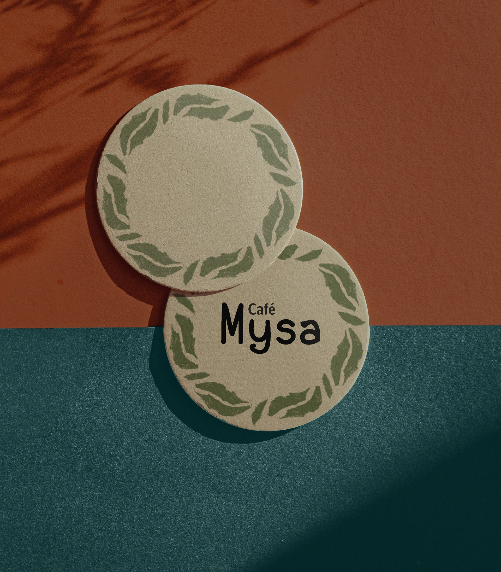
- Two Coasters: Each with a 3in Diameter
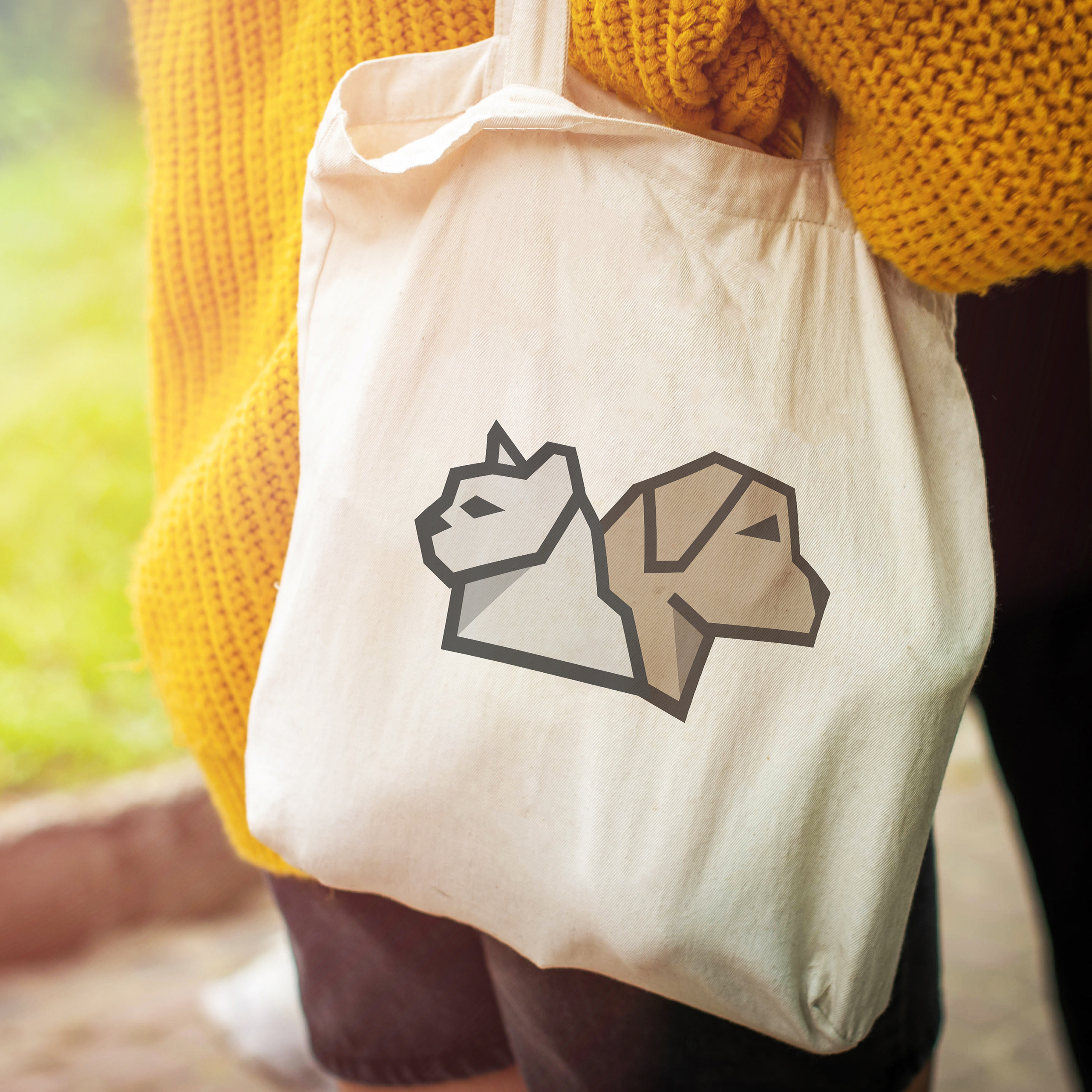
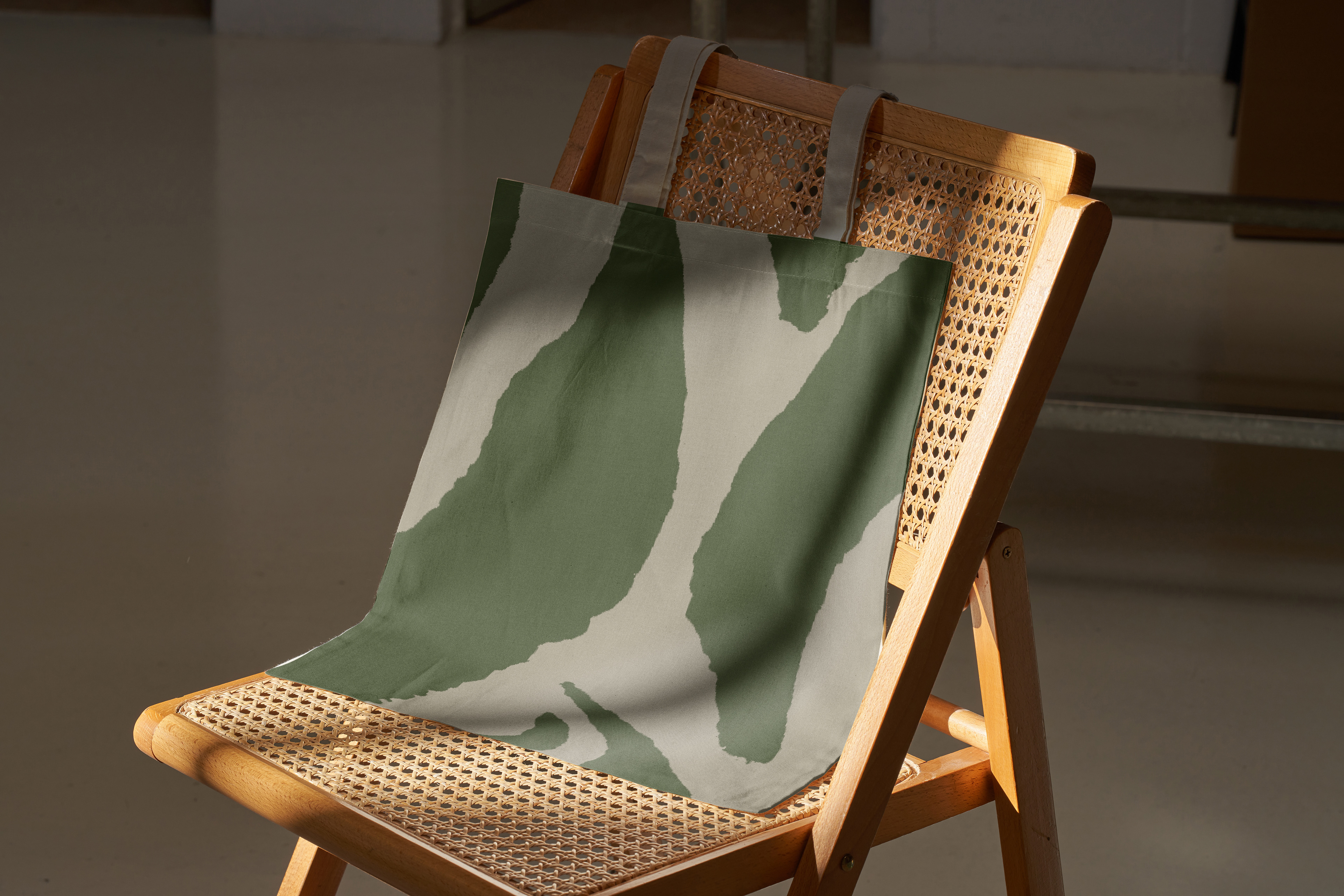
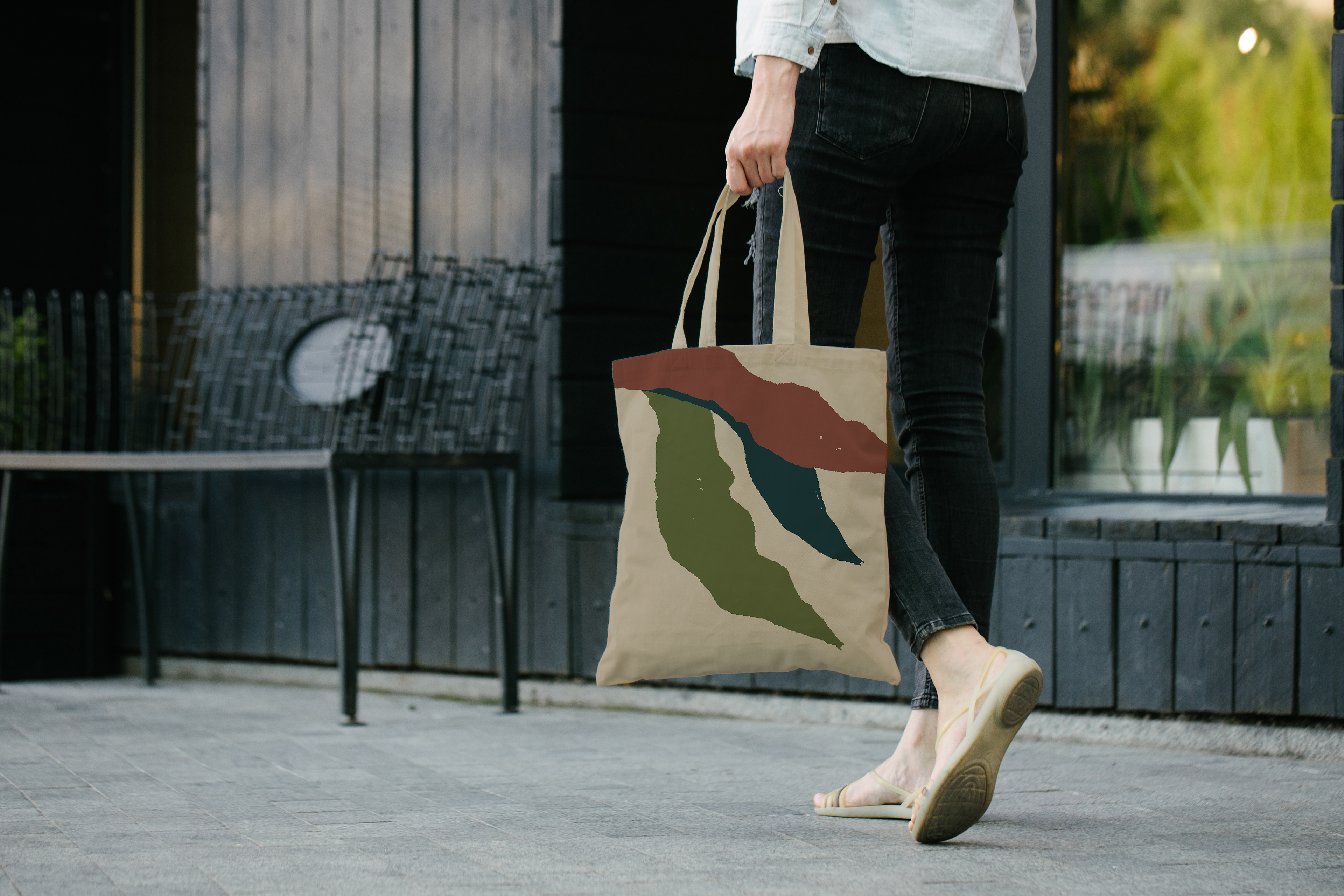
- Two Tote Bags: Each
- To-Go Cups:
- Cupsleeves:
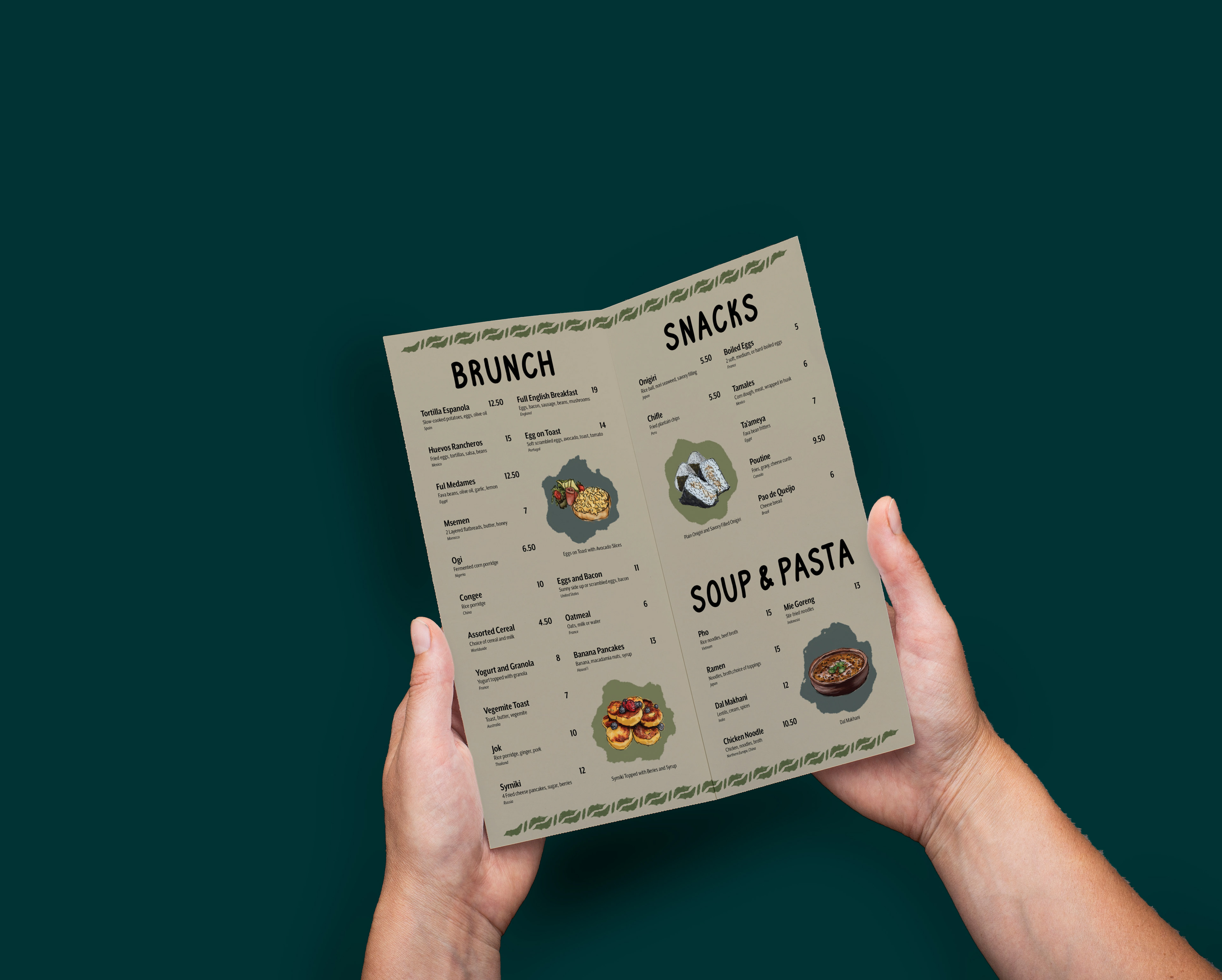
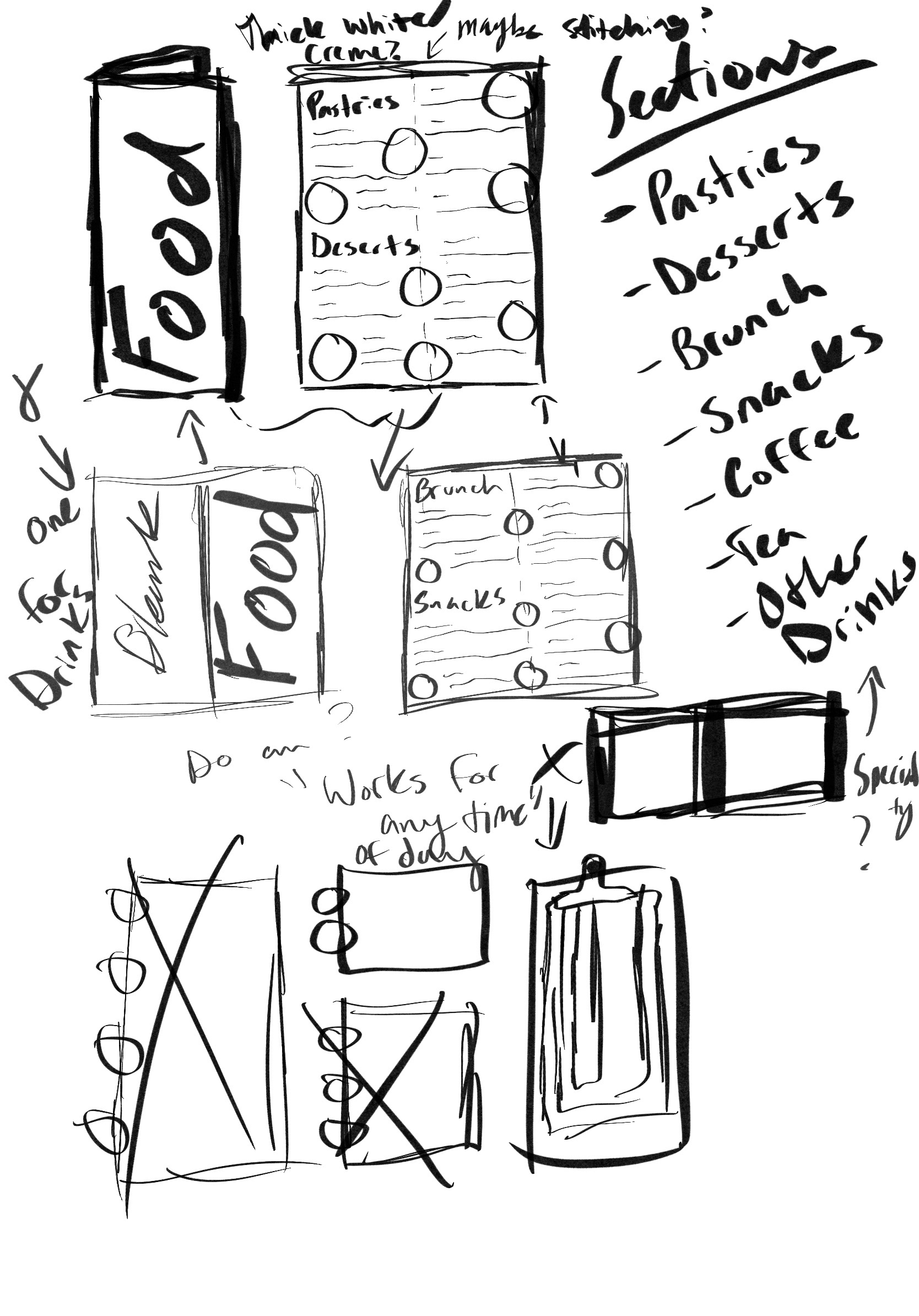
- Menu: 10in x 10in flat, 5in x 10 folded
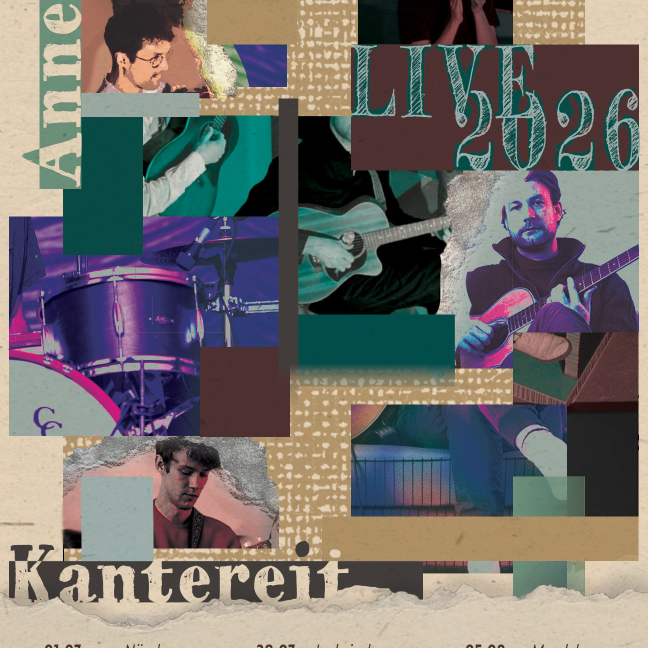
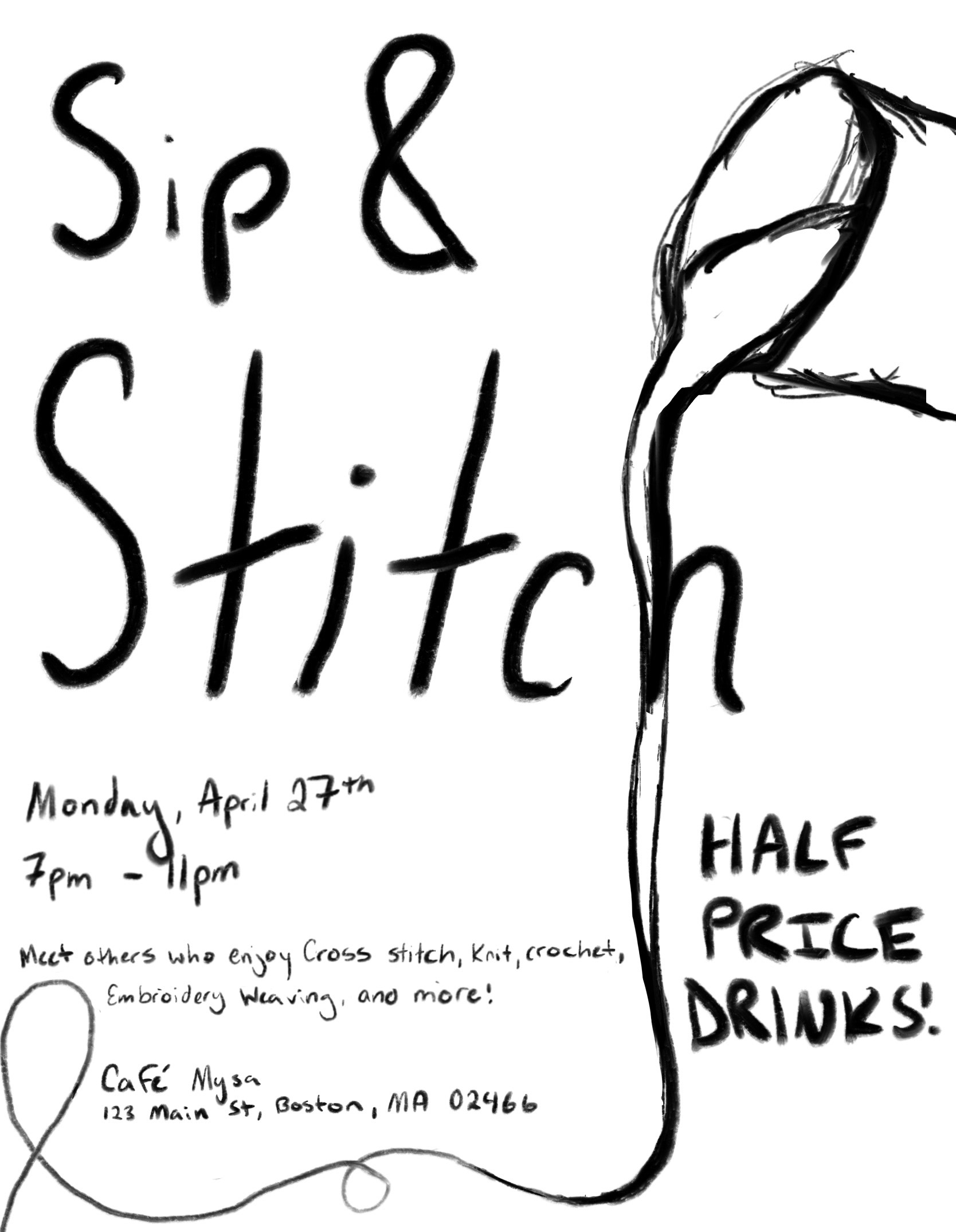
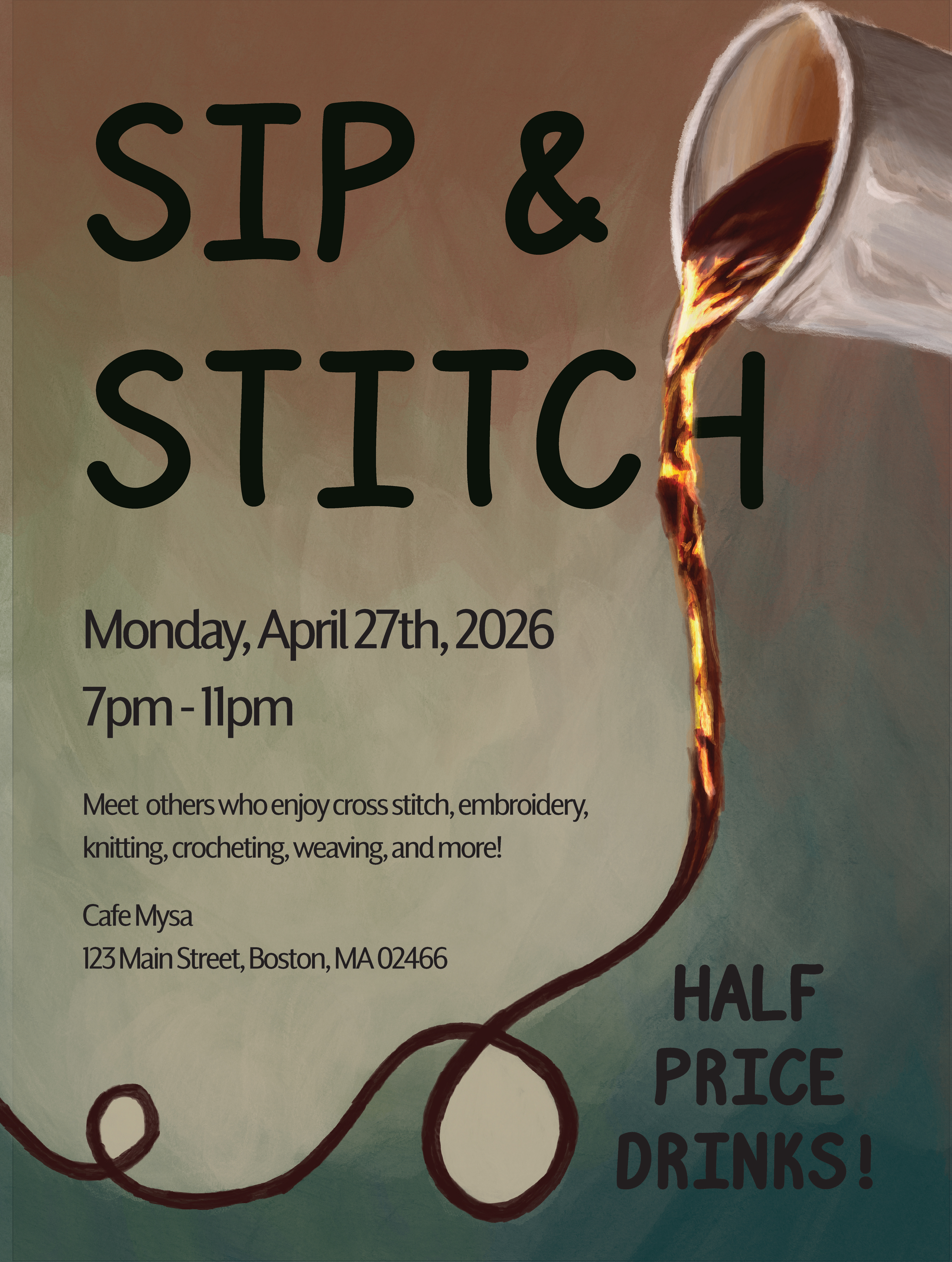
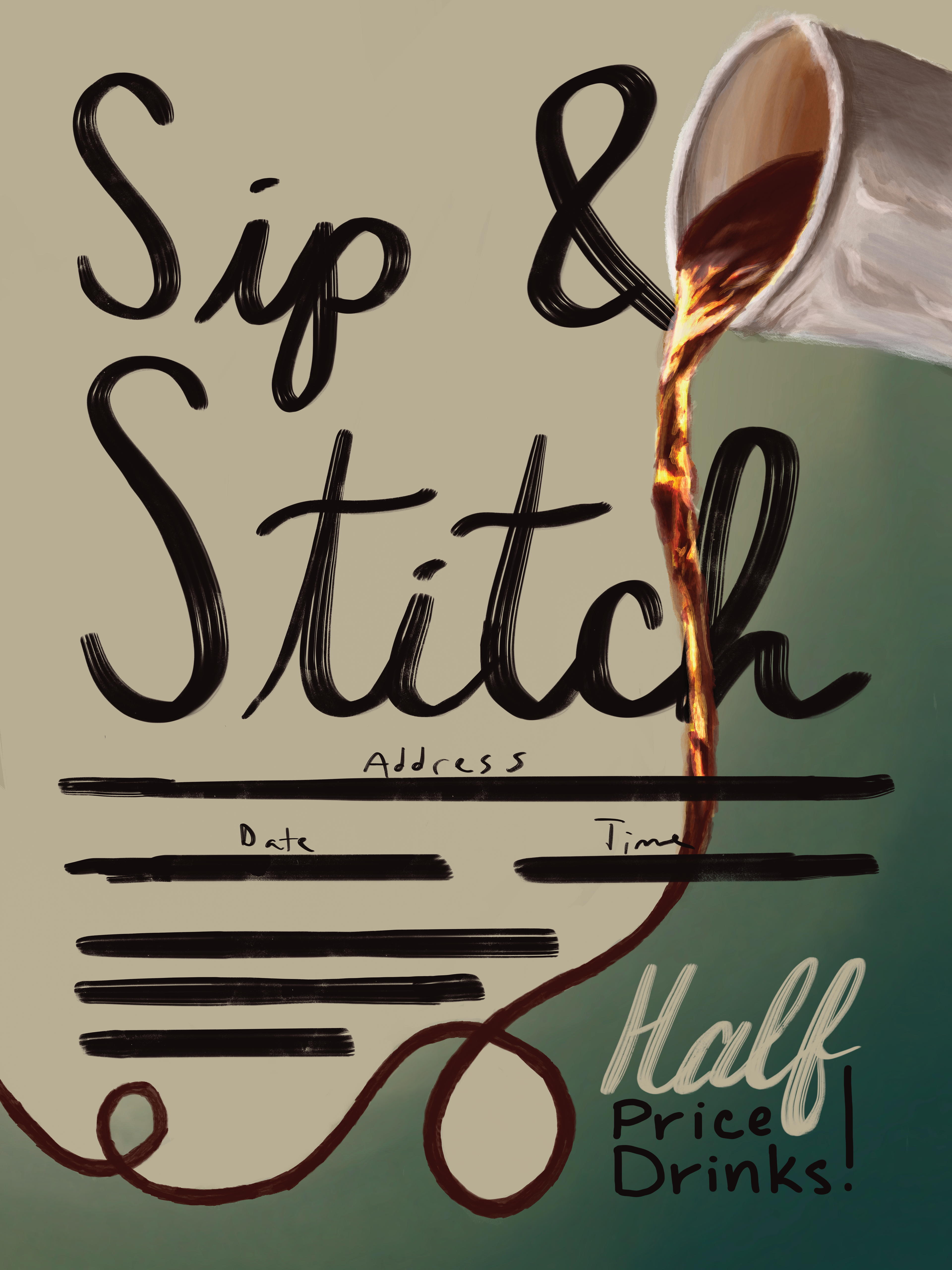
- Event Poster: 18in x 24in
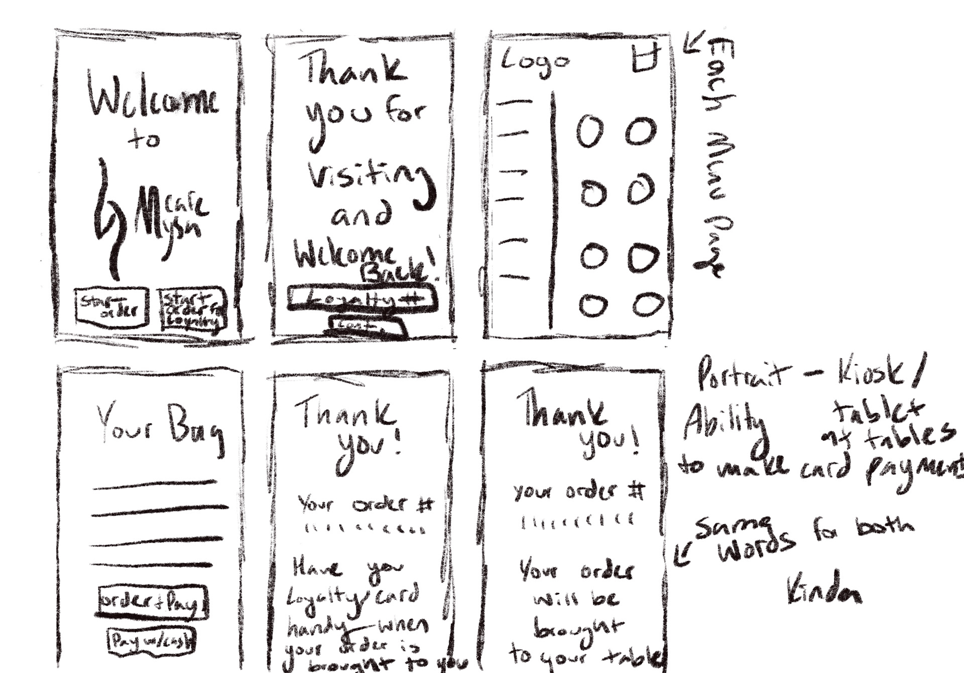
- Ordering Kiosk
- Website
Website and Ordering Kiosk Prototypes
Sketches and Drafts
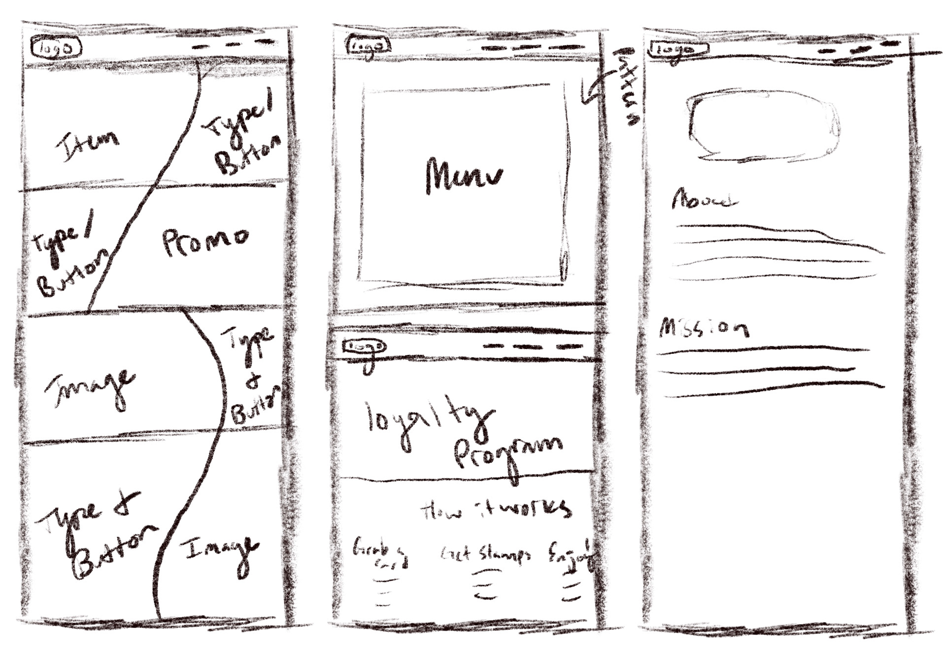
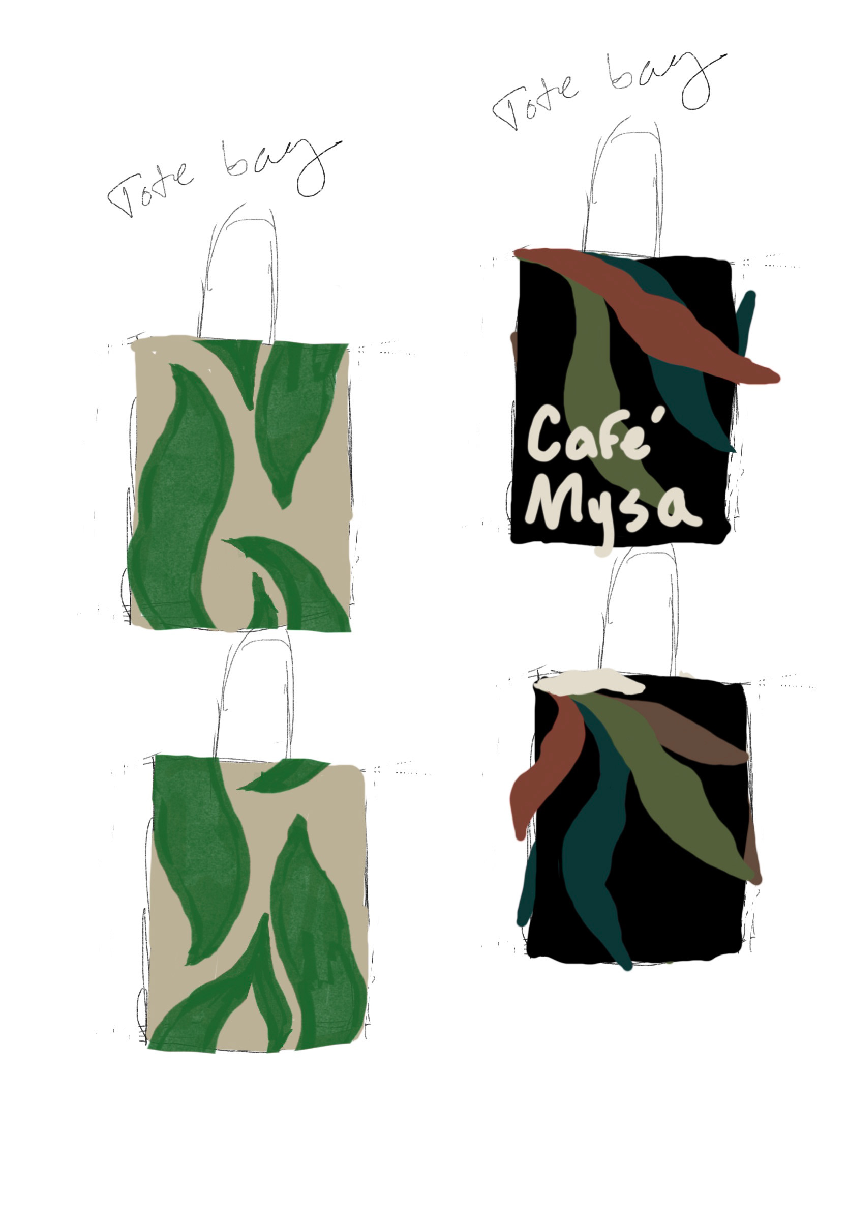
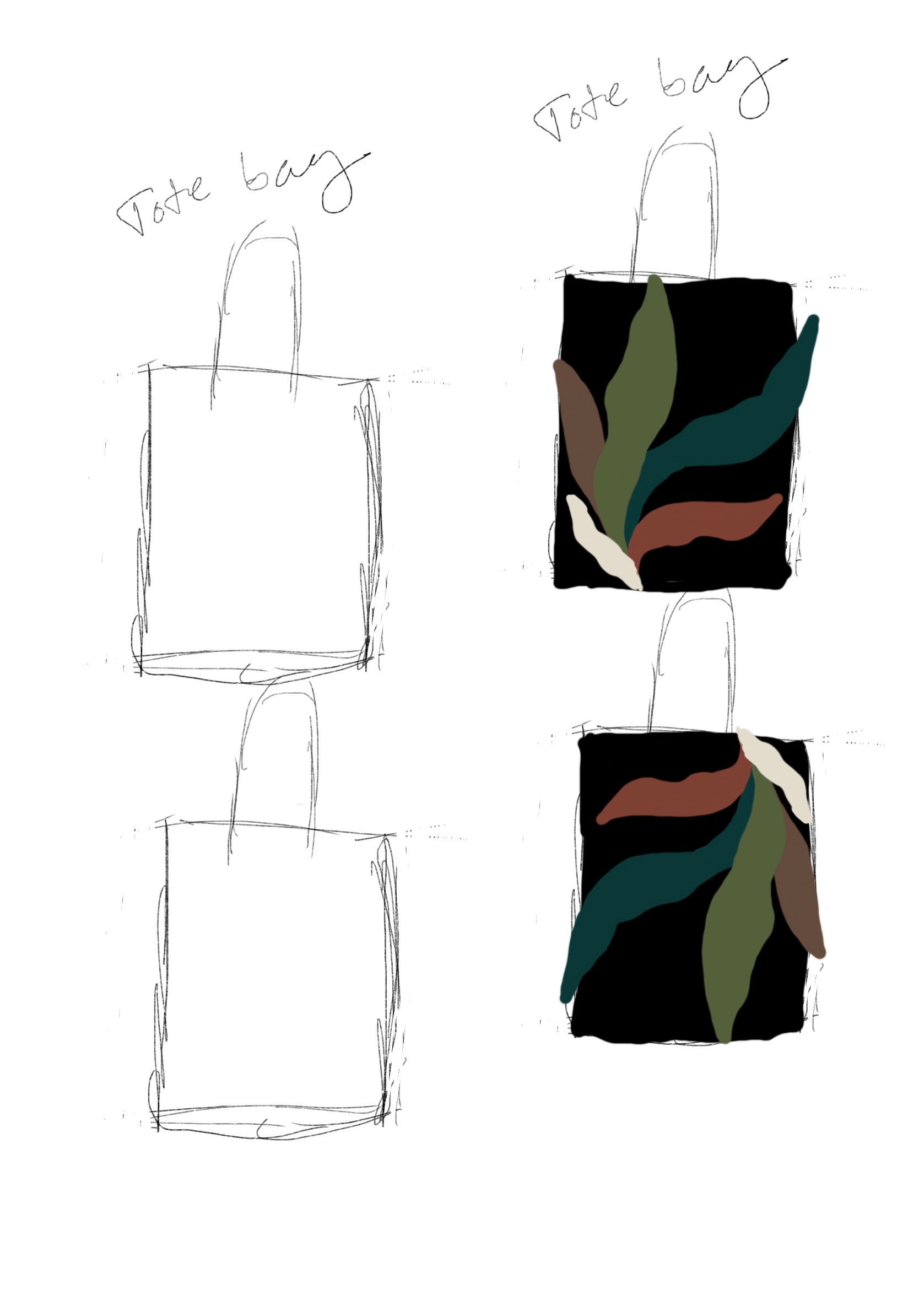
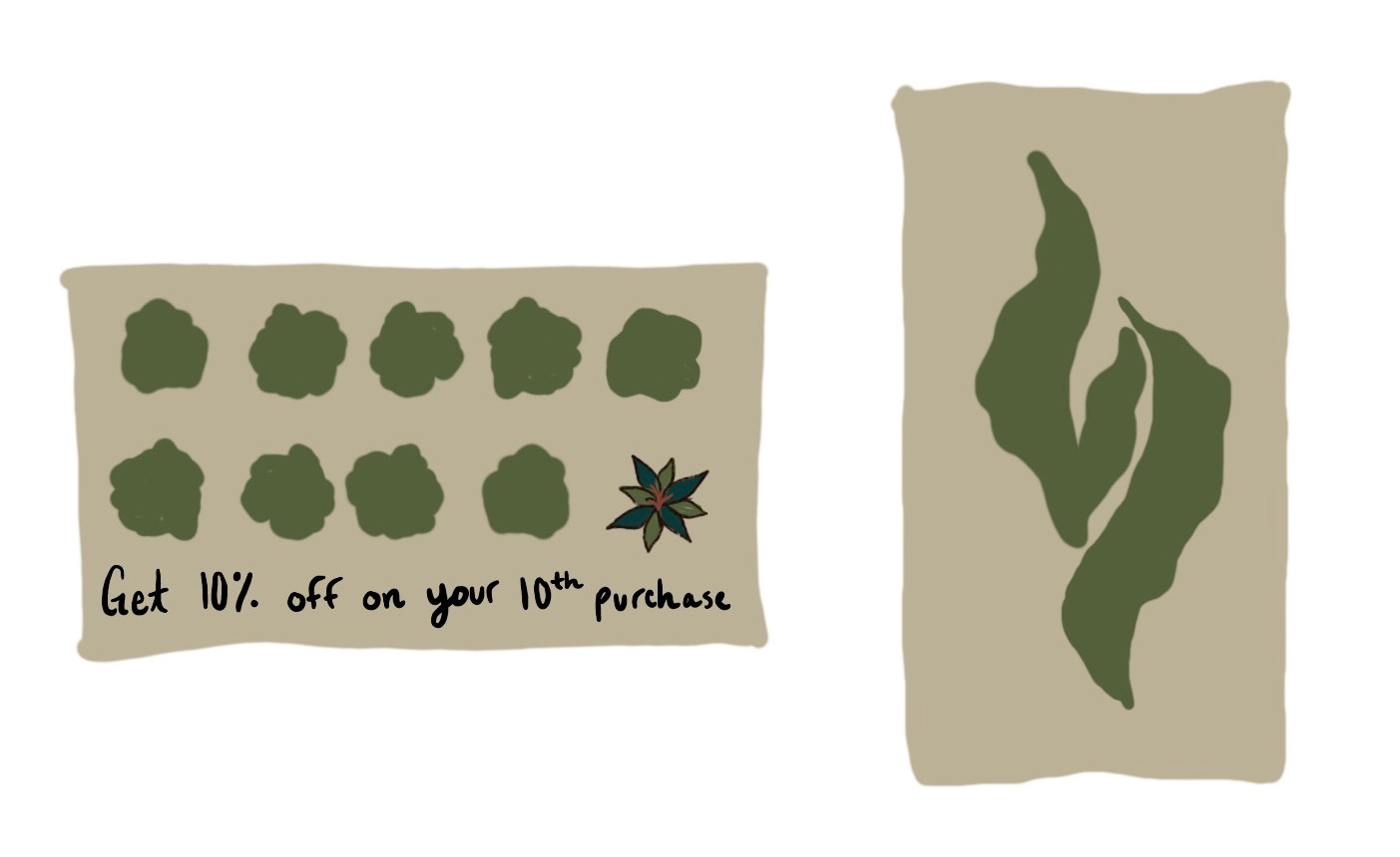
Process
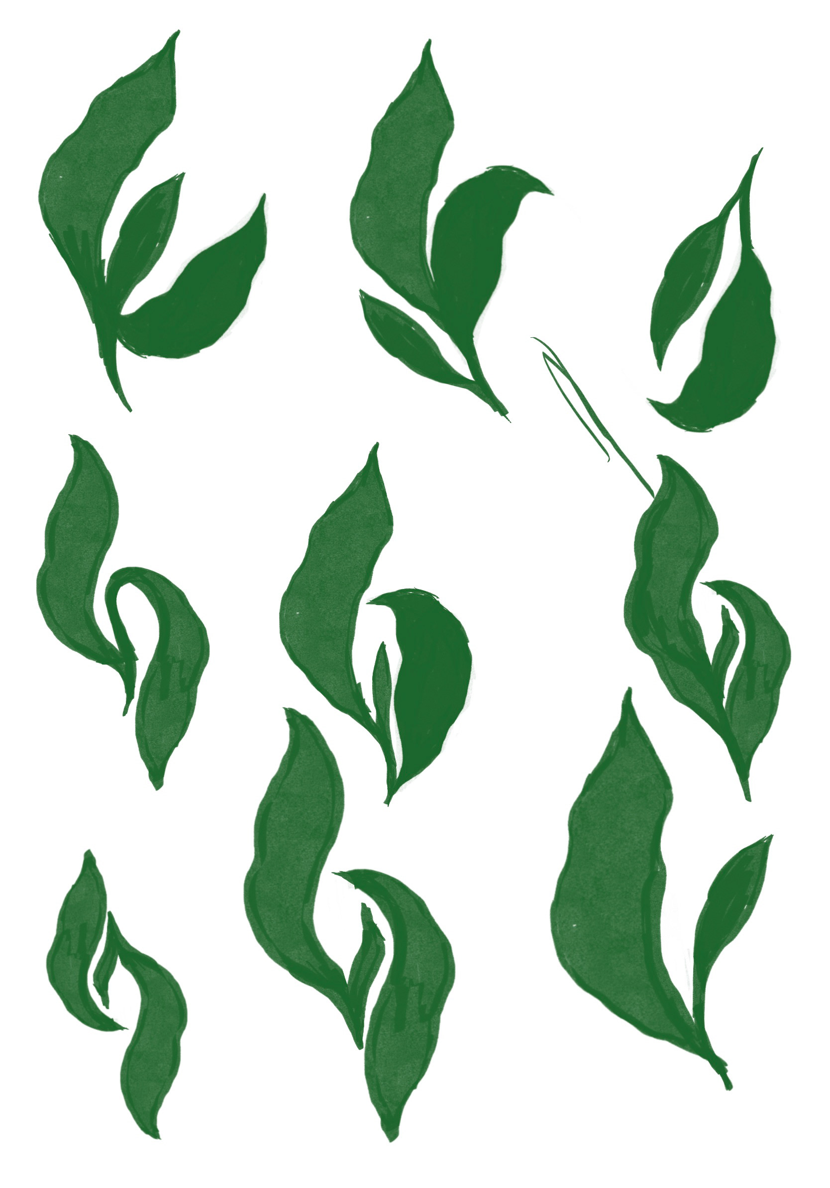
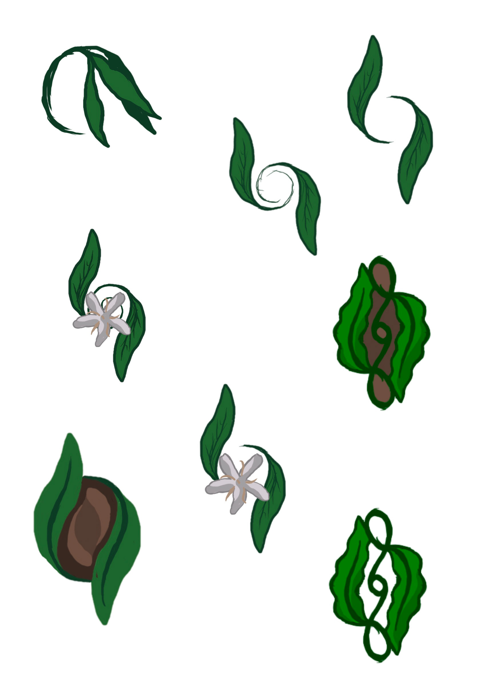
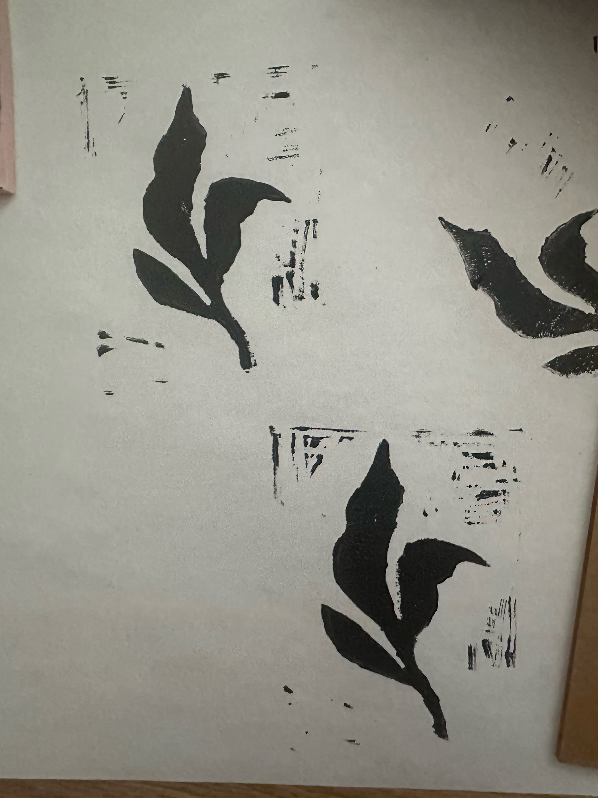
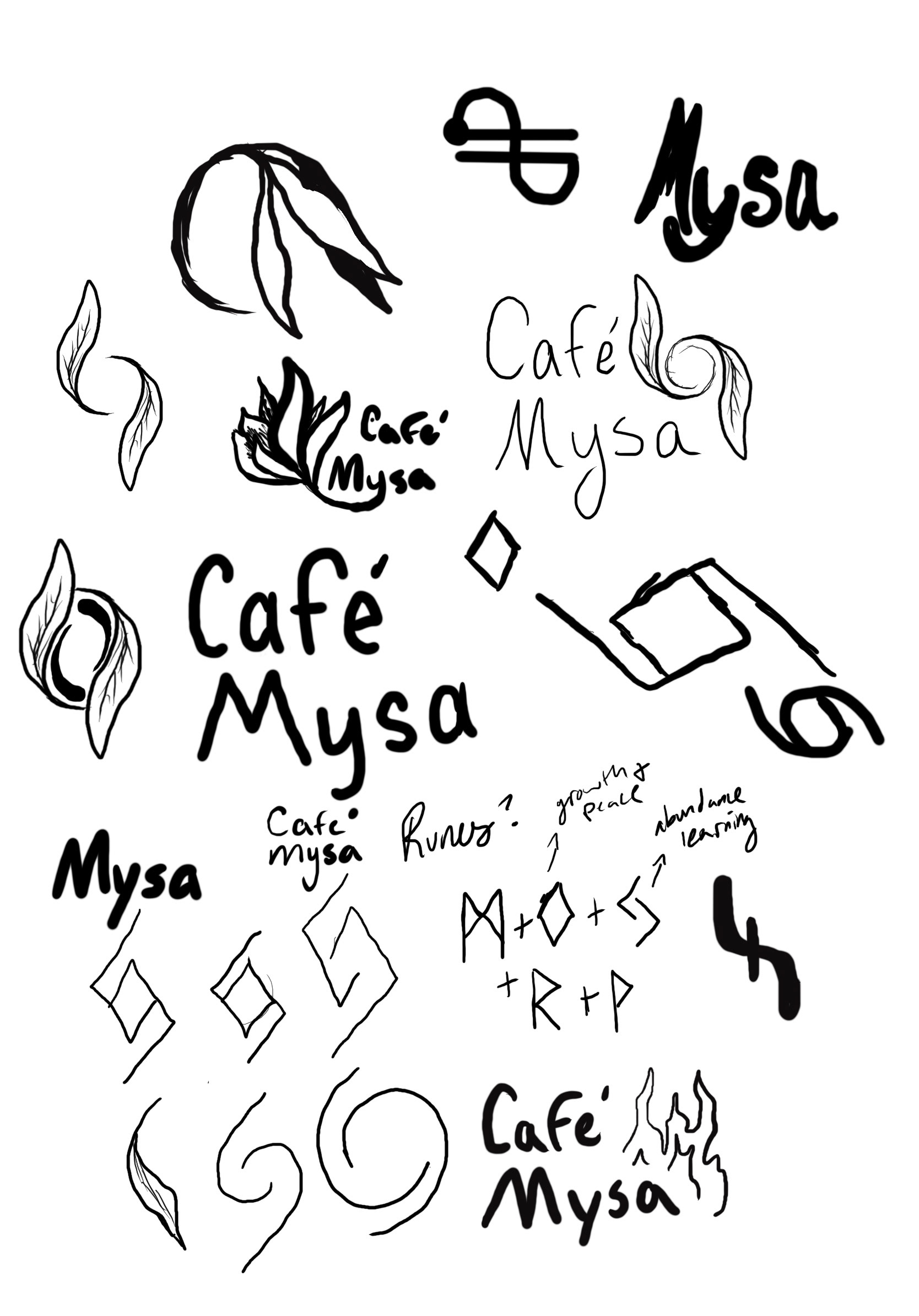
All visual designs are illustrated by hand or made via hand-carved stamps. Multiple stamps were created throughout the trial-and-error process. Some of these that were thrown to the side ended up getting used for some aspect of different designs.
The sketches were very rough, with mindmaps and sitemaps at the heart of everything. Then moving onto actual sketches, then carving stamps, then printing. The goal of the stamps was to create a rough, imperfect, and relaxing visual environment for the company. For the menu and event poster, these are covered in illustrations; however, it still has some stamped elements, such as the shapes behind the food illustrations and the border to increase cohesiveness.
Brand Swipe