Bottle, Can, and Packaging Flats
Designs and Reasoning
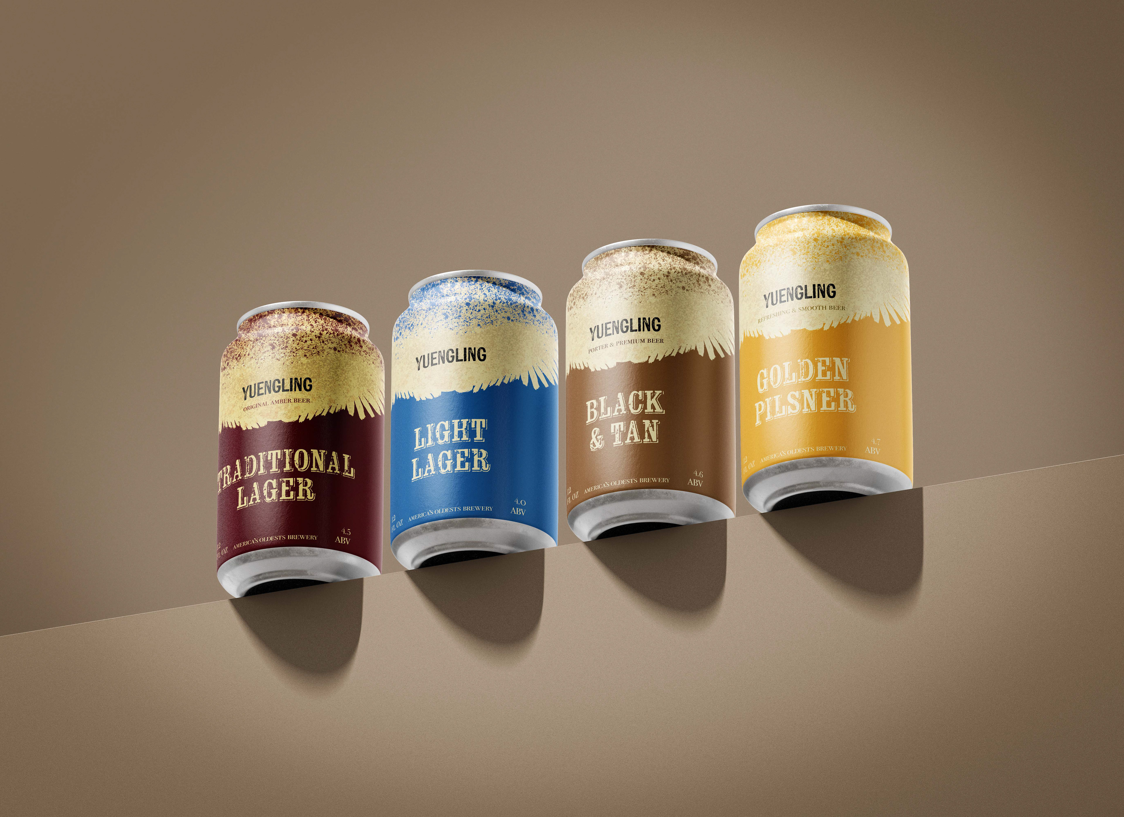
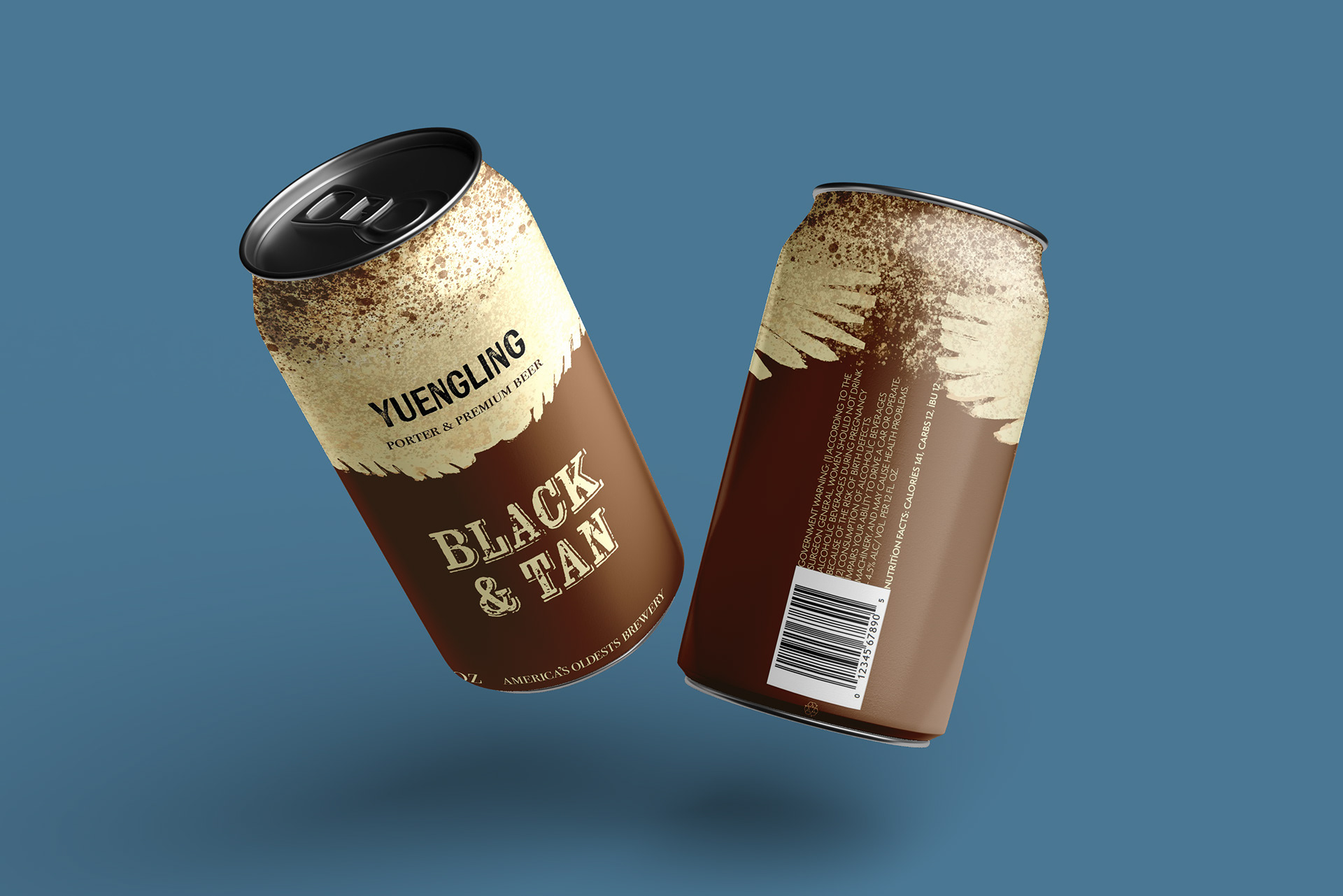
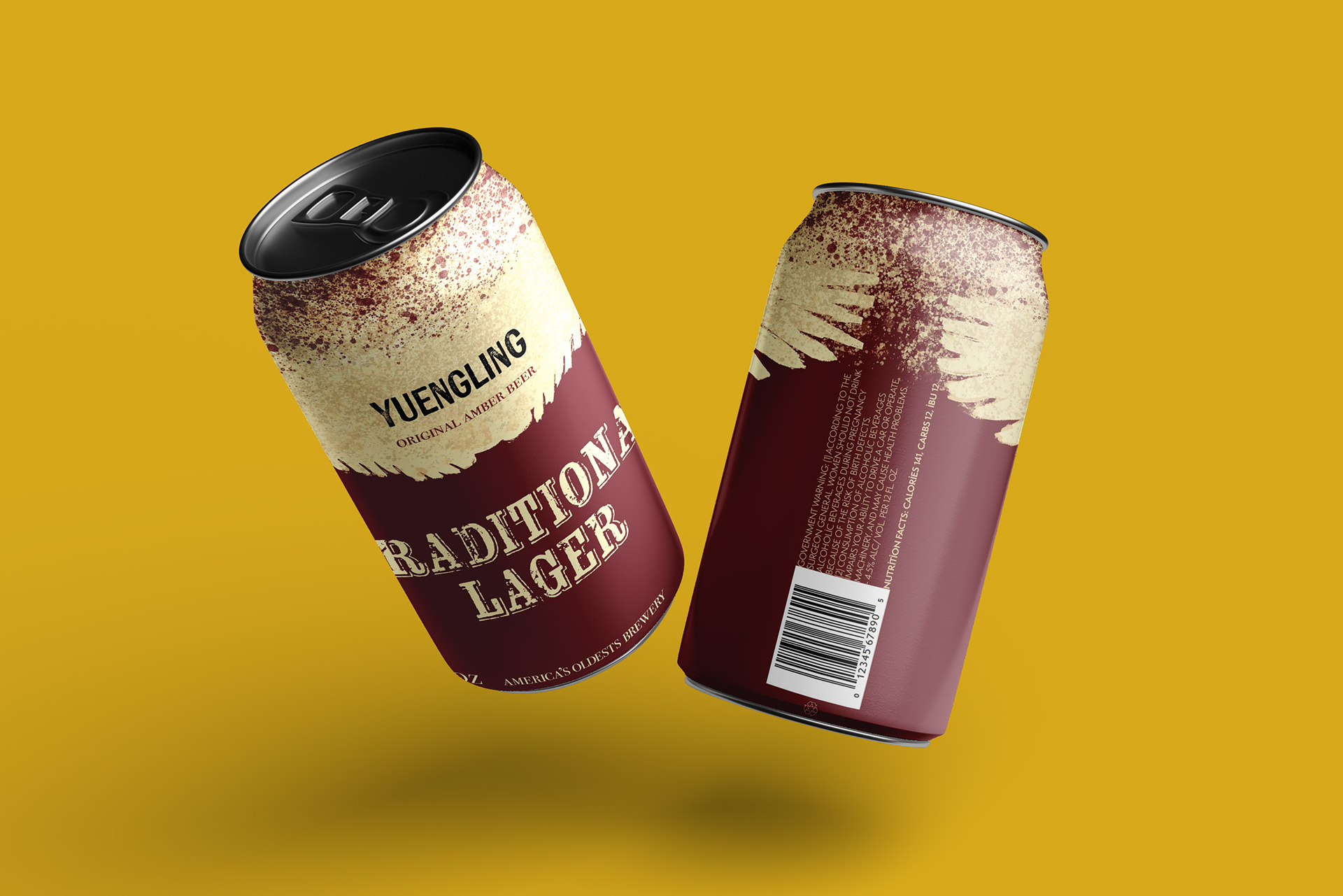
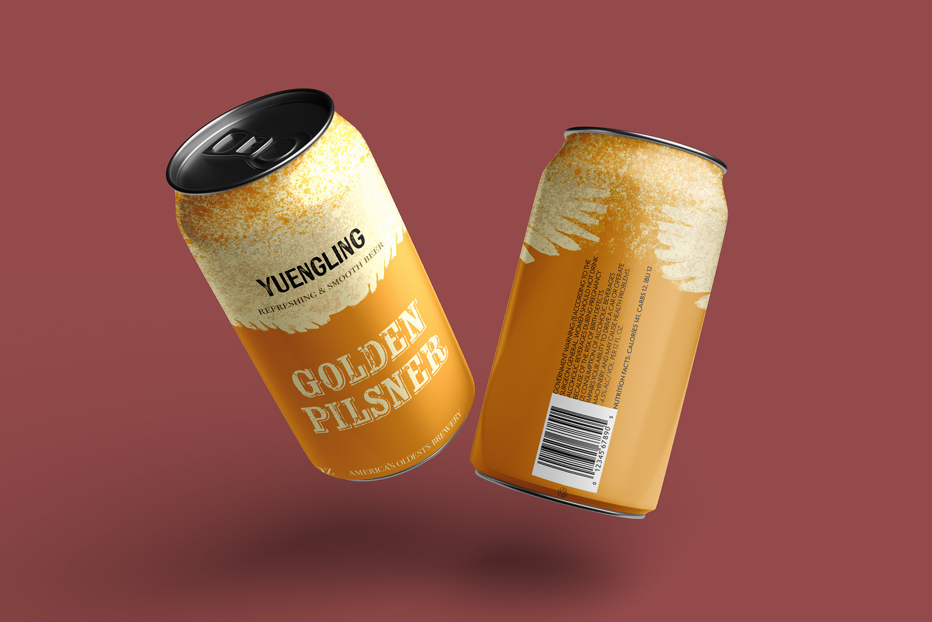
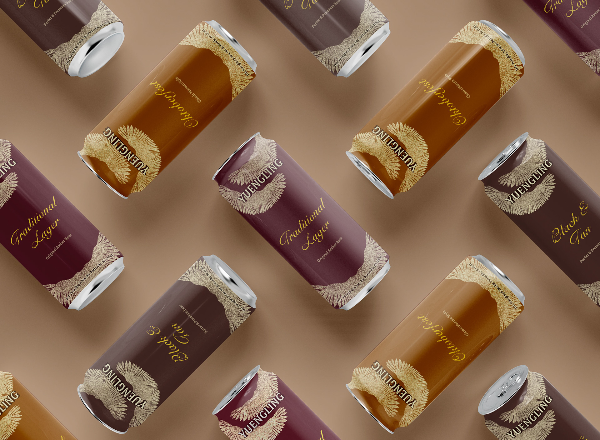
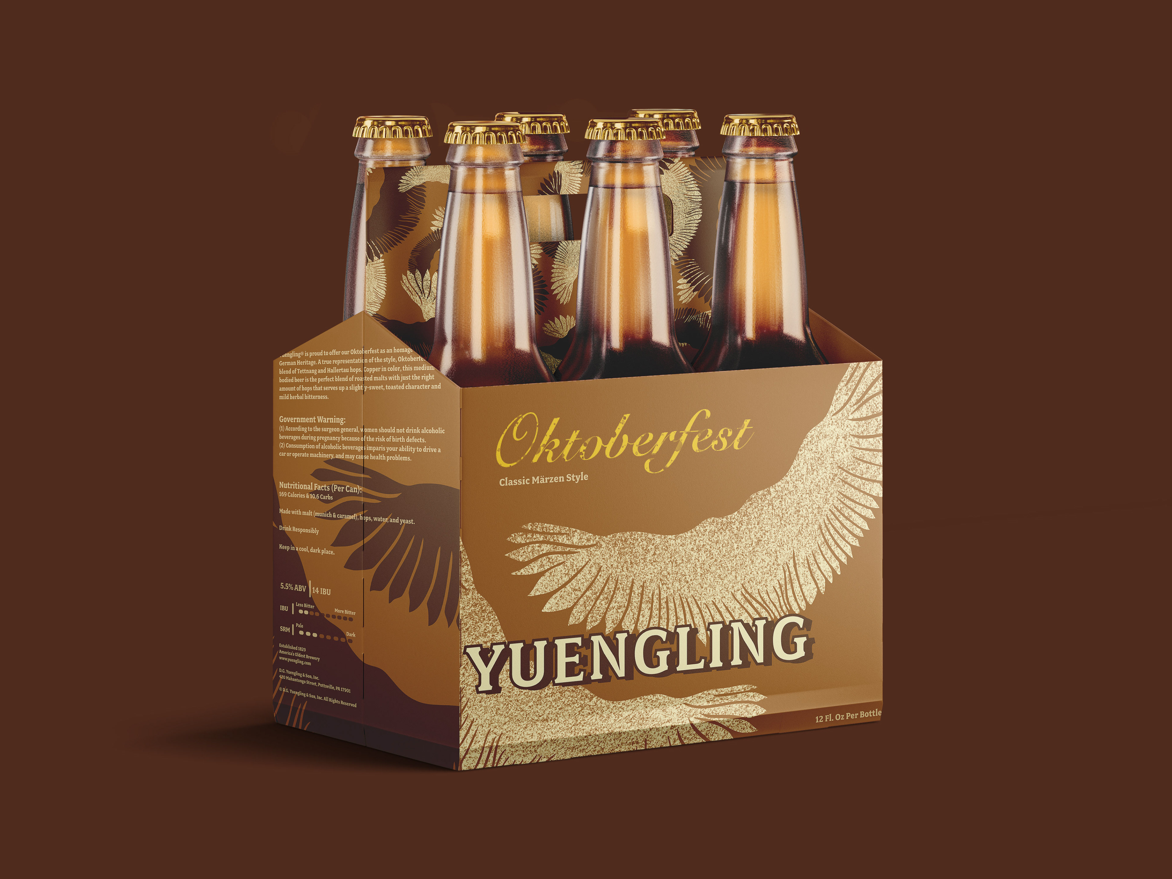
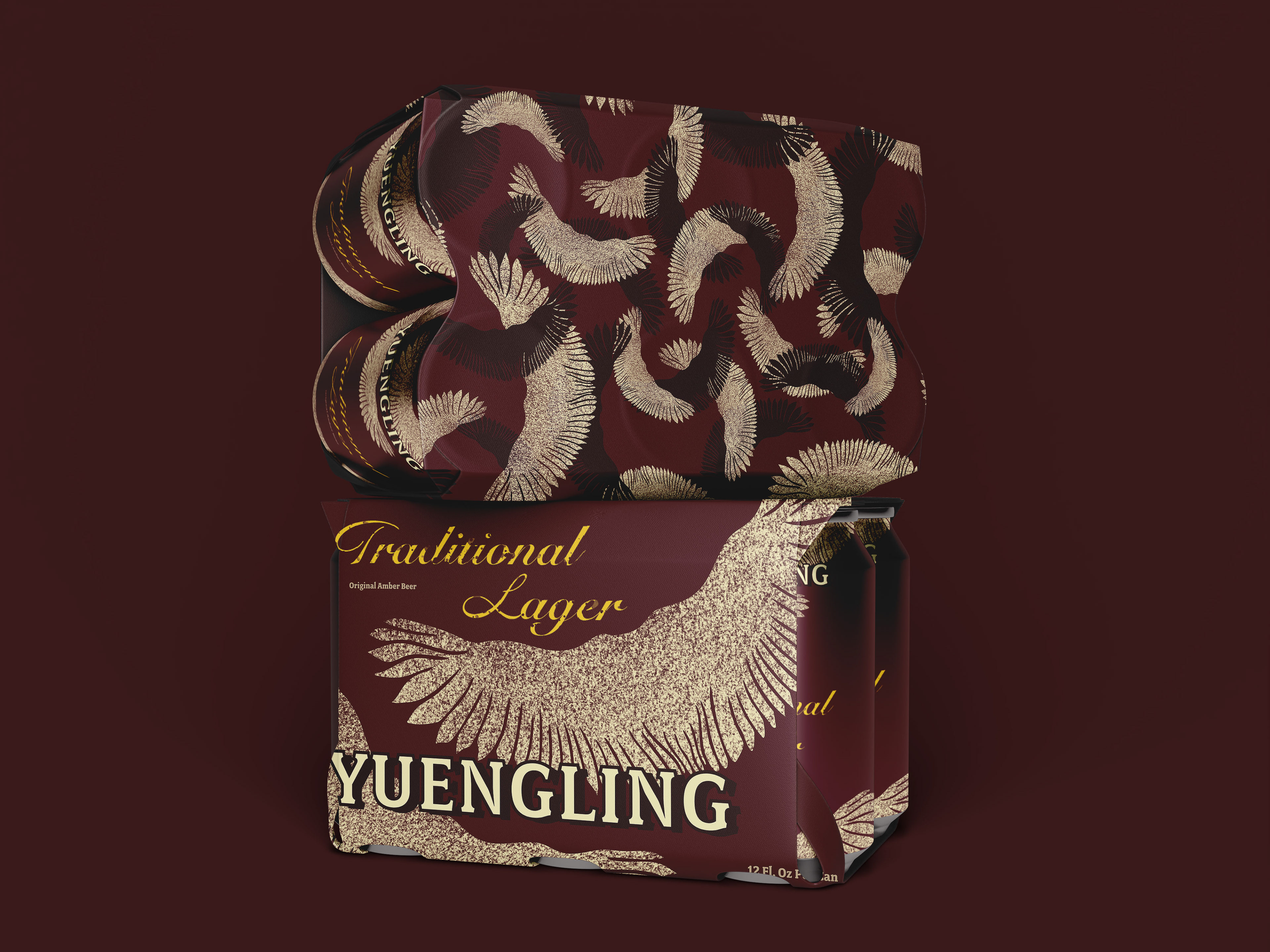
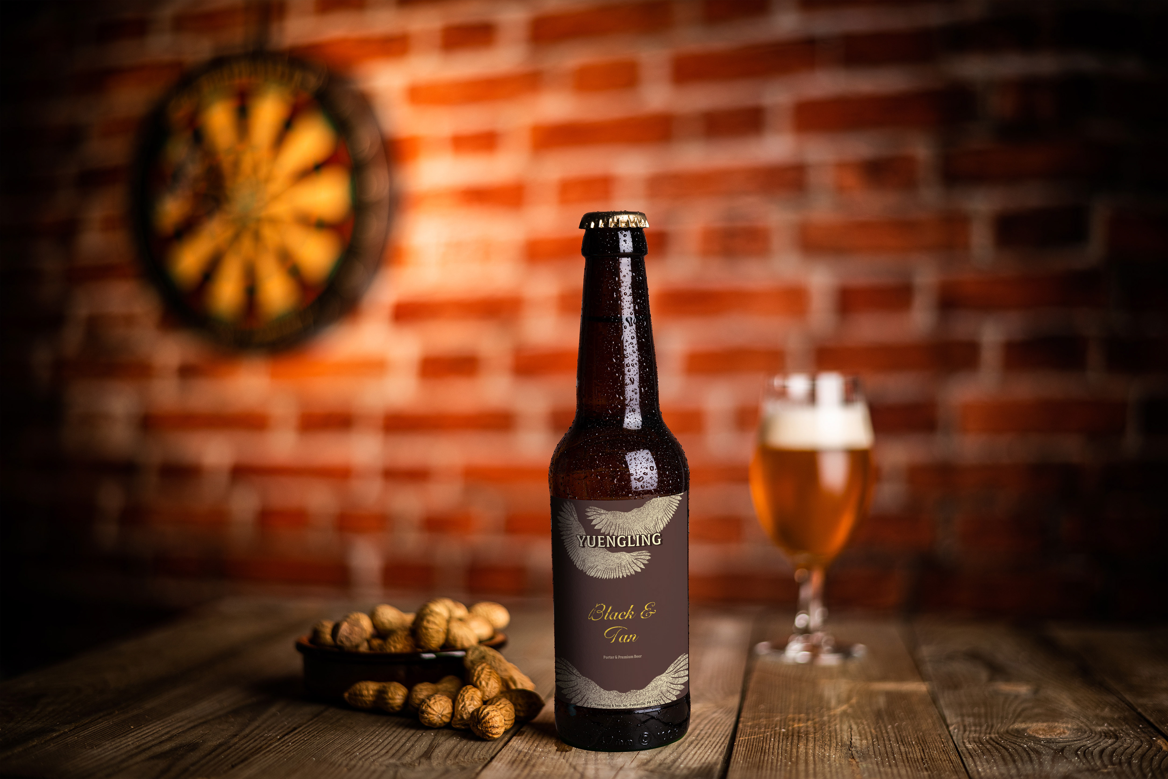
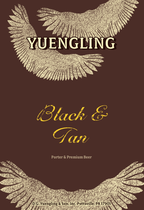
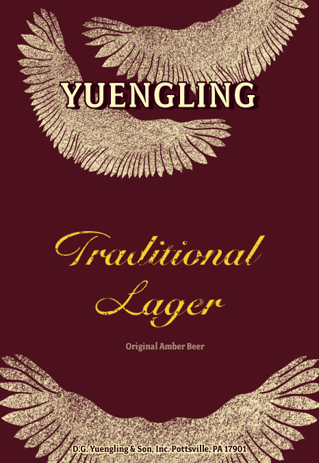
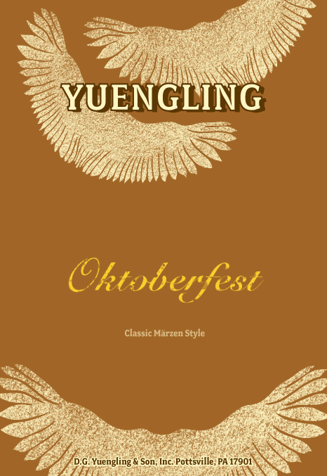
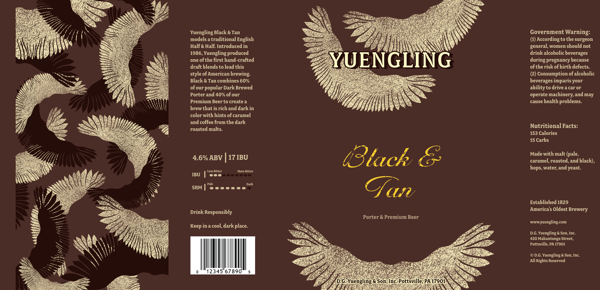
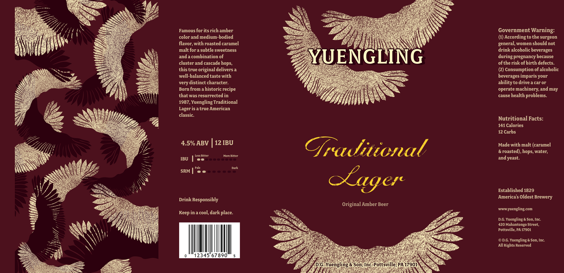
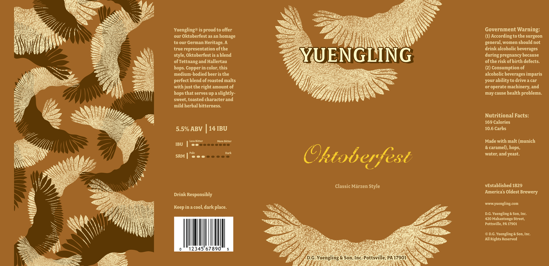
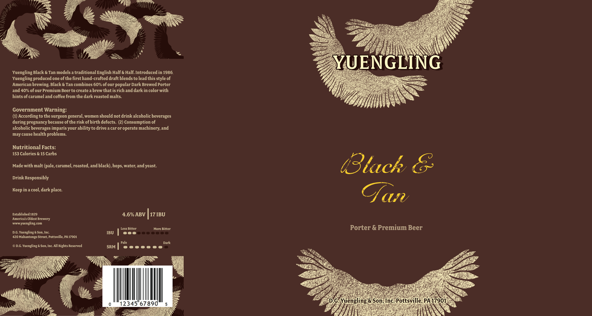
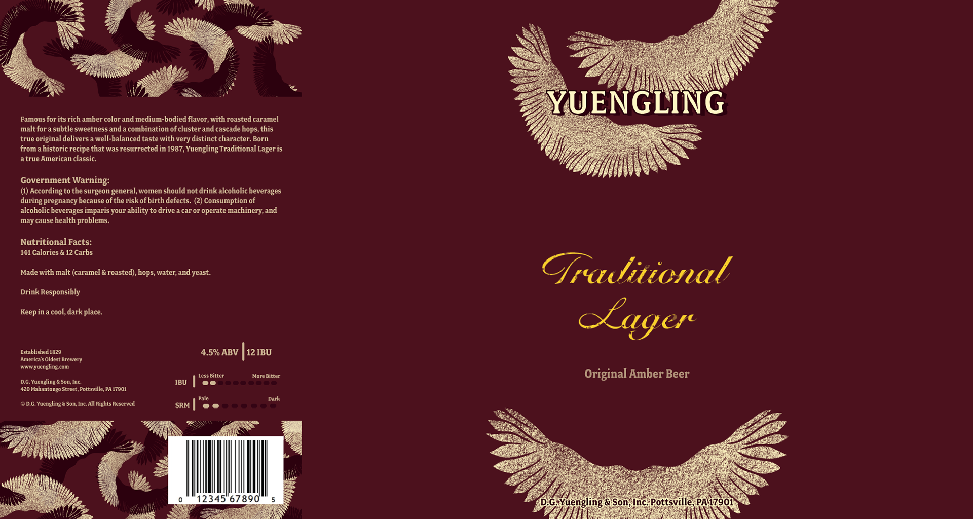
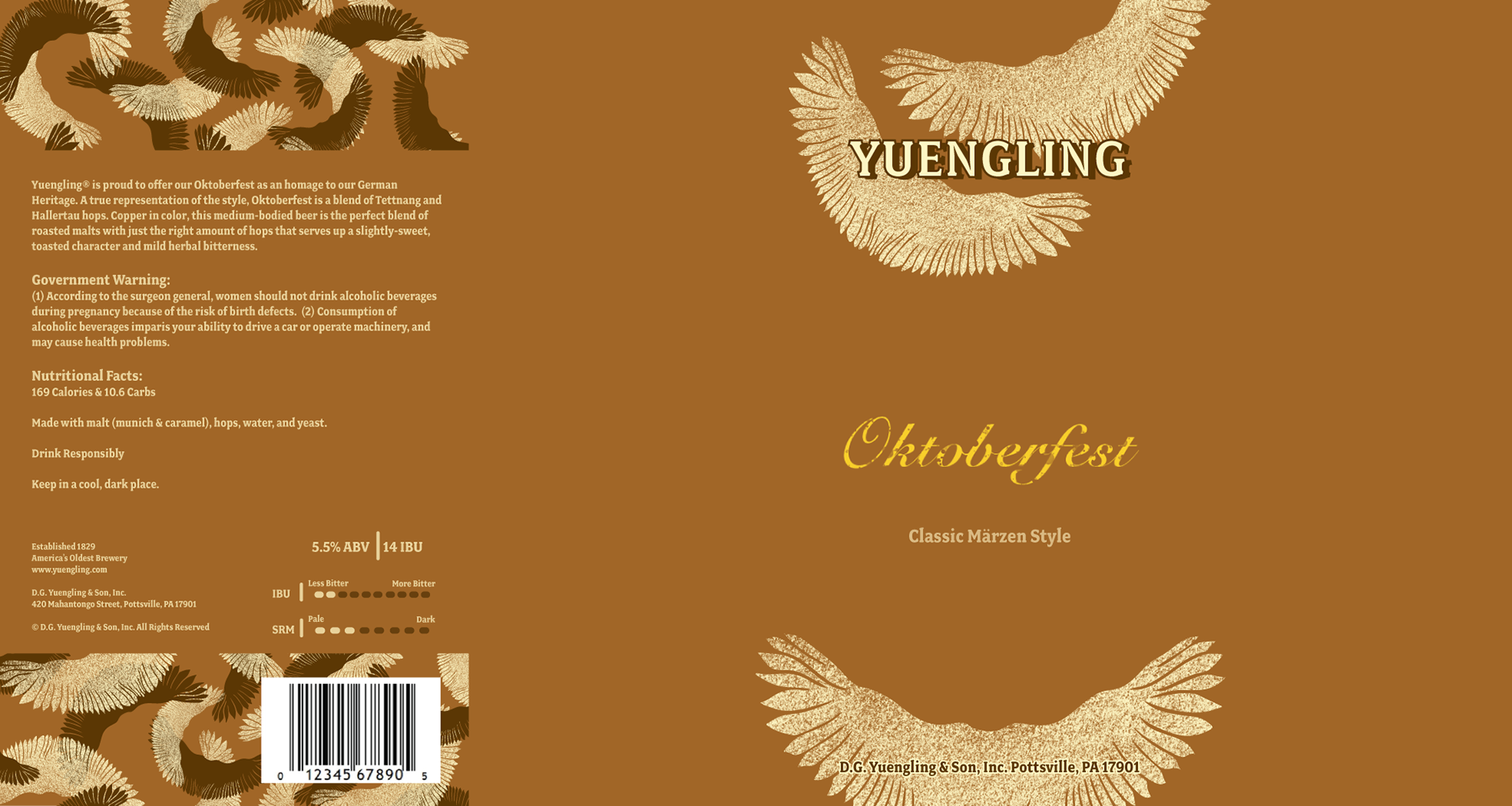
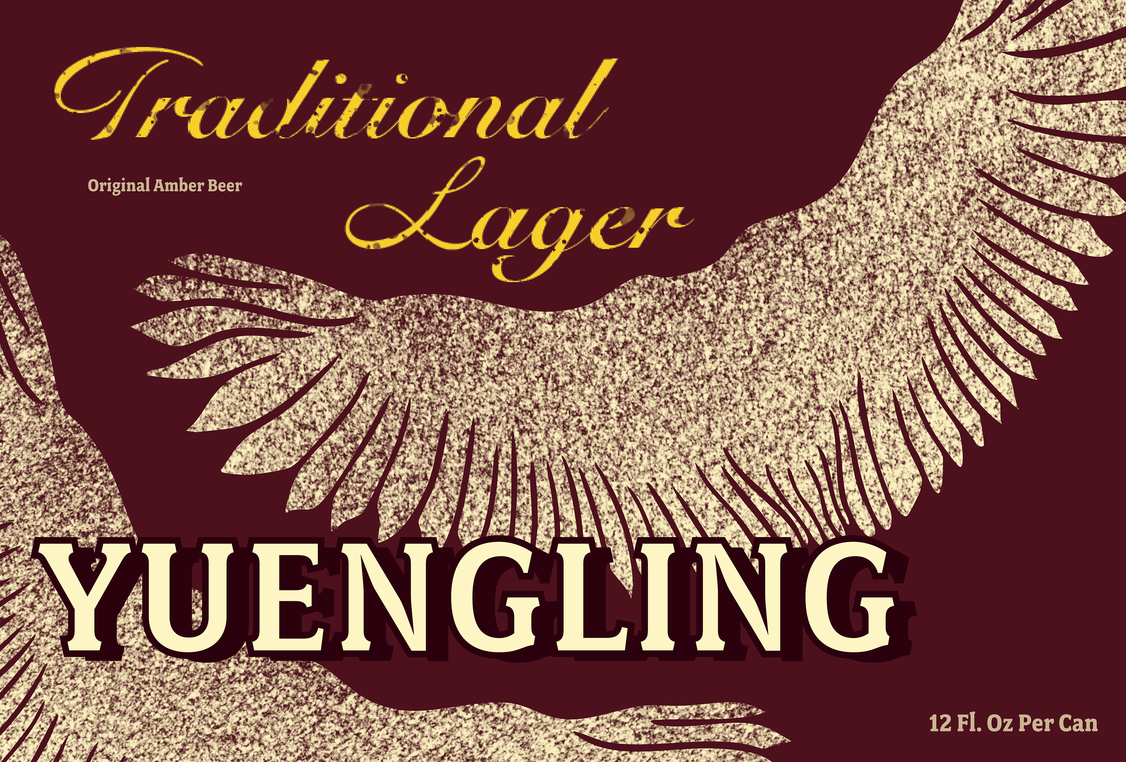
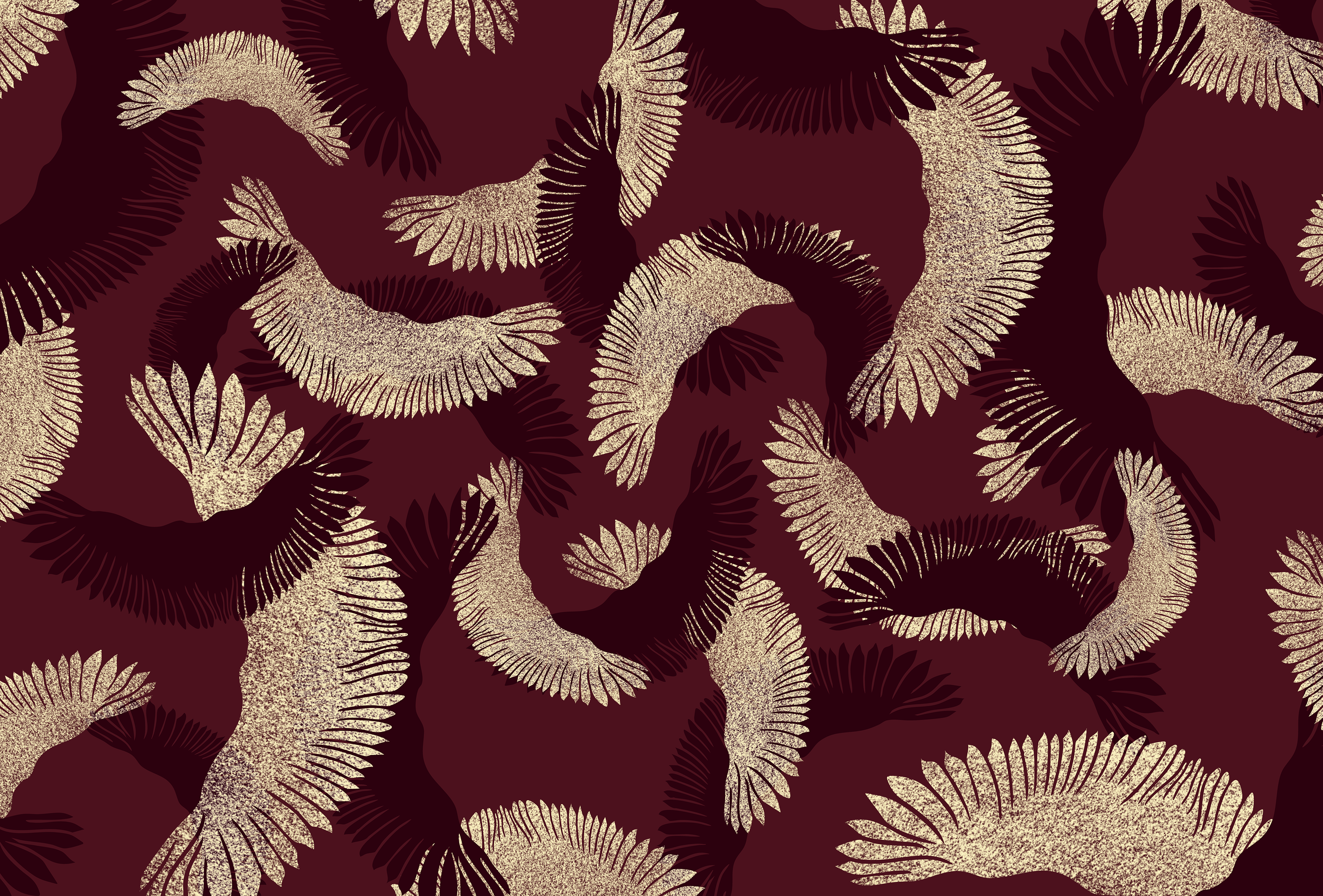
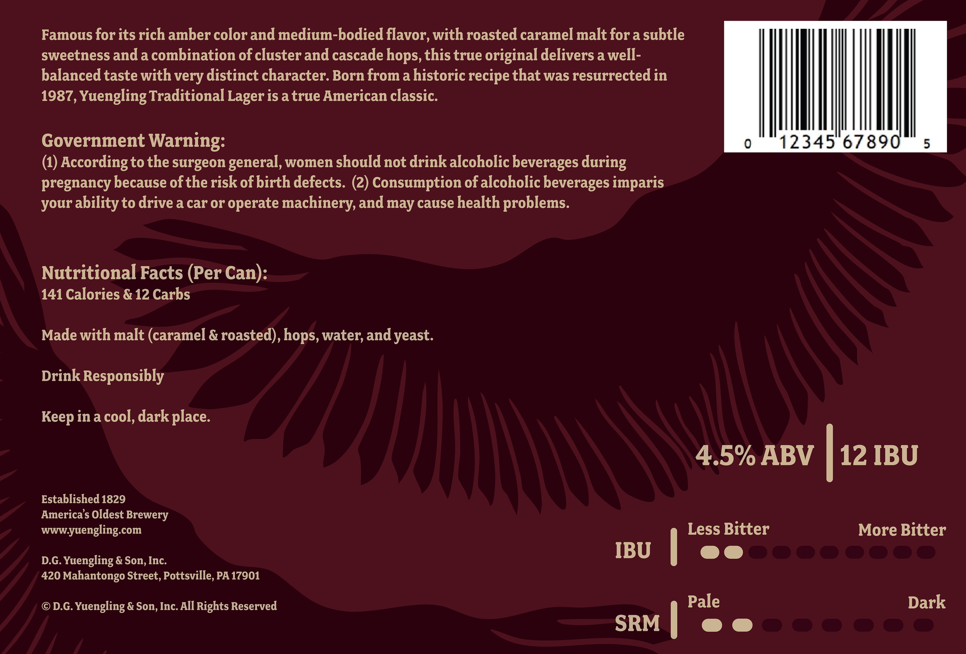
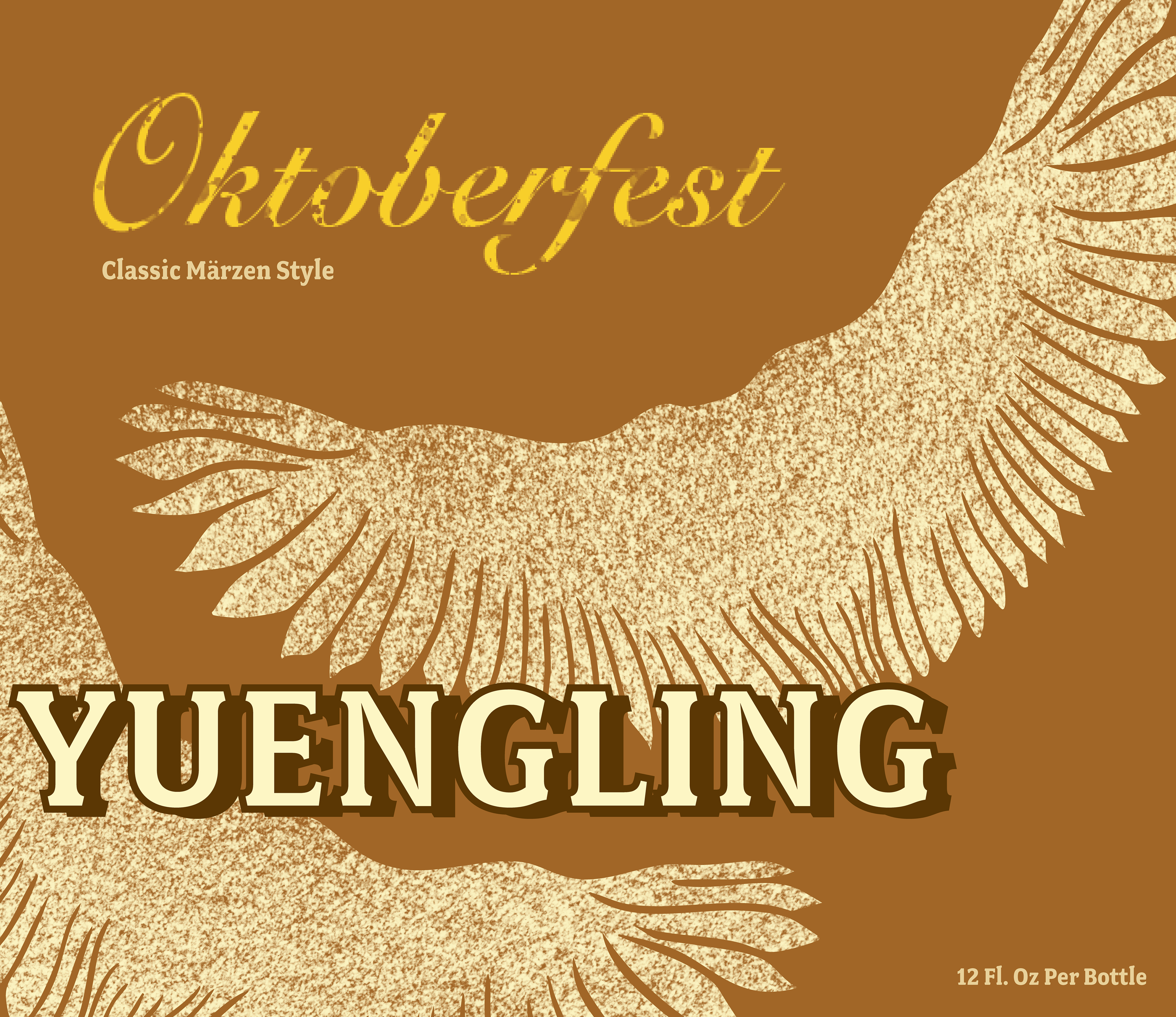
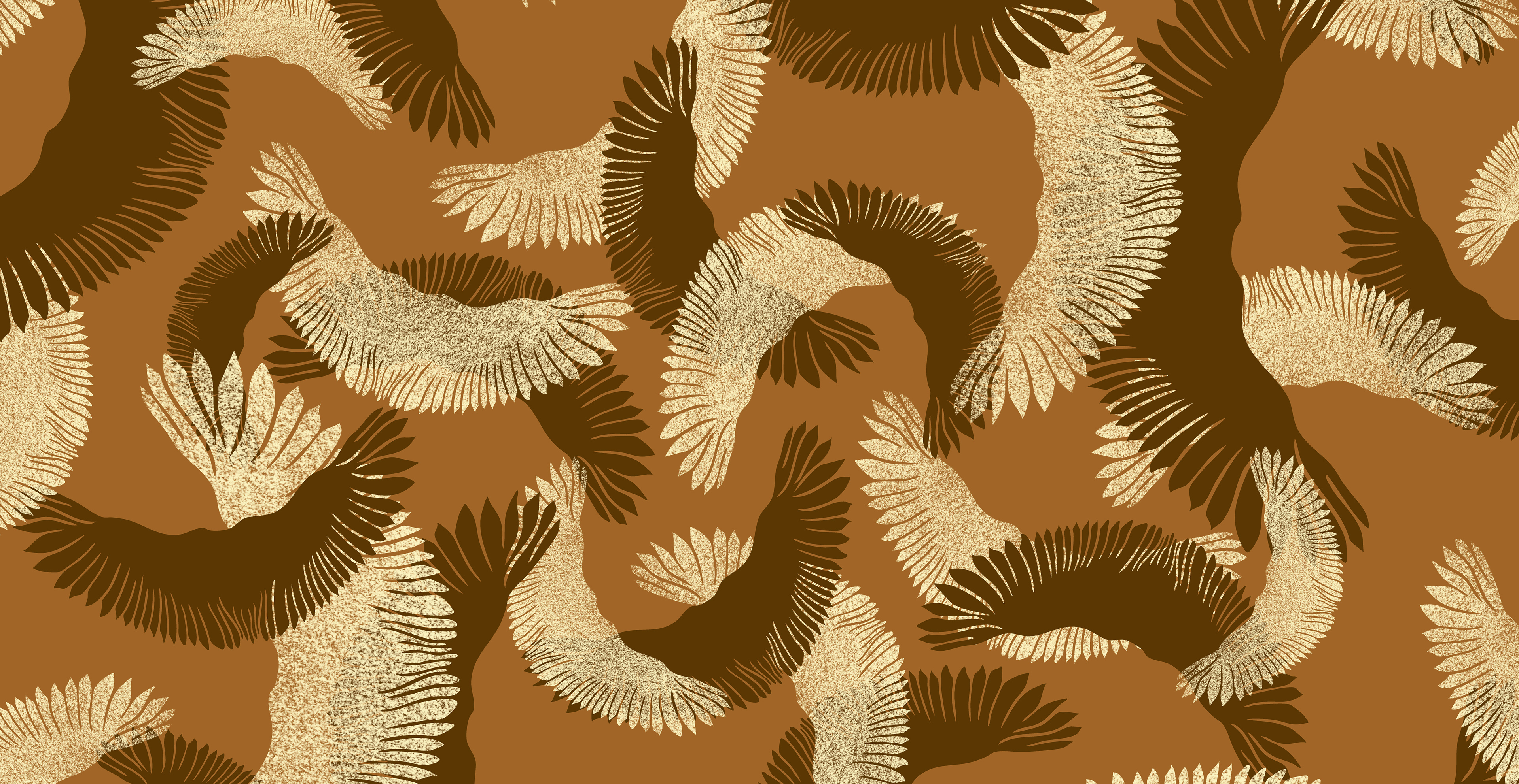
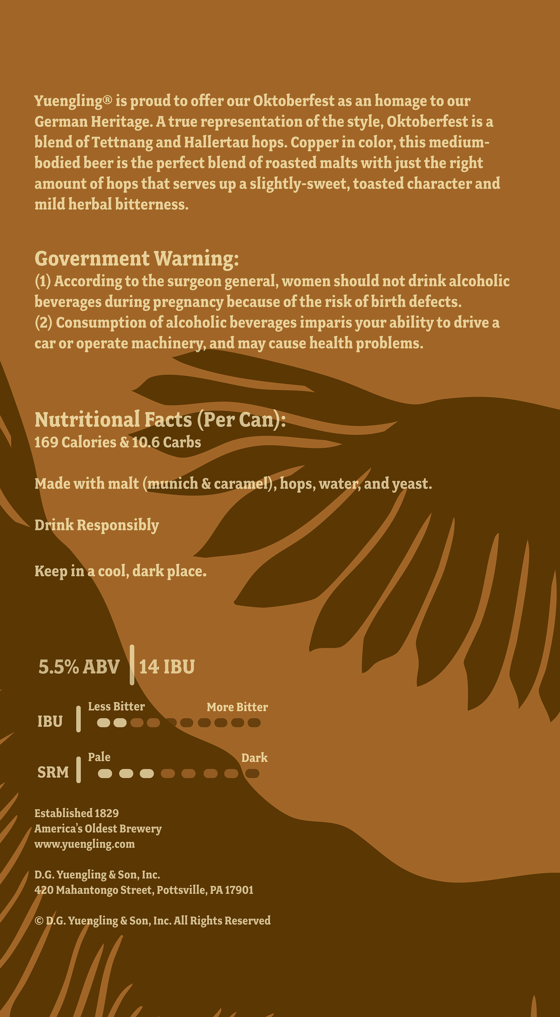
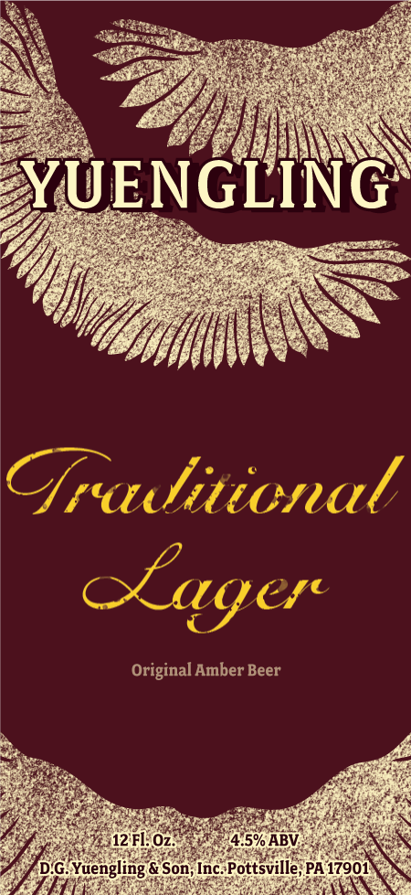
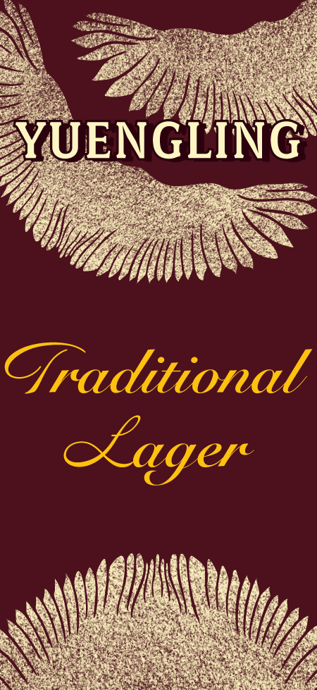
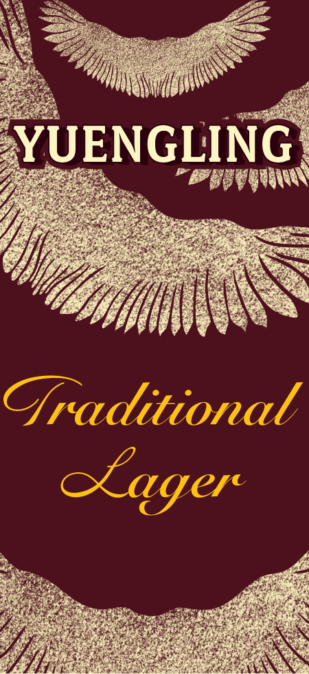
The goal of the design for Yuengling’s beer cans, bottles, and packaging was to create a modern take on the traditional style that the company currently uses. I wanted to update the design to appeal to the younger generations that are starting to consume alcoholic beverages. This design features a simpler version of the signature eagle wings that the company uses in their branding and a cleaner, less crowded design. The project forced me to focus on the changing target audience that I was trying to reach with the design. Taking something that has a lot of history and bringing a simple, modern twist to it.
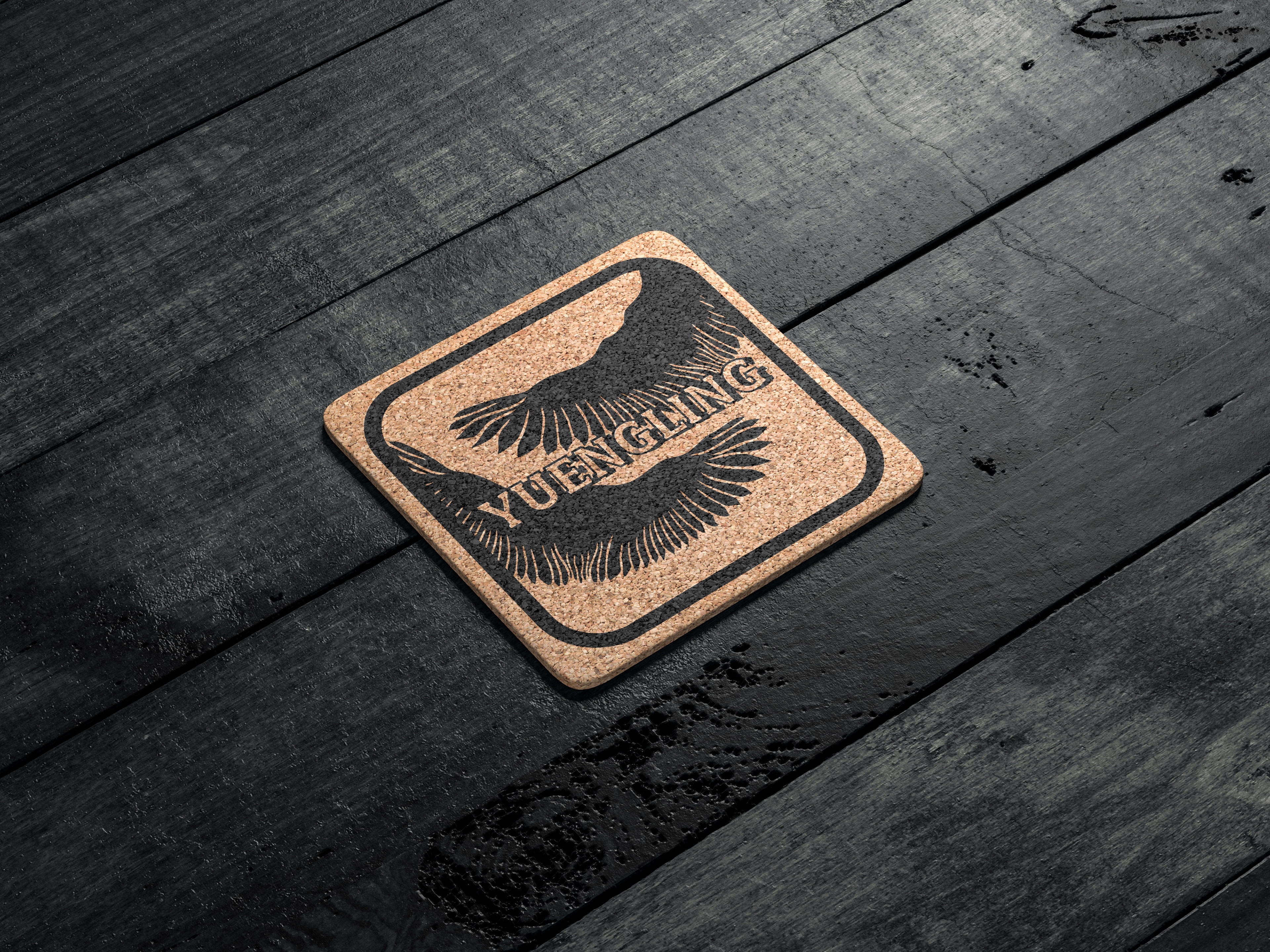
Along with the design for the bottle labels and cans, I created packaging for both the bottles and cans, along with a coaster design that could be used in business or at home.
The cans consist of a front design measuring 1.5 in x 3.26 in and a full wraparound design measuring 6.56 in x 3.5 in. The bottles have a similar layout, with both a front label design (1.55 in x 2.26 in) and a full label wrap (7.22 in x 3.5 in). The bottle packaging is 21.6 in x 18.68 in x 12.18 in, and the can packaging is 21.14 in x 31.22 in x 21.14 in. The coaster design is 27.78 in x 27.78 in.
Drafts

The Original
The original assignment was to take a product, either an alcoholic beverage, soap, tea, or medication, and redesign the packaging to fit a different target audience. In my case, I chose to redesign the packaging for an American beer brand, Yuengling. We were challenged to create designs that were focused on completely changing the style of the original packaging, creating an updated, more modern design. Additionally, we were required to create four different design variations. In my case, I chose four different flavors and styles of beer that Yuengling sells.