Mission Statement
Our mission is to work towards ending pet overpopulation that results in the euthanasia of unwanted cats and dogs.
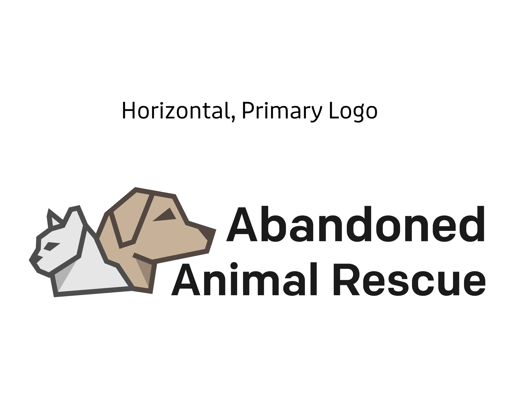
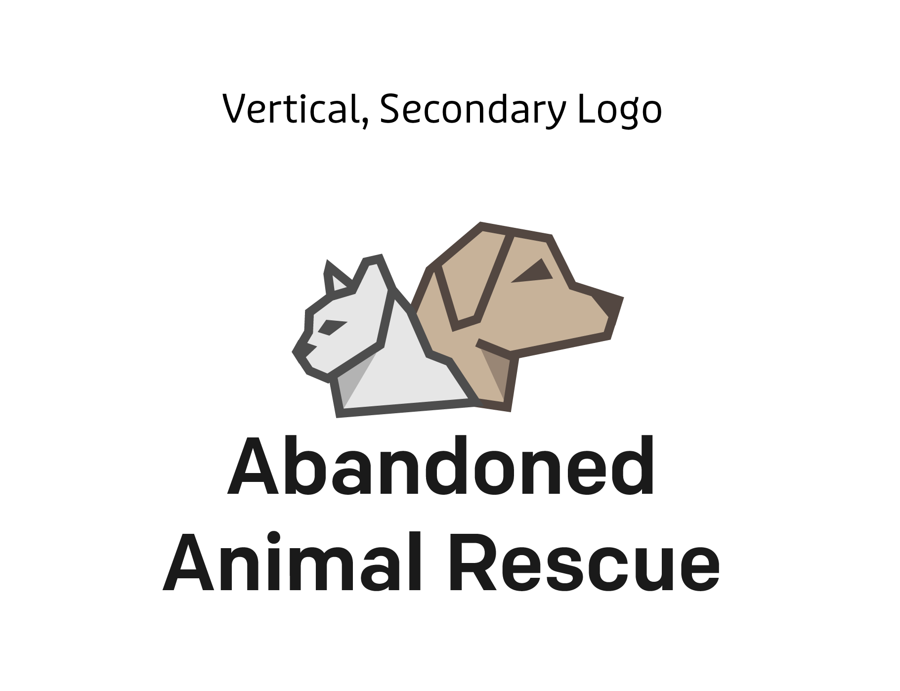
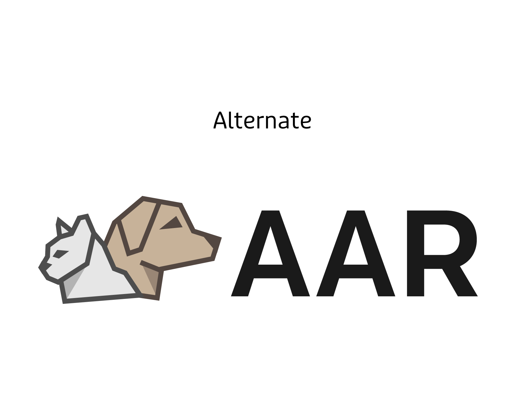
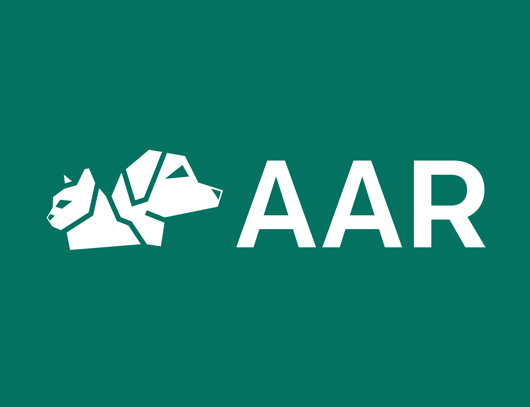
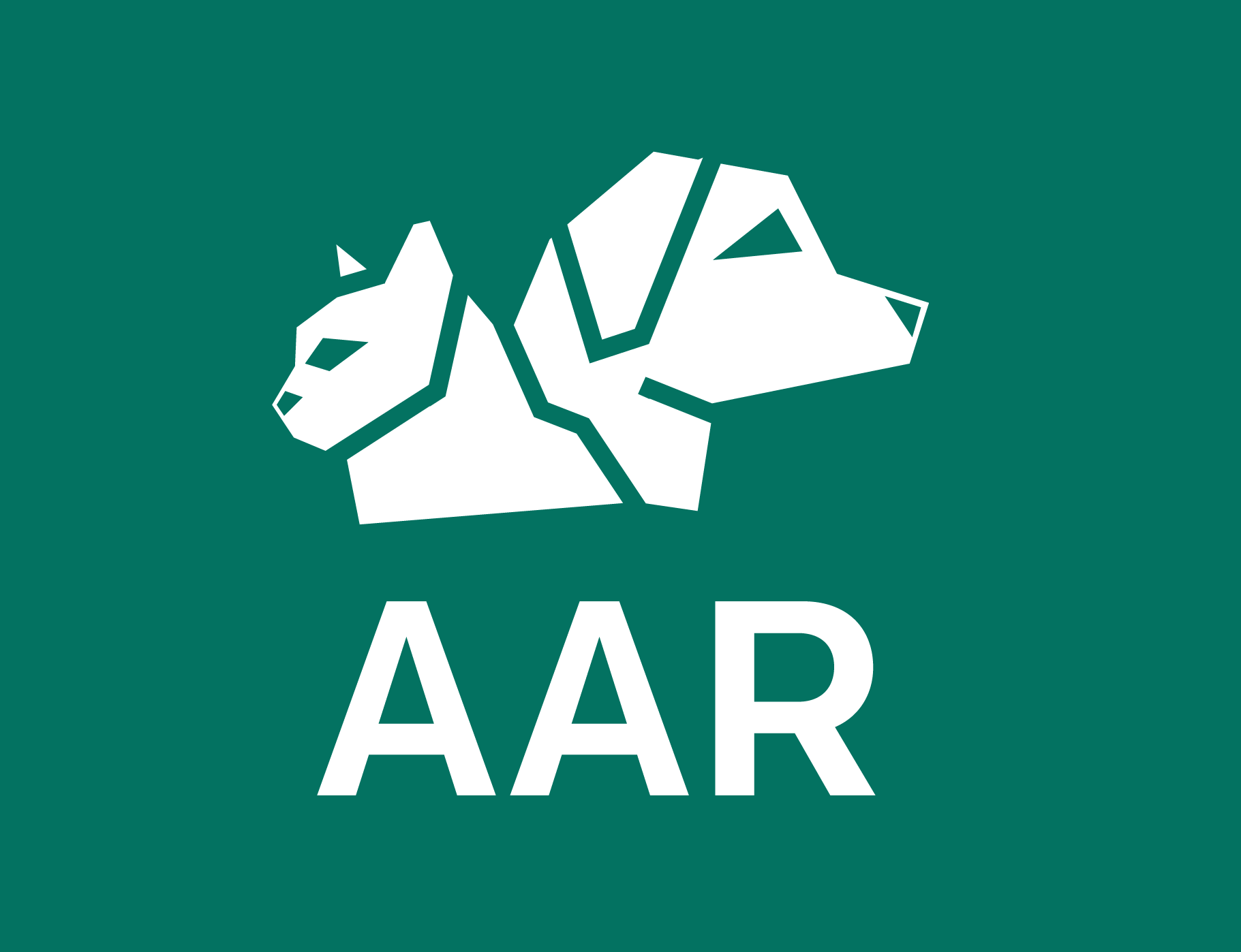
Logo Variations
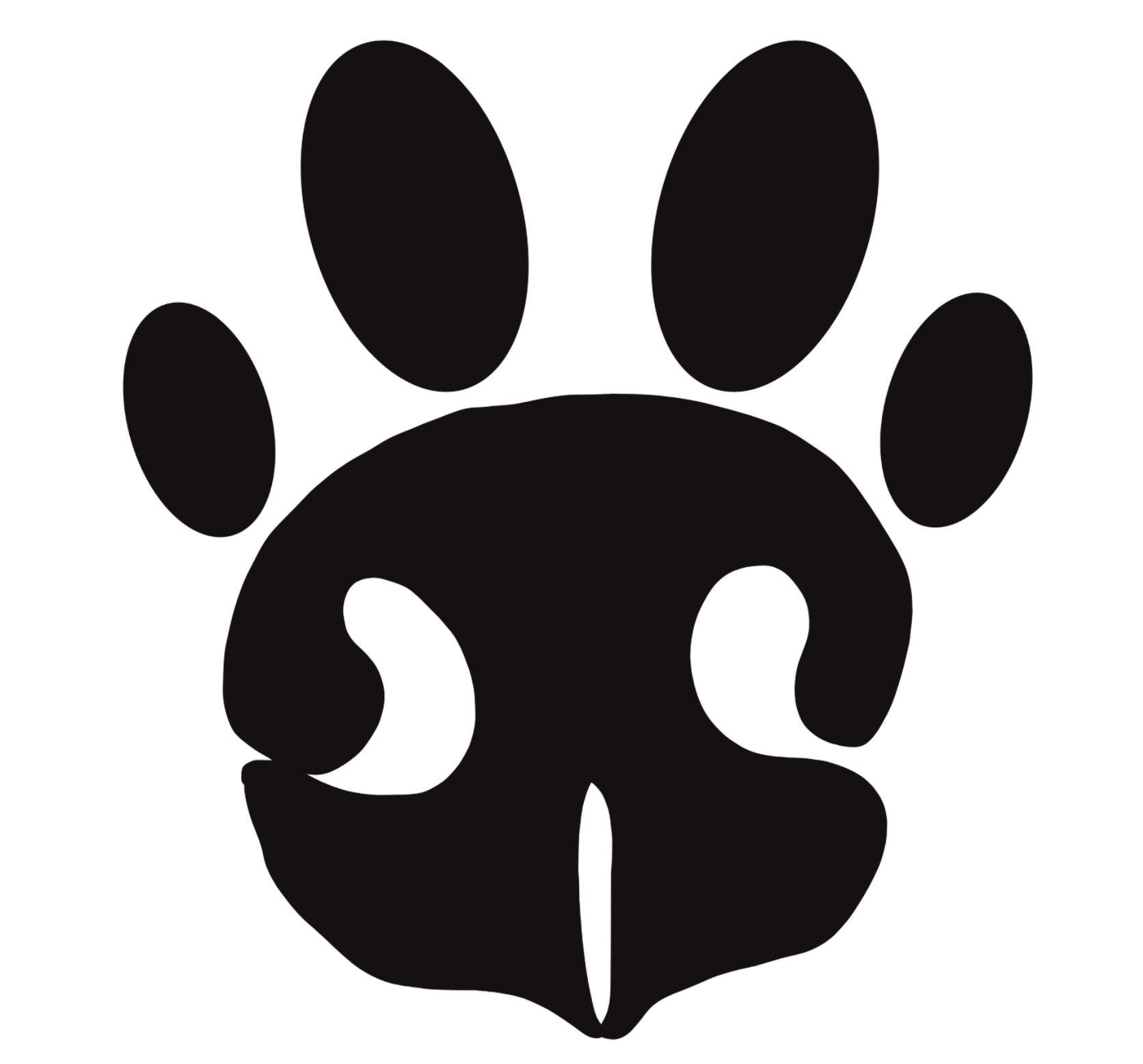
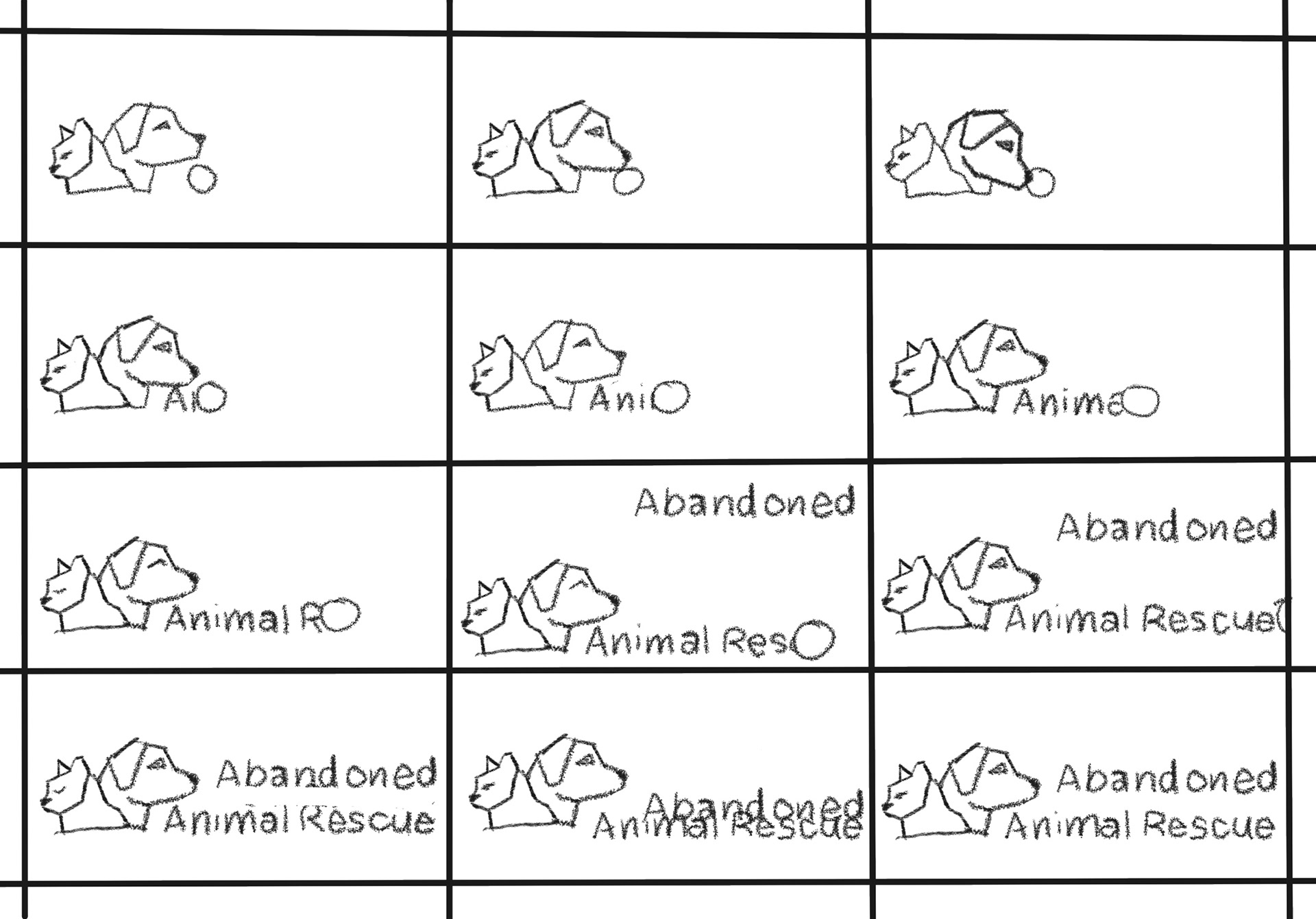
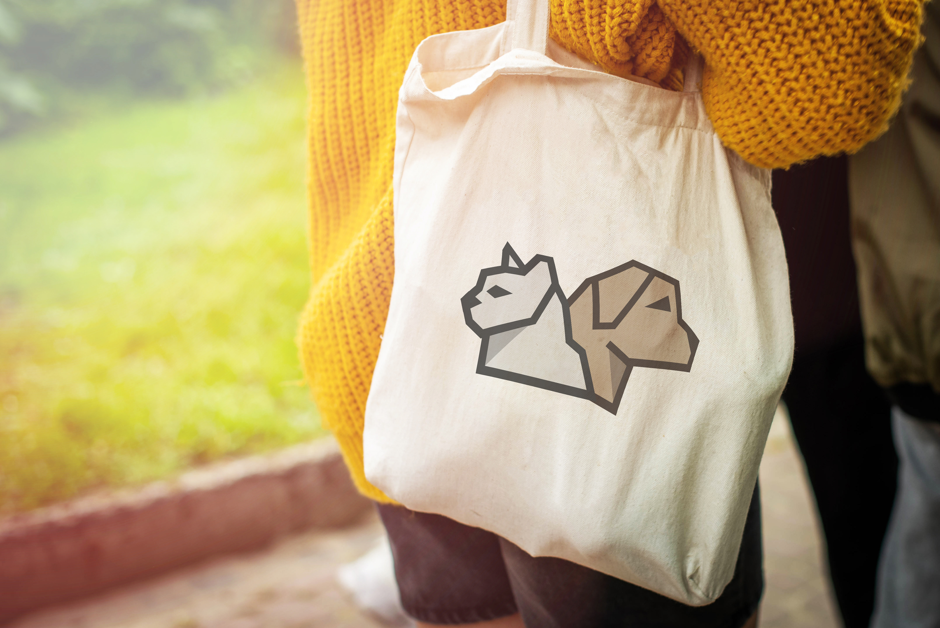
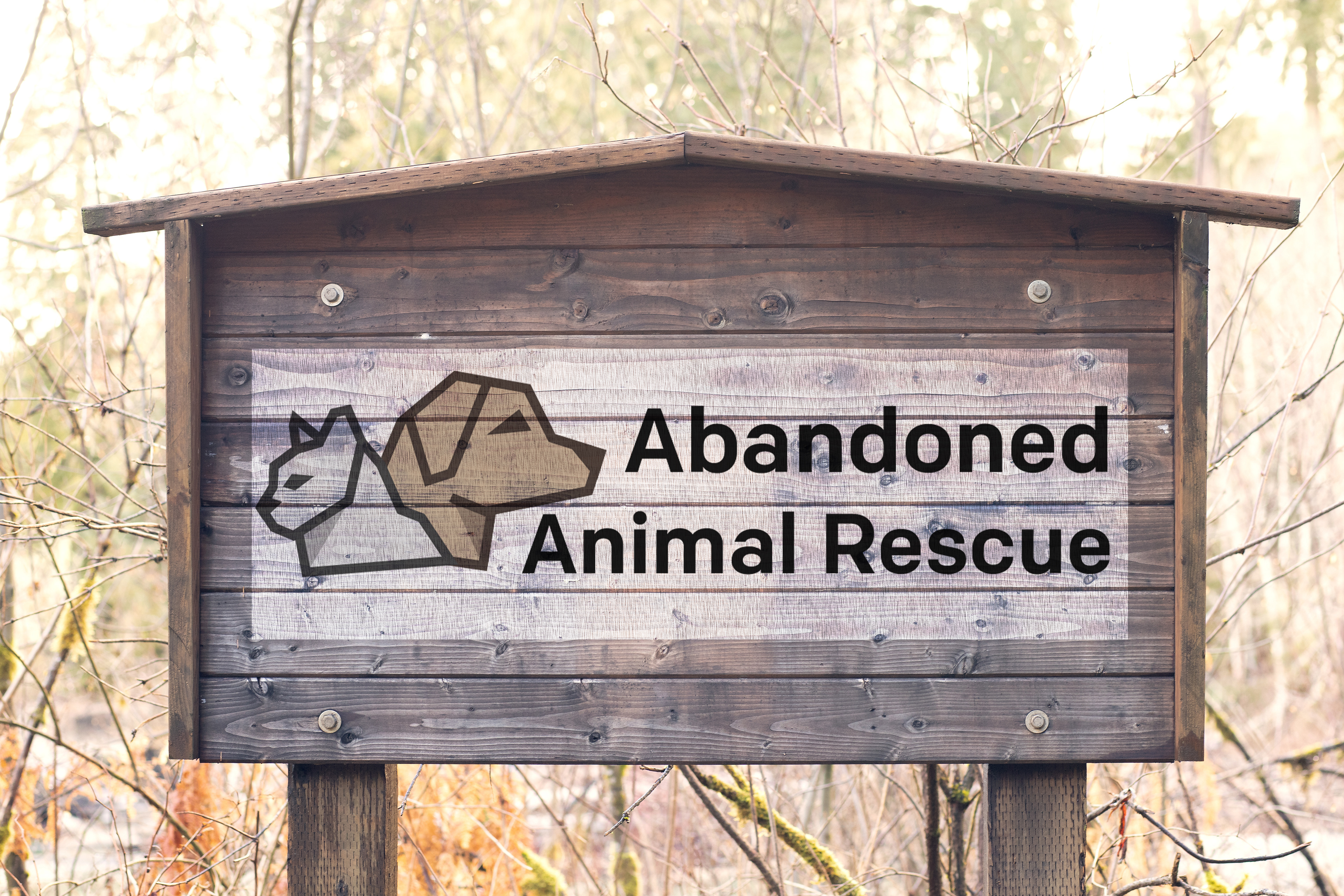
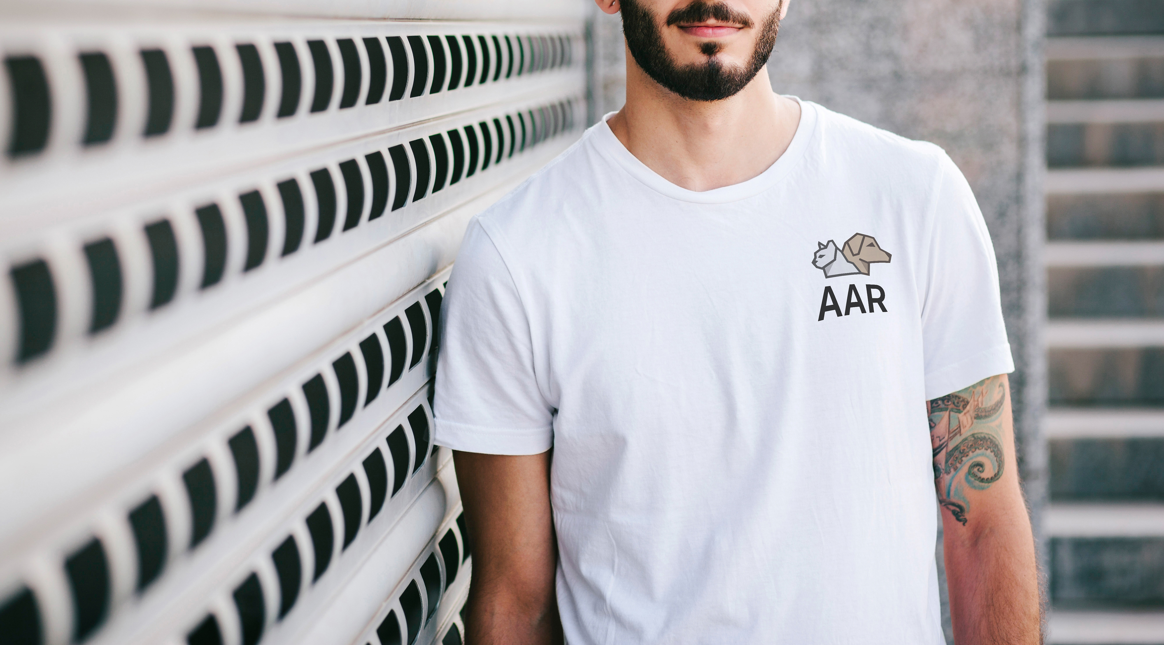
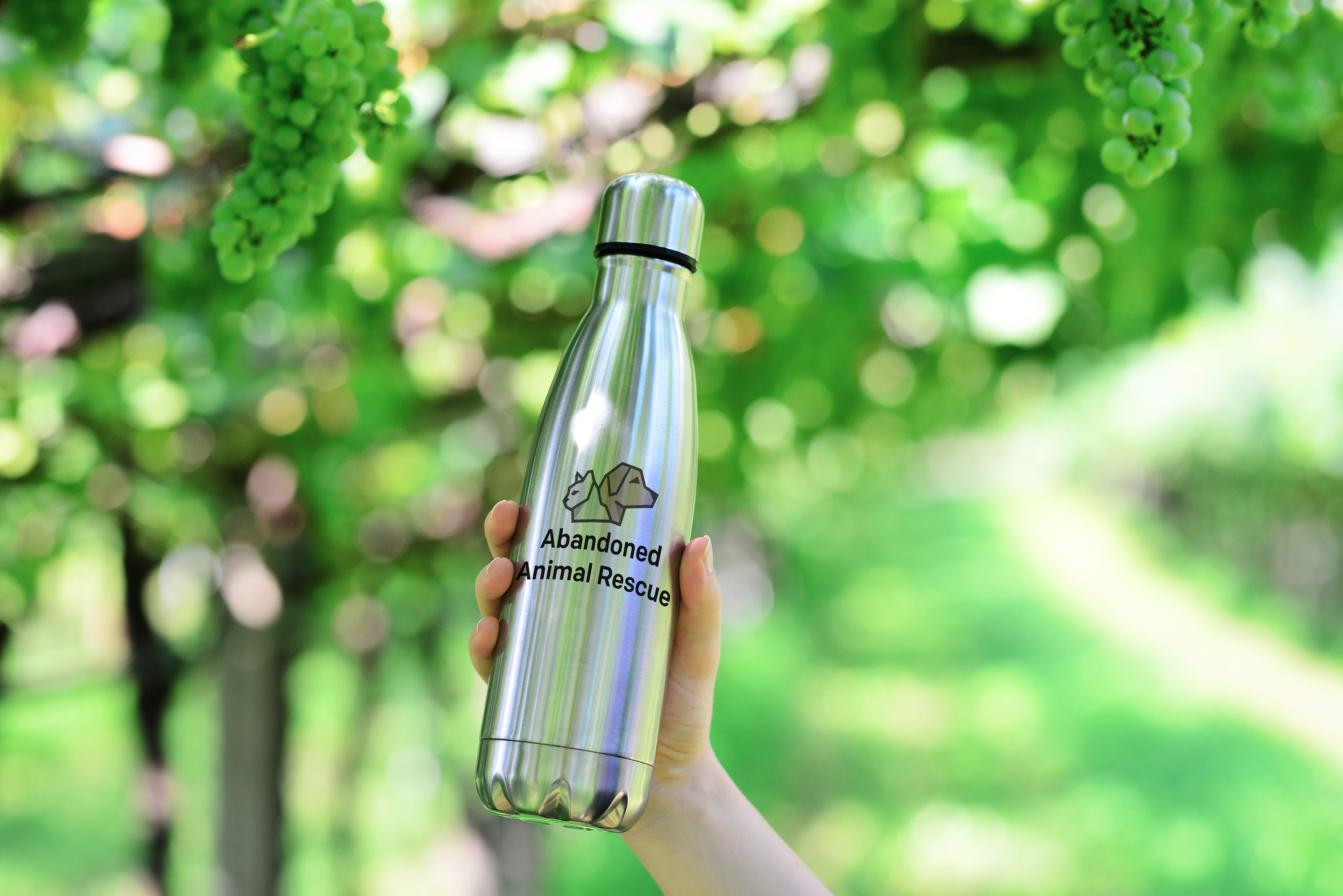
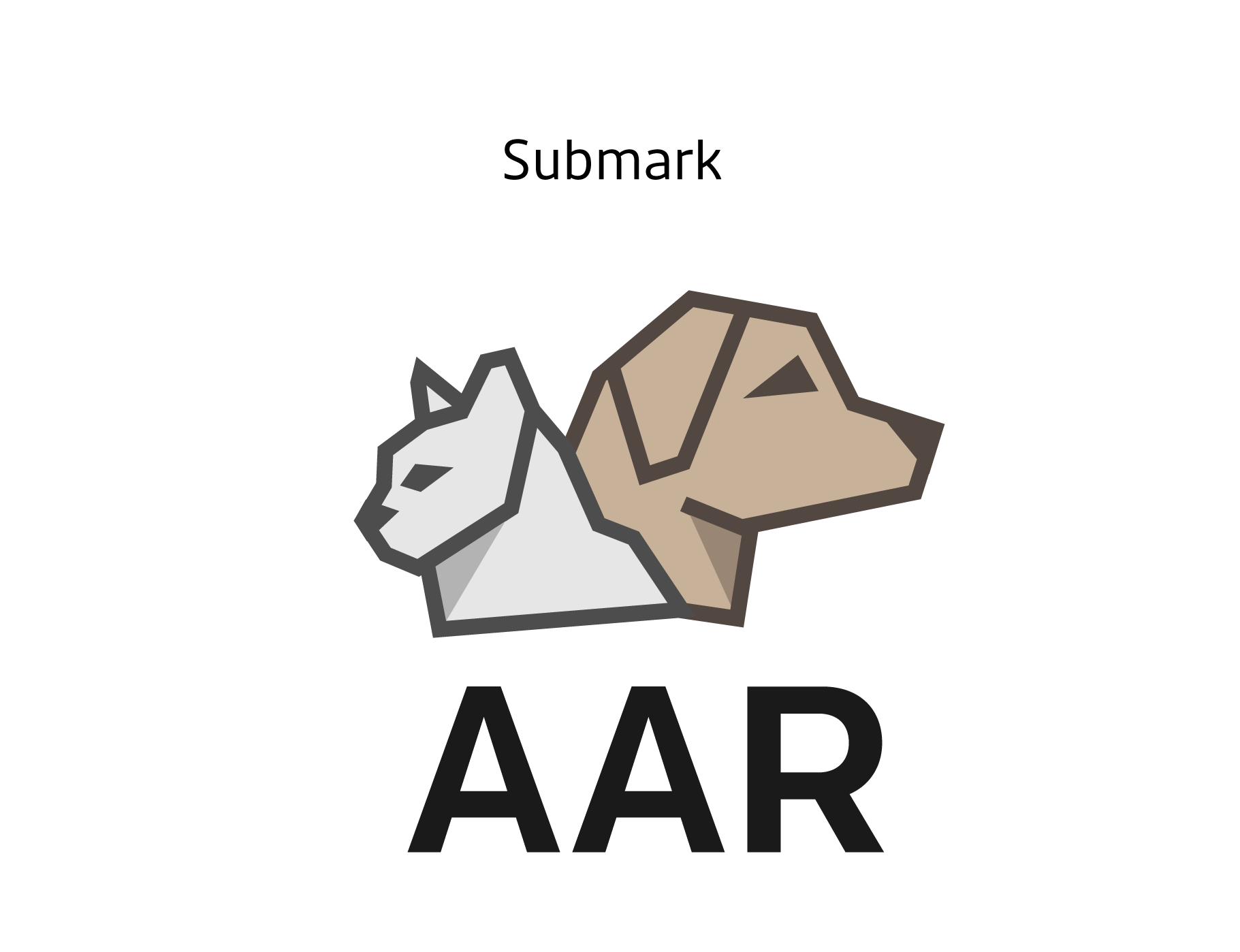
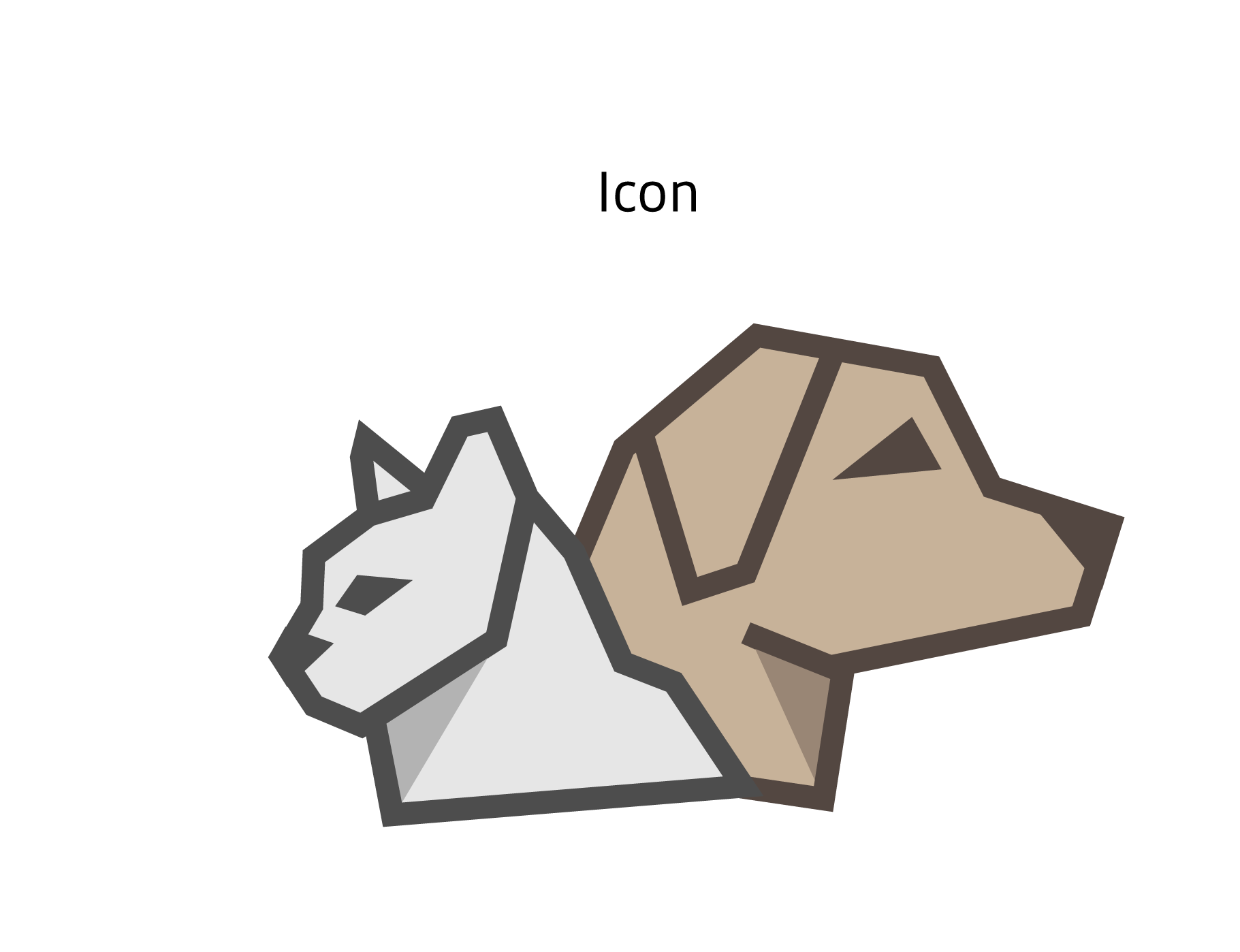
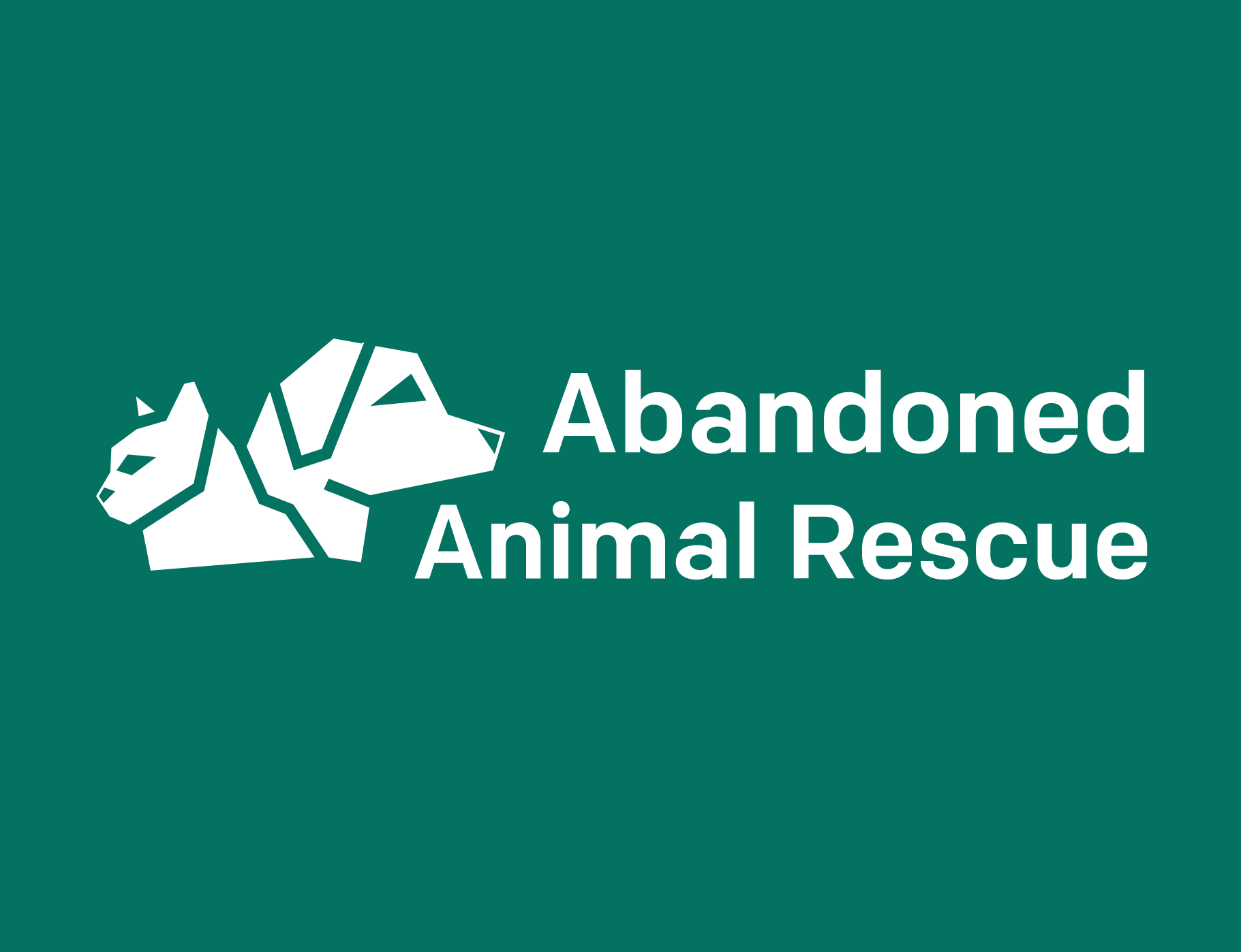
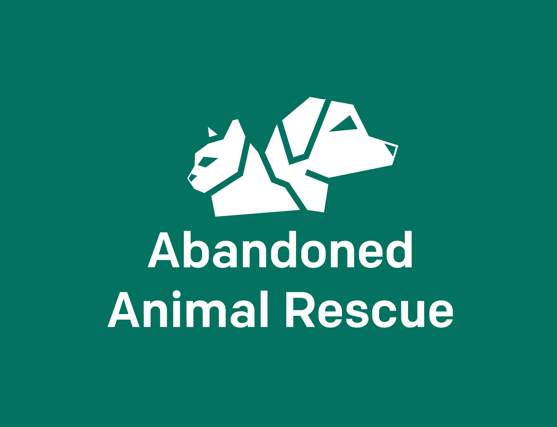
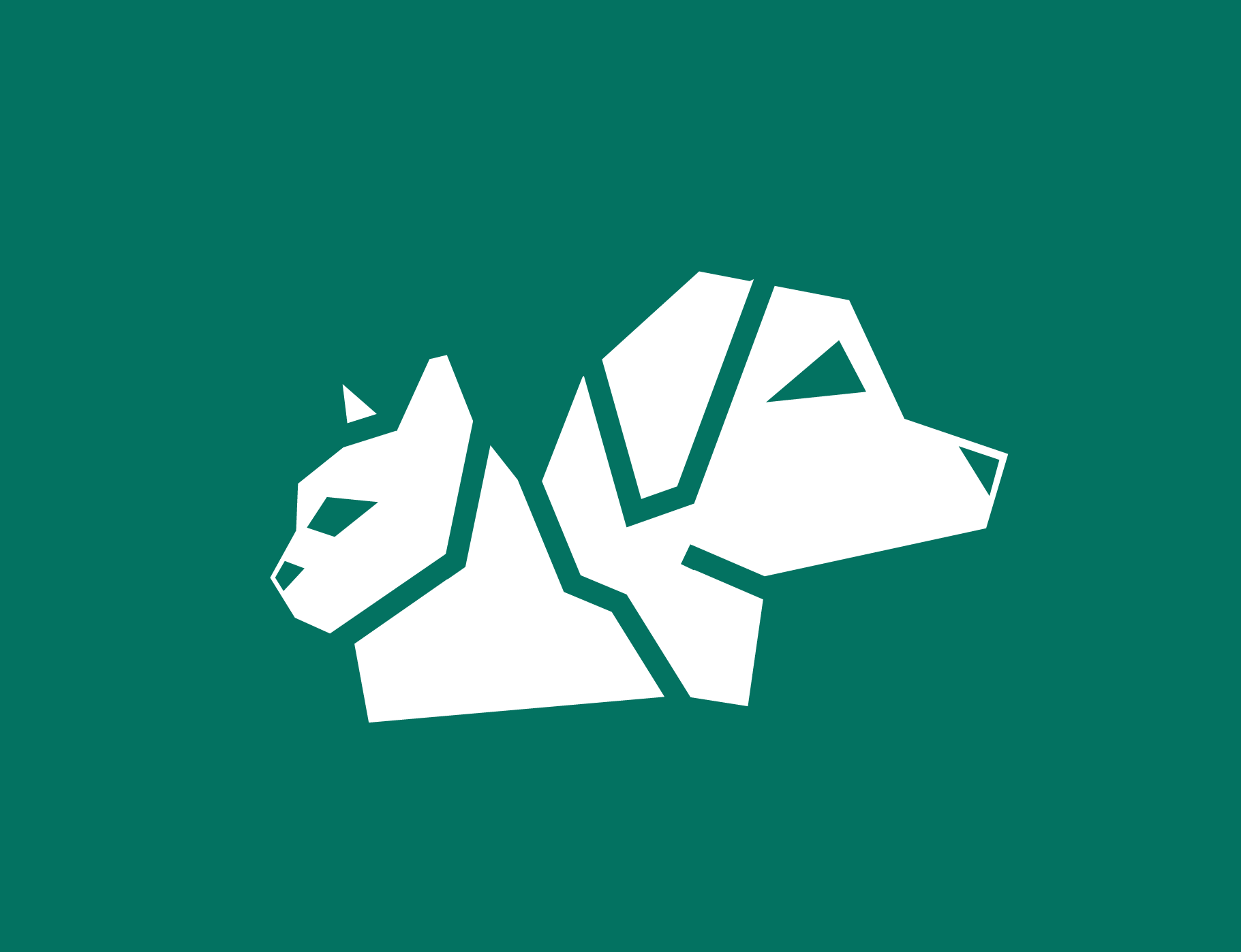
The logo icon was created using geometric heavy lines, intended to bring attention to the brand. This includeds both a dog and cat to address the animals that are treated and available for adoption at the Abandoned Animal Rescue. Combining a design that is recognizable to most people and the geometric lines keeps the design unique. The primary logo lockup has the logo icon closer to the type to integrate the two elements while also providing balance to the overall design. The secondary logo design stacks to allow for additional usage in smaller formats while still providing some balance.

Logo Variations in Reverse


Typography
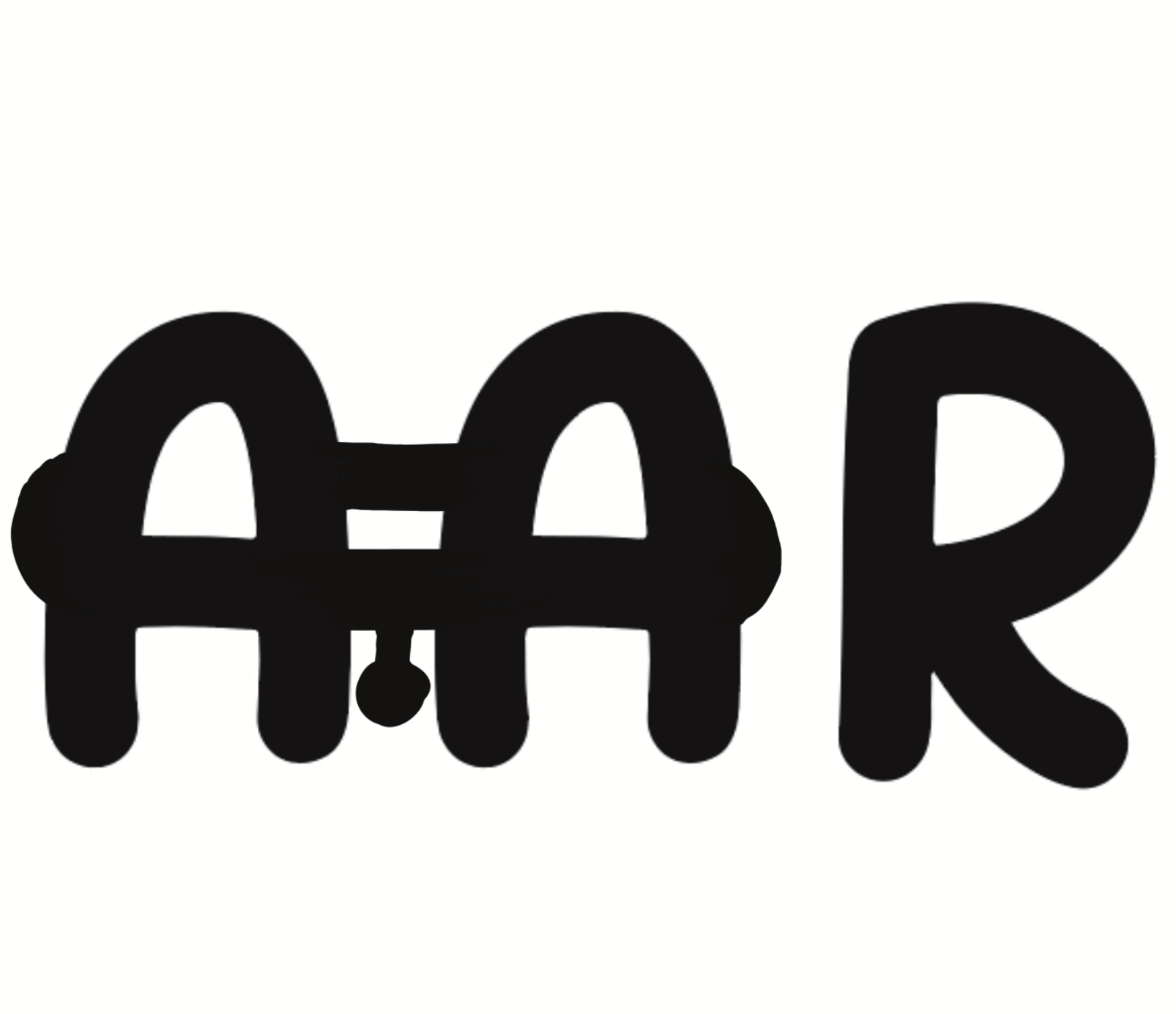
The two typefaces chosen were selected to enhance the serious appeal for donors. The Chono font balances the style of the logo with the geometrical shapes of all type elements while still including some roundness. The Puffin Display font was selected to enhance this roundness while not overpowering the Chono type in the logo lockup.
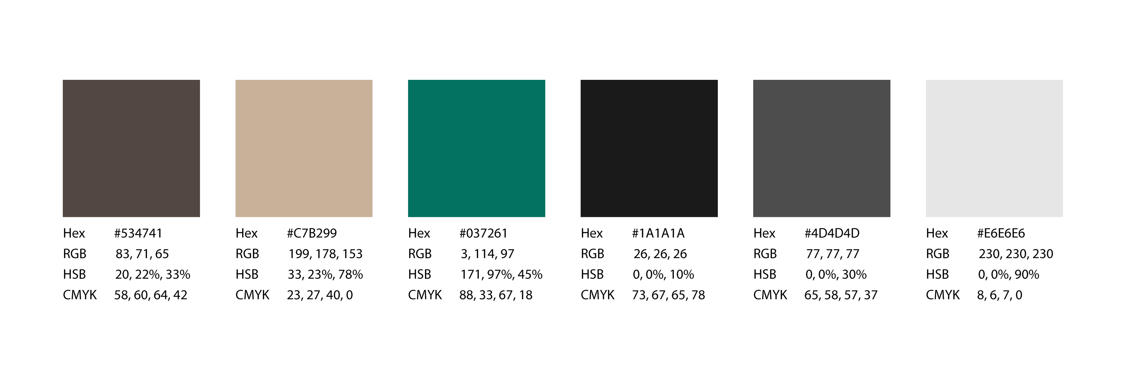
Color Palette
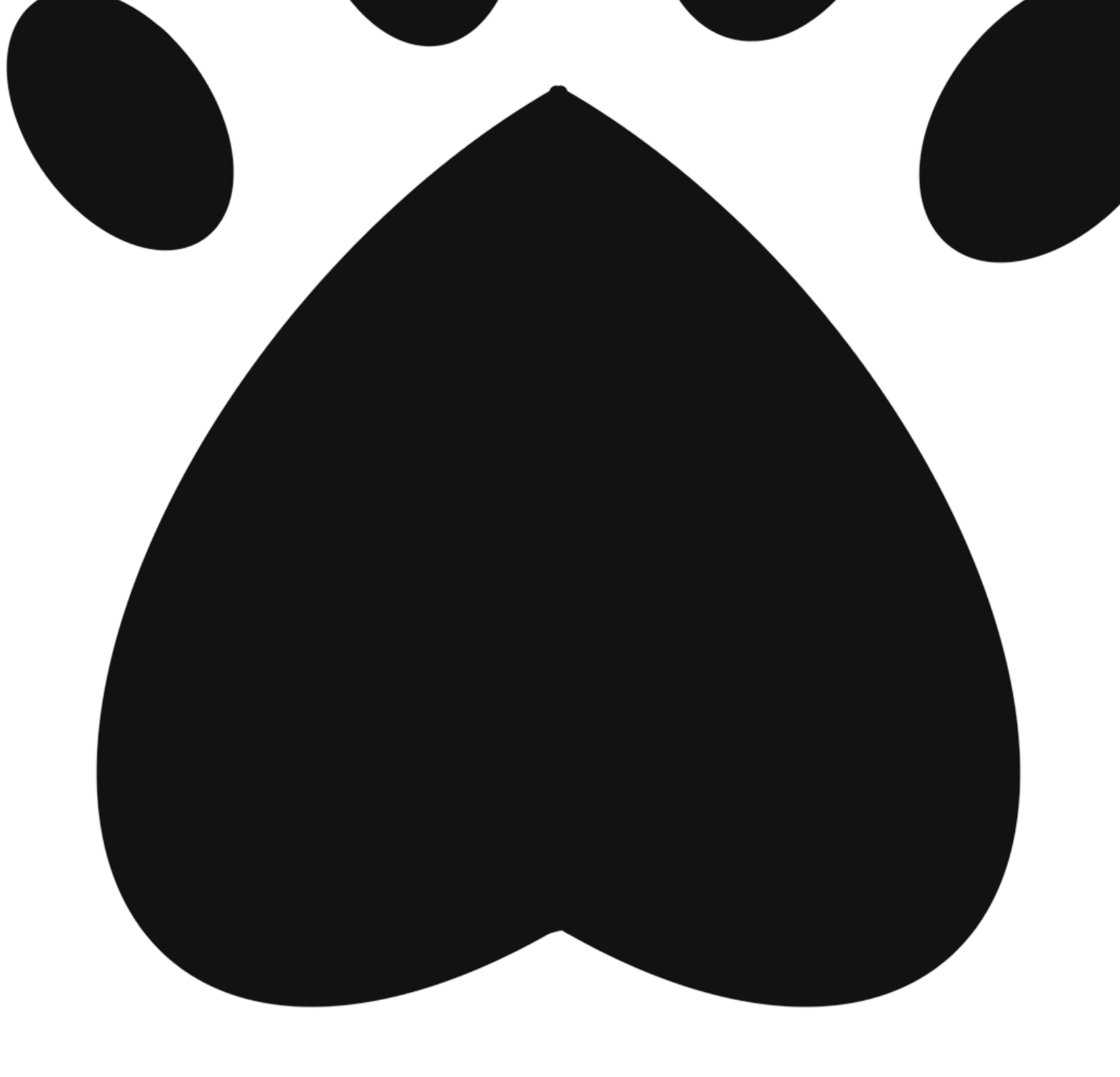
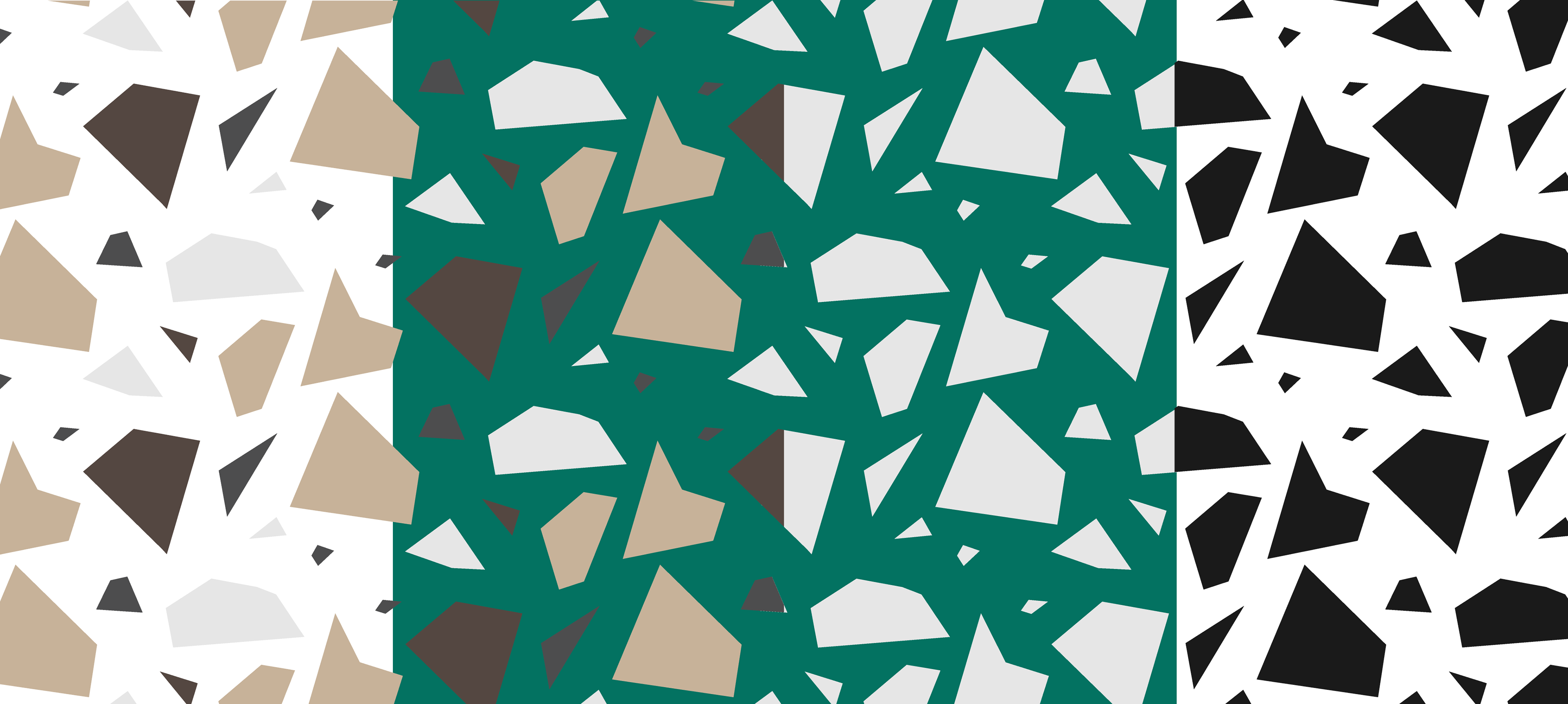
Patterns
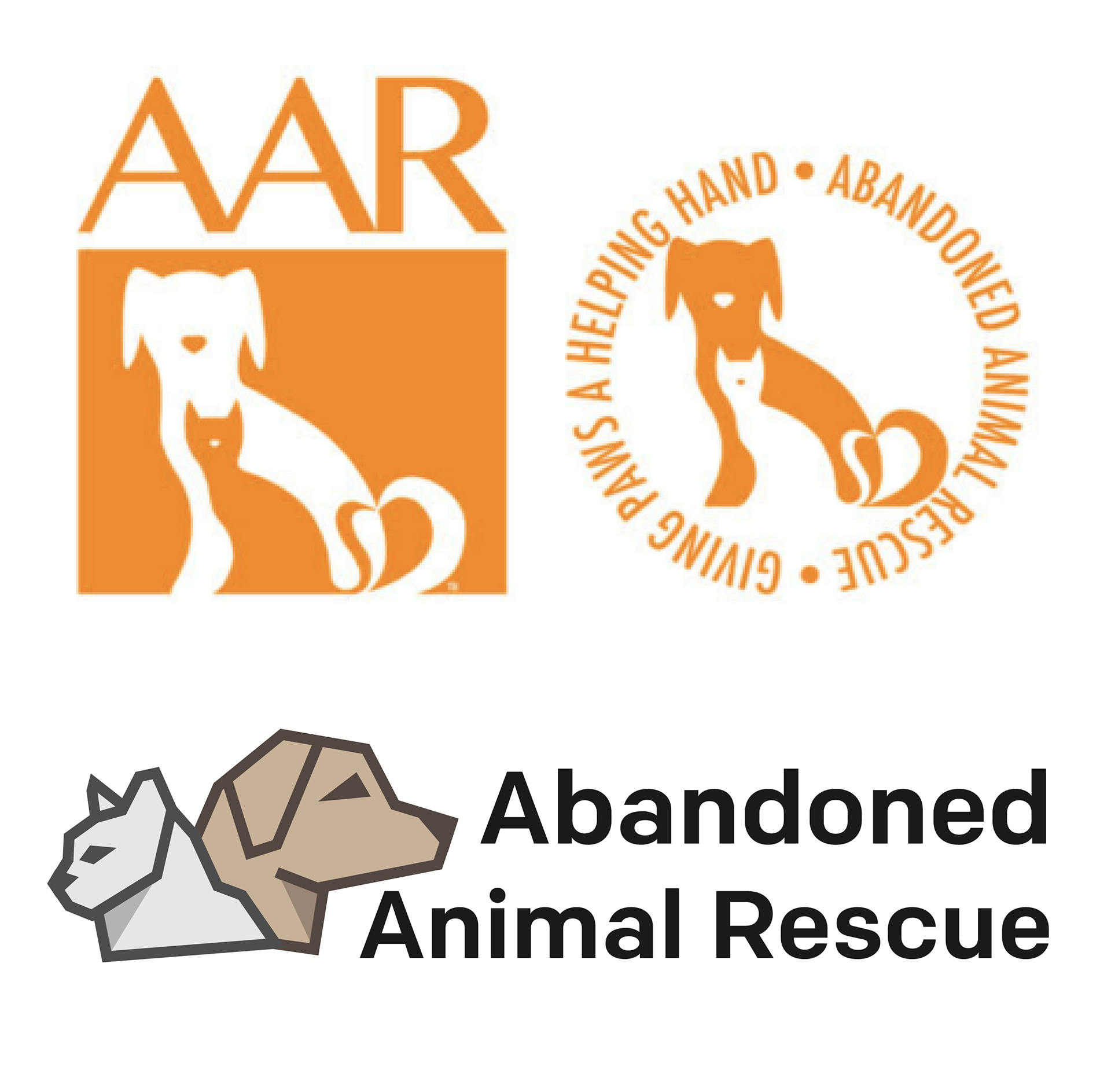
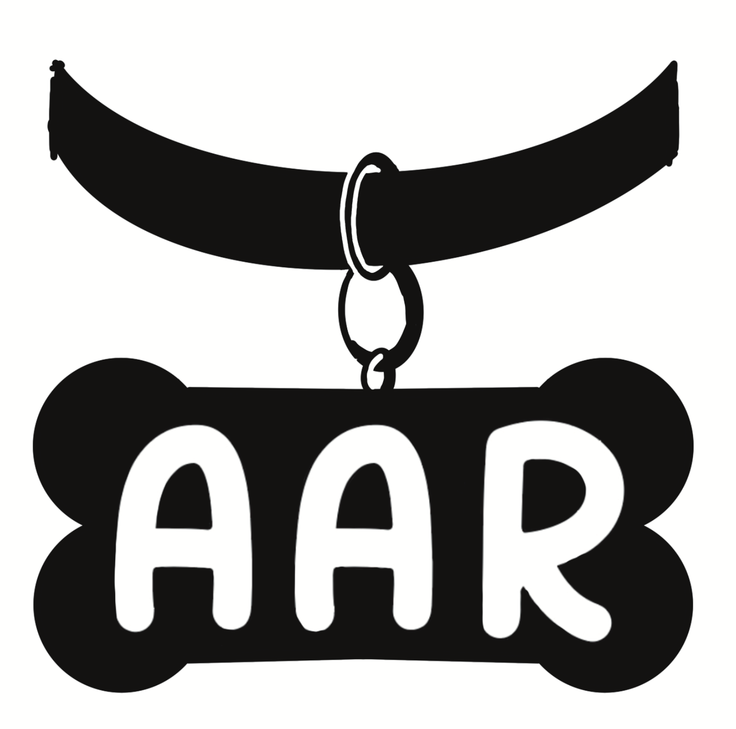
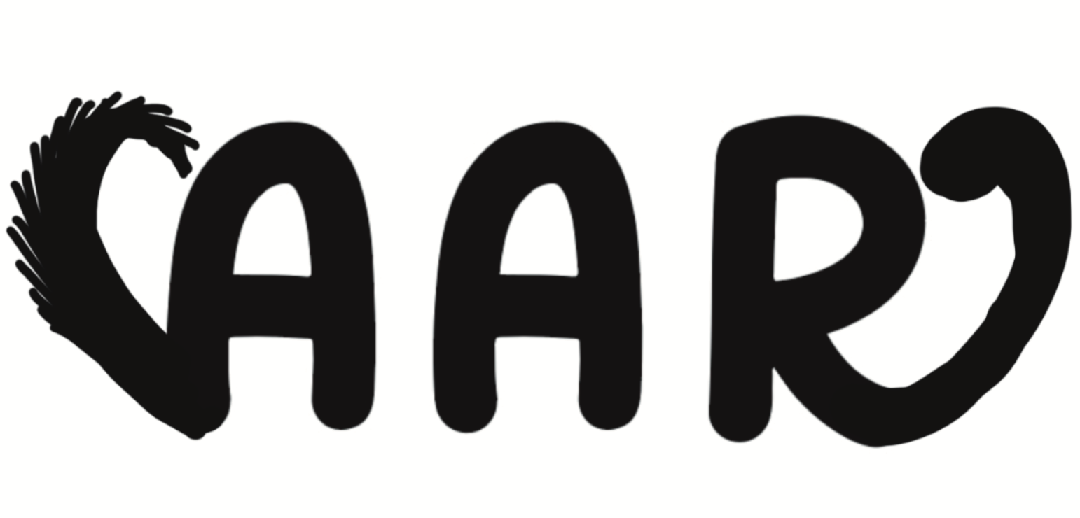
Original Logo
The original logo design has typography that does not match the style of the logo design. The mix of thin and thick elements on the typography, sharp edges and harsh corners clashes with the rounded and soft lines displayed in the logo icon. The color of the logo lockup does not align well with the idea of an animal rescue and does not intrigue people to learn more about the nonprofit.
The new logo design was created to appeal to all parties who would be participating in the nonprofit. The cohesive layout of the sans serif type and geometric logo icon design work to appeal to donors. The softer colors used in the logo icon make the icon more friendly and inviting to appeal to all other parties who would donate or adopt.
Sketches and Drafts