Poster and Merch Design Flats
Design and Reasoning
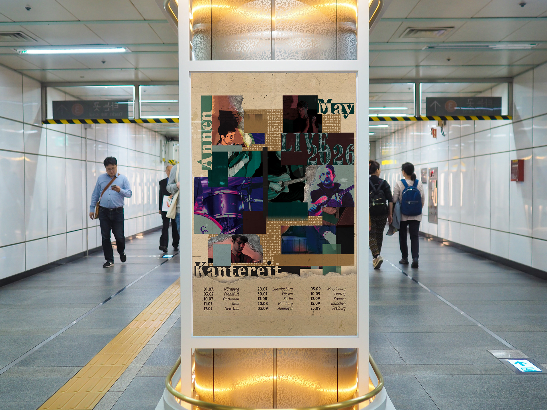
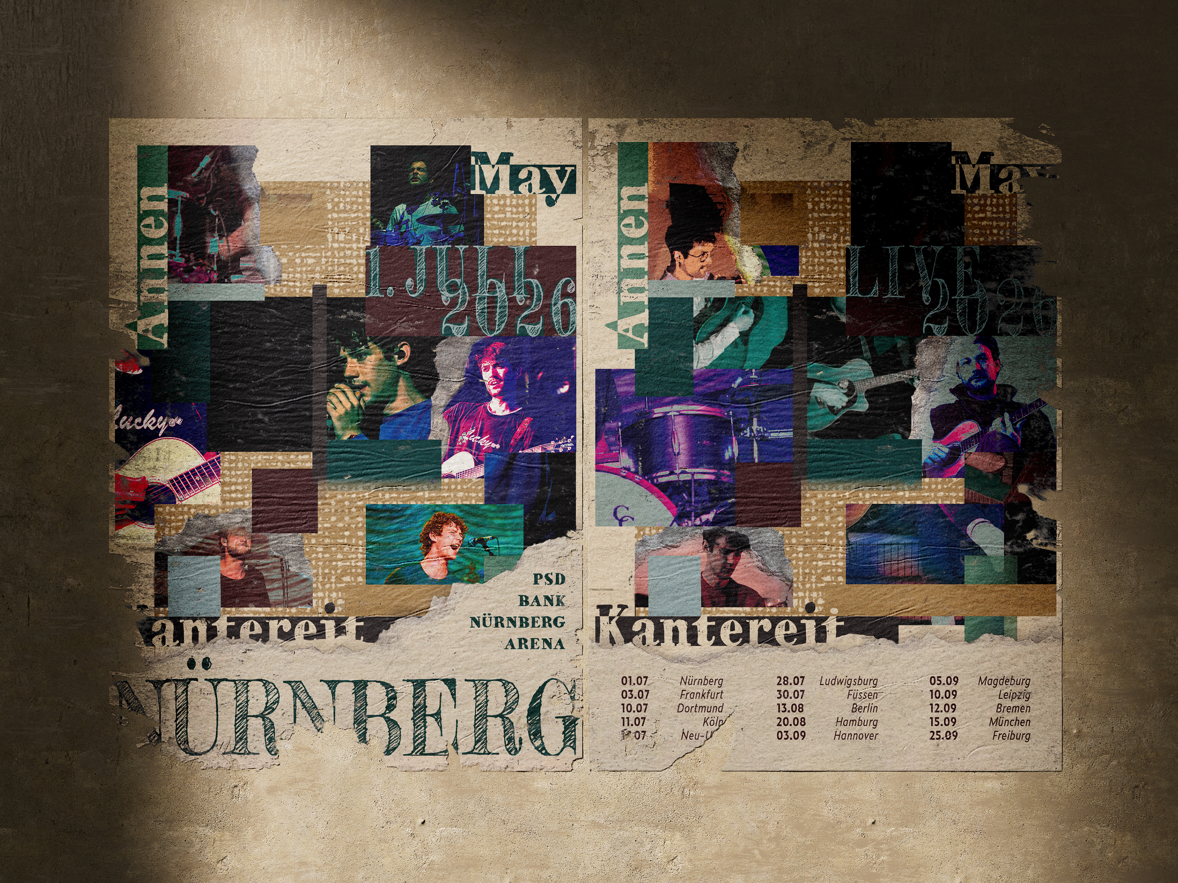
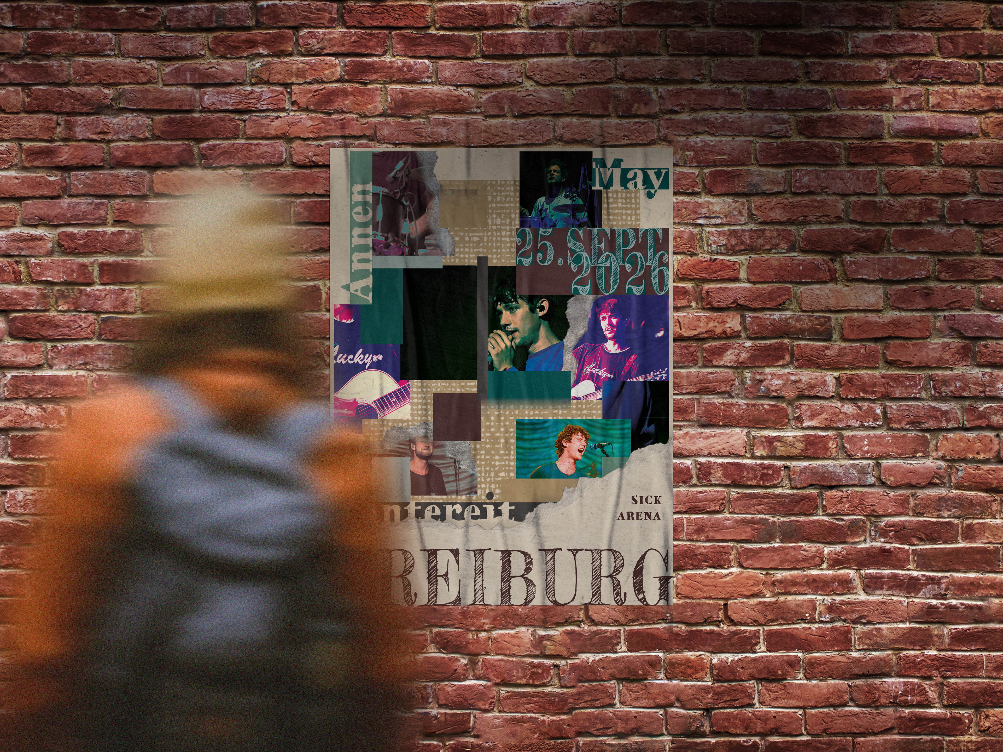
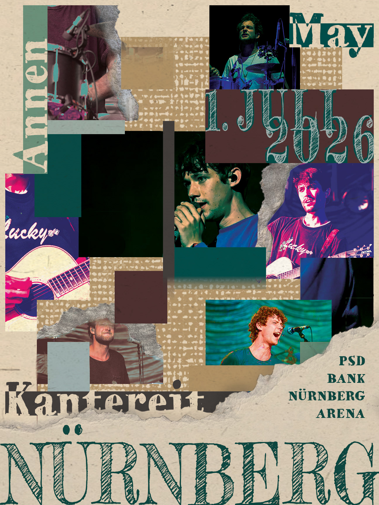
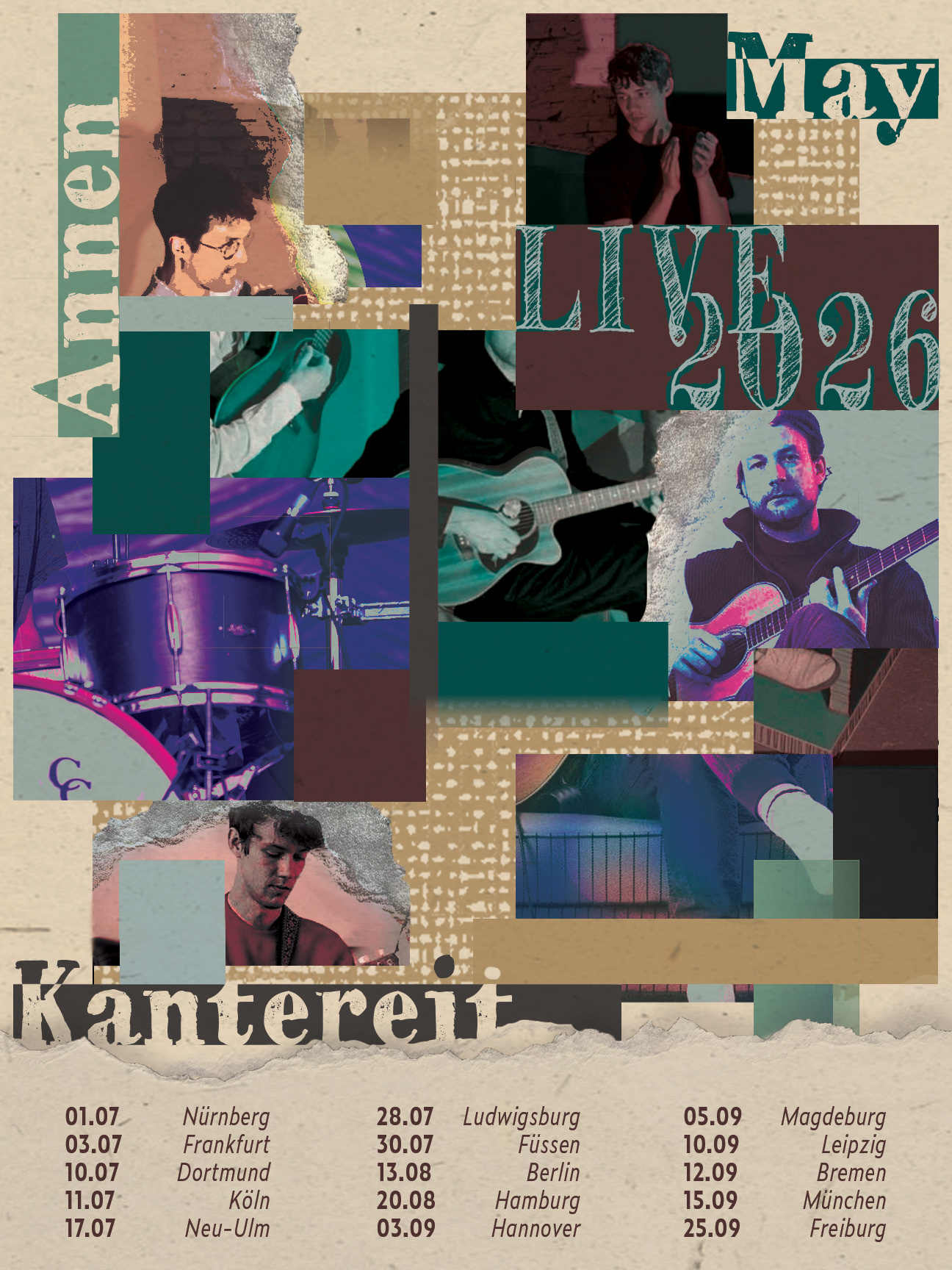
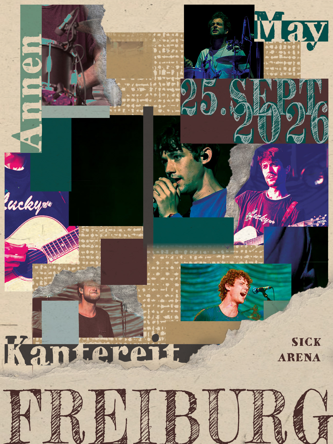
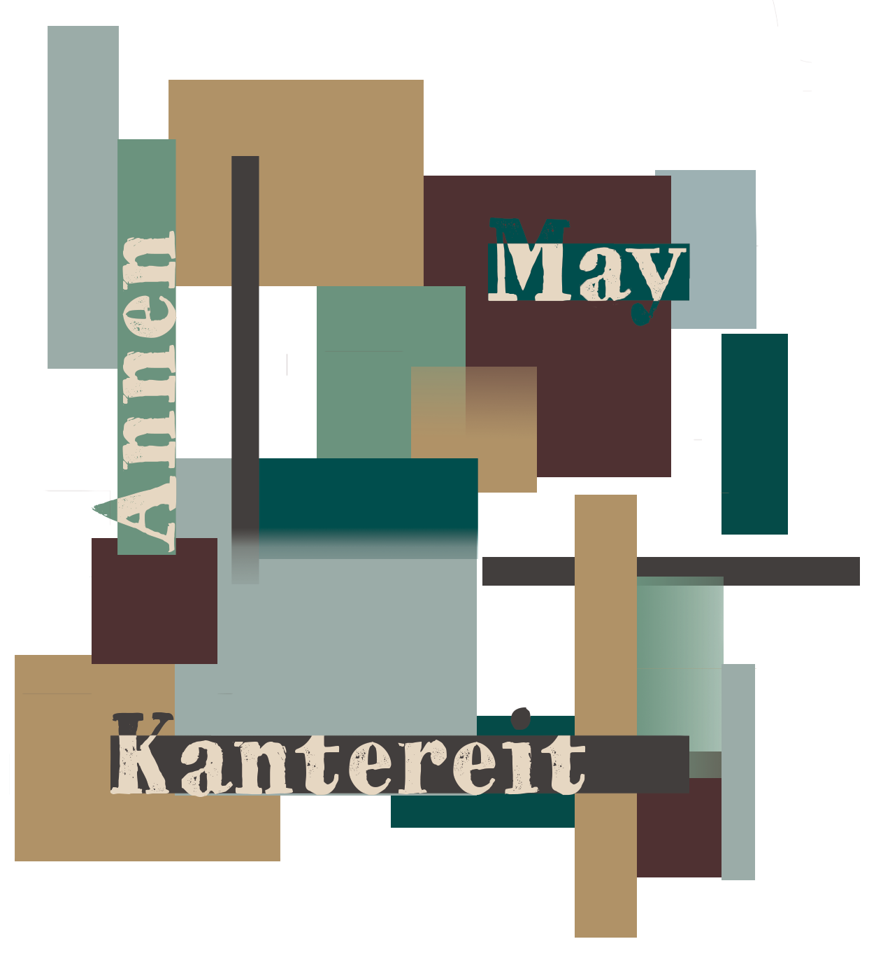
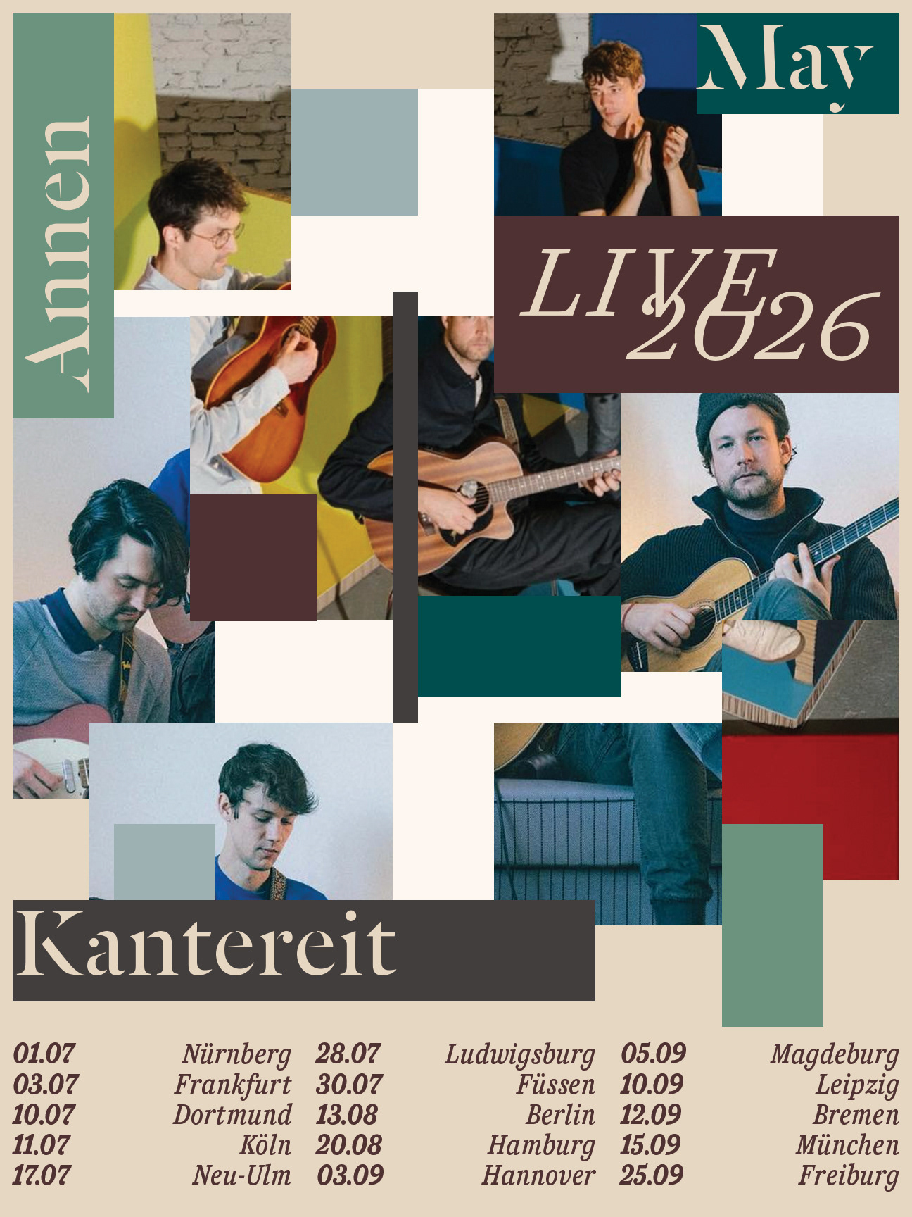
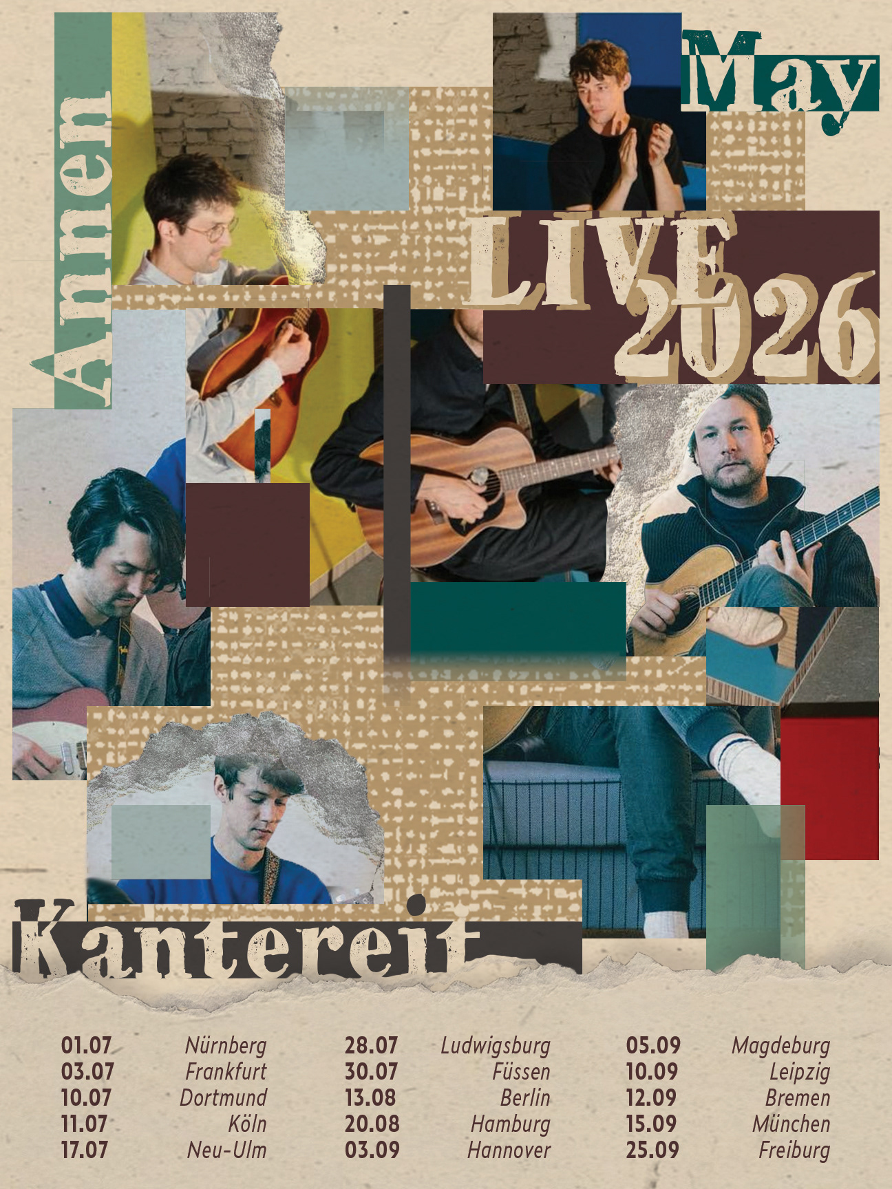
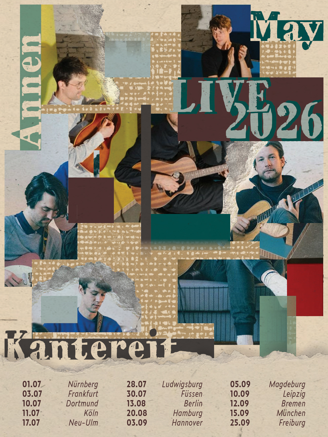
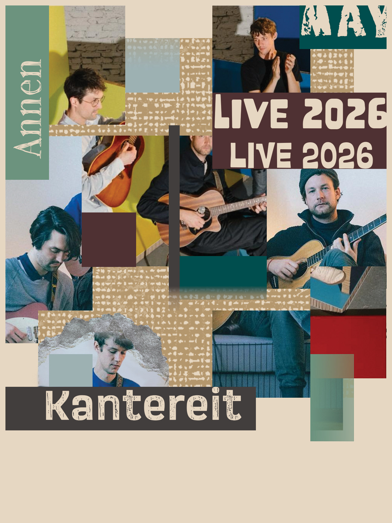
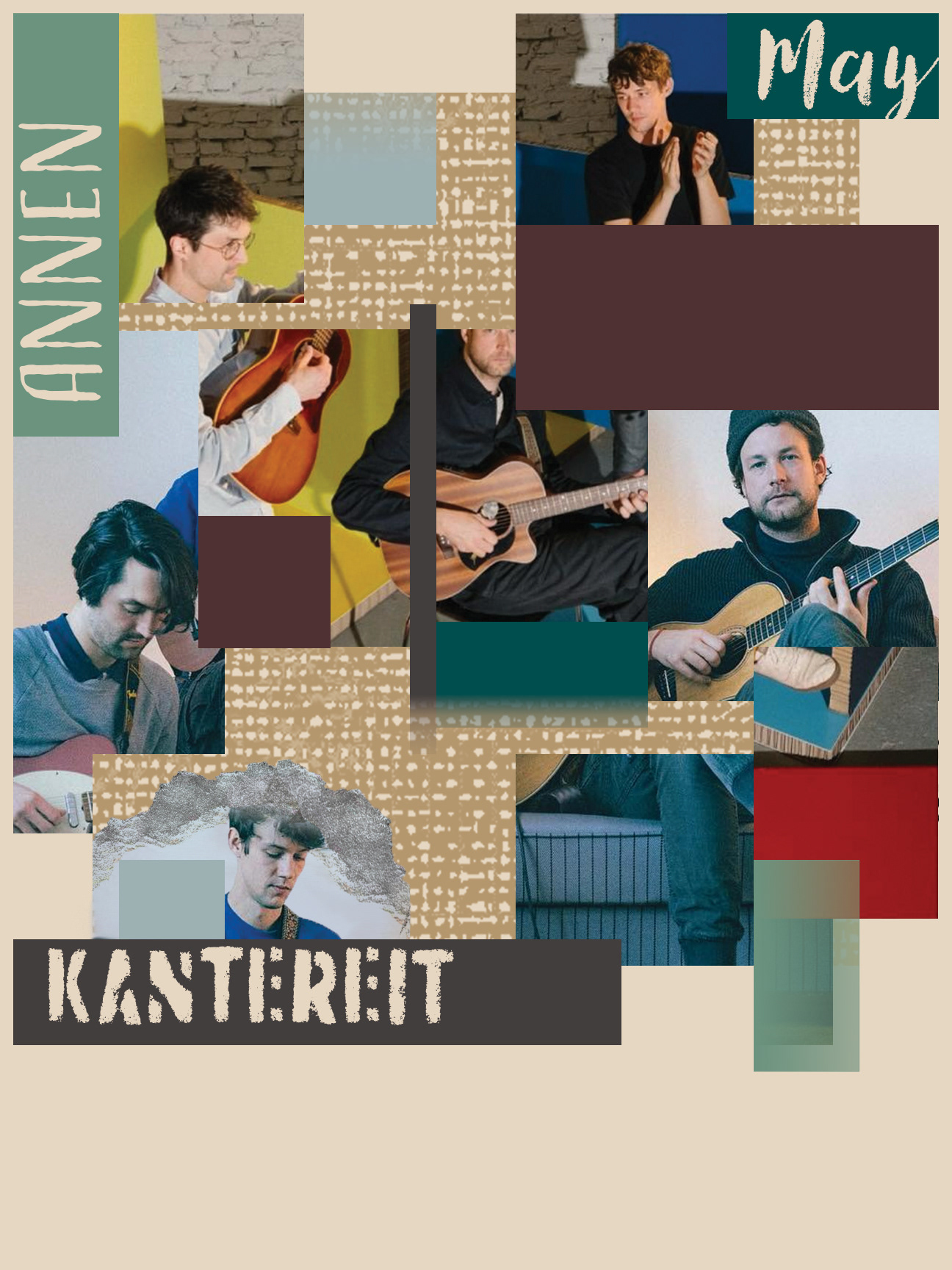
The goal of the poster re-design for AnnenMayKantereit’s 2026 tour was to create a new series of posters that better represent the band and their music. I wanted to capture the rough and deep aspects of their music, which you can hear both in the live performances and in the raspy voices of the singers. The project forced me to work outside of my comfort zone of using heavily grid-based designs. Although this series is also based on a grid design, I pushed myself to use more chaotic placement of elements and image manipulation. As I worked on these pieces, I realized that if I wanted to represent the band and their music, I would have to learn that sometimes pushing things further could bring me to a better piece overall.
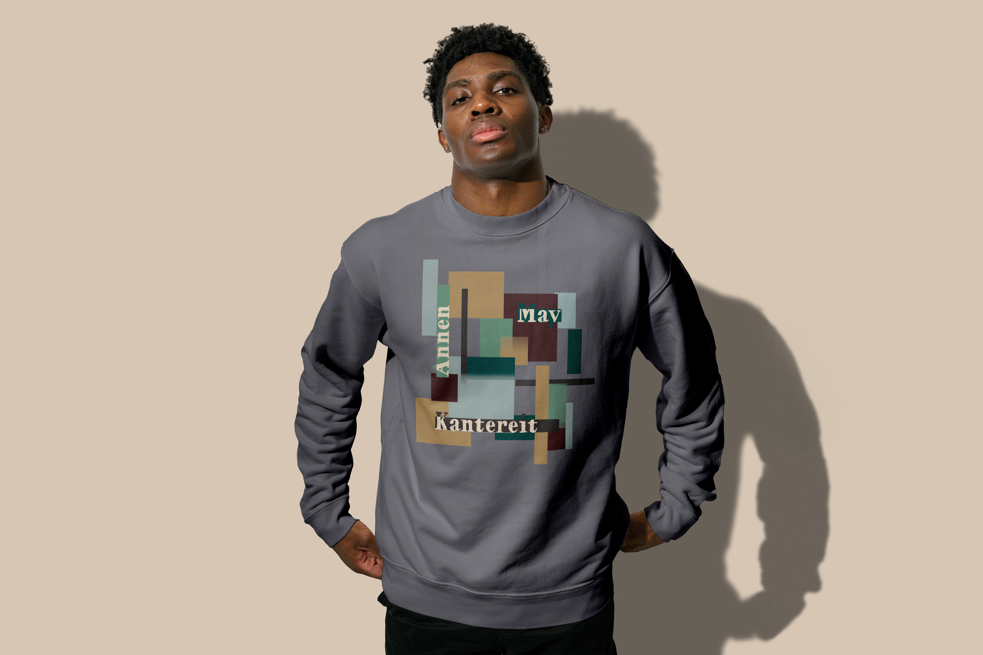
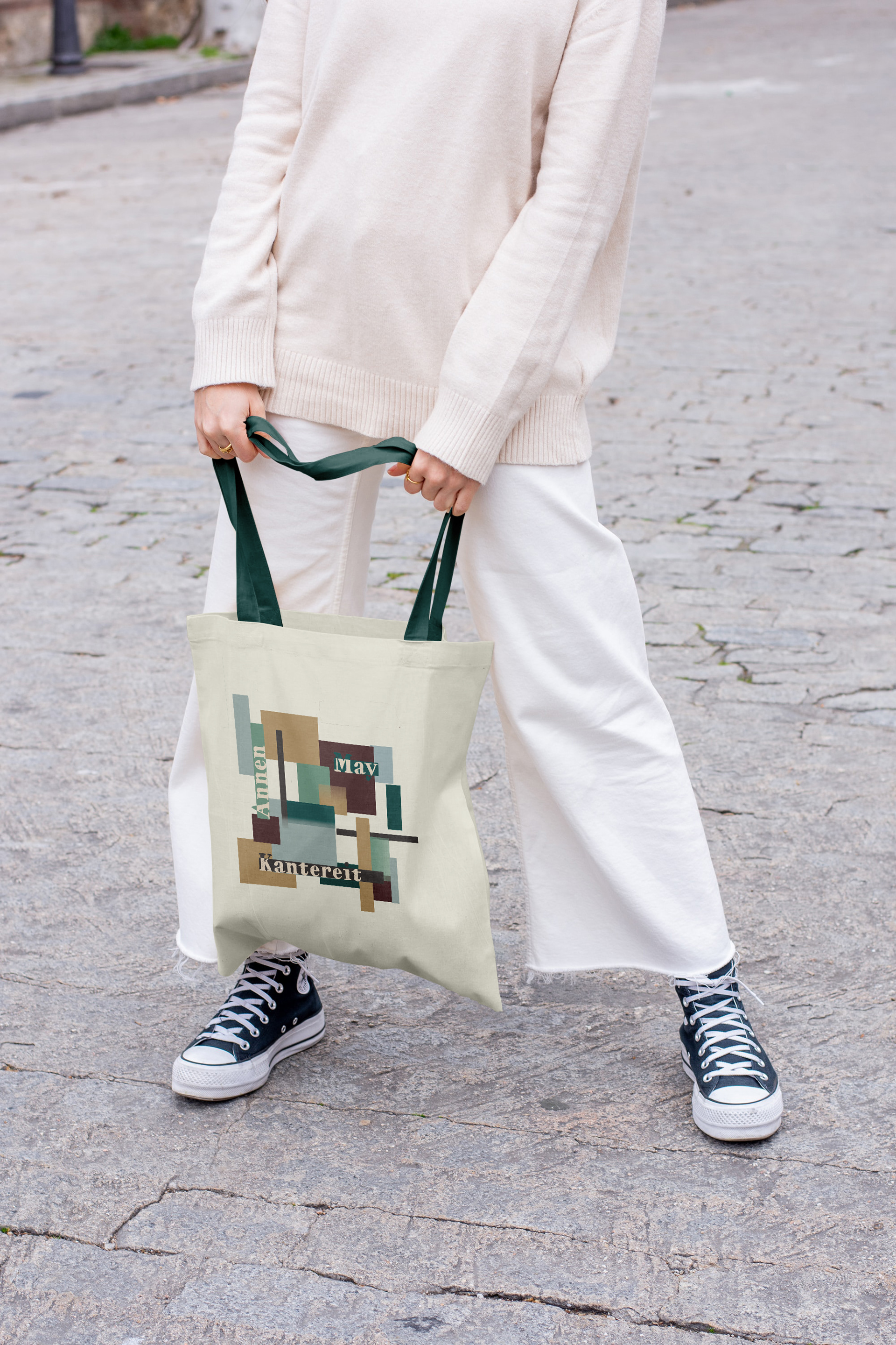
Along with the series of posters, which includes two location-specific posters and an overall tour poster, I created a design that could be used across multiple pieces of tour merch.
Each poster layout is 18 in x 24 in, and the t-shirt/tote bag design is 12 in x 13 in.
Drafts and Feedback
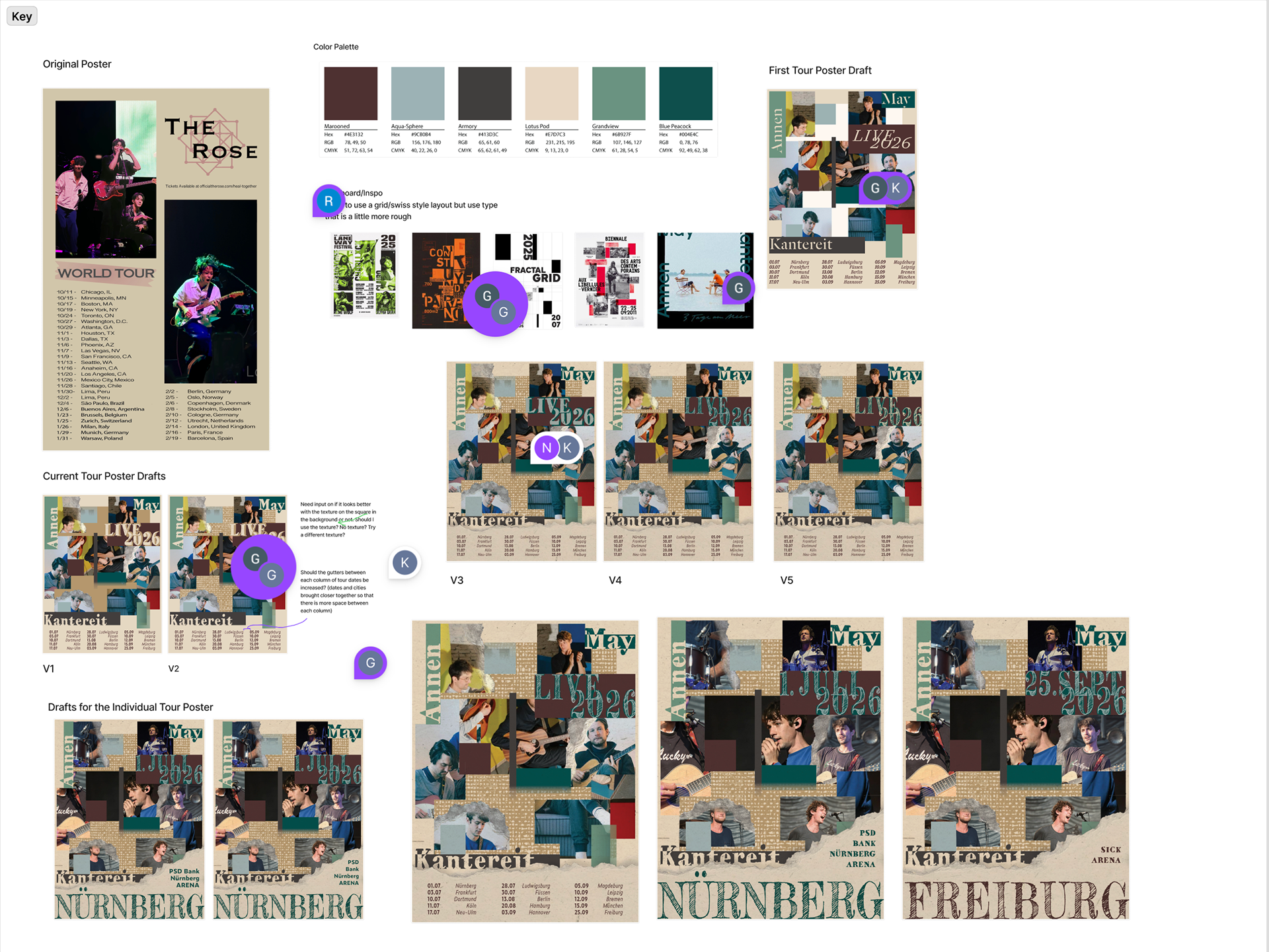
The Original
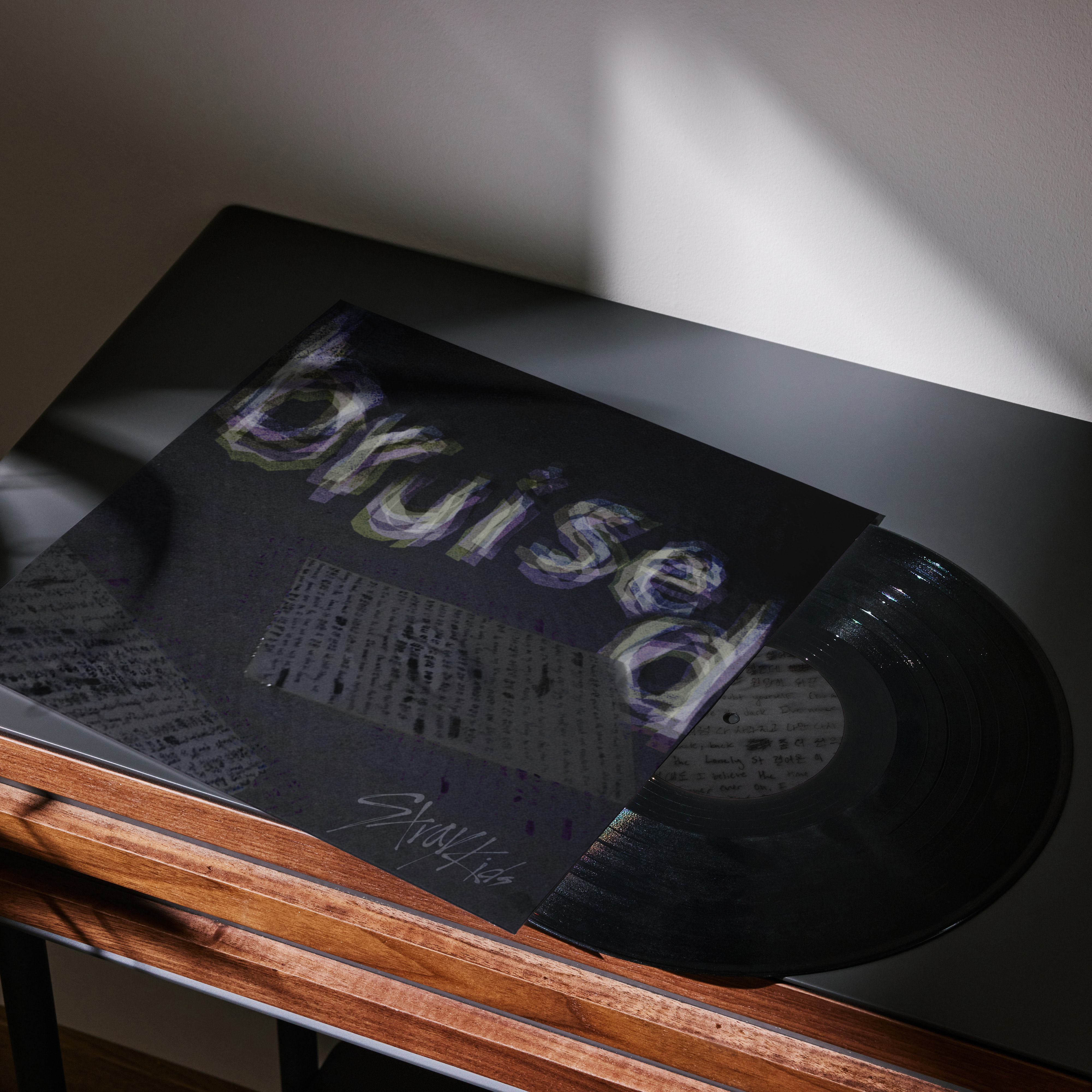
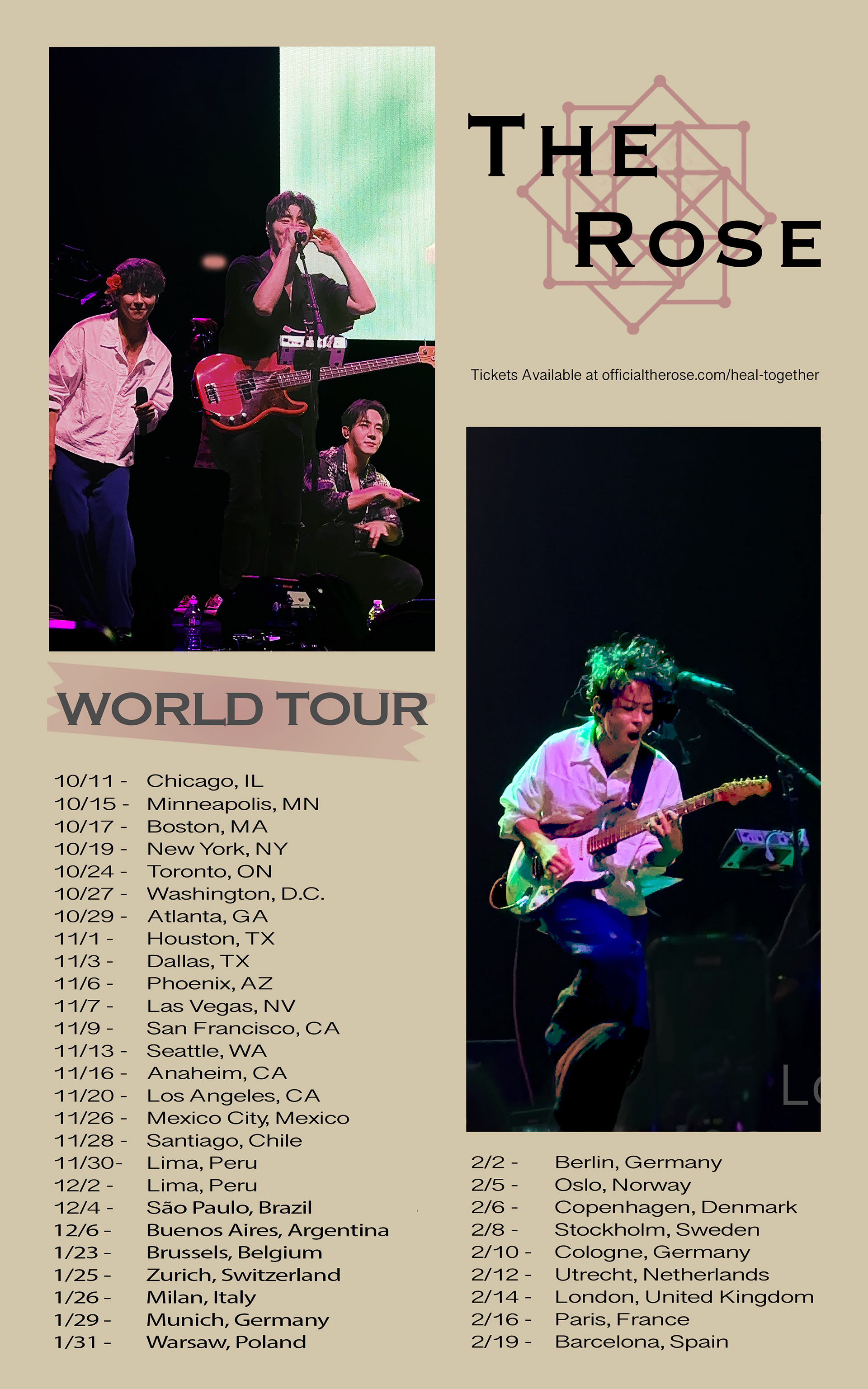
The original assignment was to design a poster of our choice, focusing on music, film, or events. We were not limited in the use of images, typography, color, or size, as the main point of the assignment was to get a better understanding of different design tools. This was a 1.5-week project with feedback and insight from the professor on our use of different tools in Adobe programs. The original band choice I used was The Rose, a Korean rock band, which, at the time, was one of the musicians I listened to daily. I also decided to move forward with this artist as I had photos from the concerts I had taken and was looking to push myself on using personal photography rather than pulling images from the internet. When submitted, I had created the design to the left with the basic, well-known tour poster layout, including only obvious elements. In the re-creation, I wanted to show my improvement in skill level, confidence, and understanding of photo manipulation and typography. Additionally, I chose to change the band I represent in the design to focus on pushing myself out of my comfort zone to stylize the design to fit the aesthetic of the musicians.